On a Thursday afternoon last spring, a customer emailed the studio a photograph of an empty wall above a walnut sideboard — north-facing light, cool grey paint, roughly ninety centimetres of vertical space between shelf and picture rail — and asked which of our four coastal prints would work. We wrote back with a question rather than a print. Then a second question. Then a third. By the fourth reply she had chosen the Amalfi Coast, but the choice was hers, arrived at by elimination. This piece is that exchange reorganised as a flowchart in prose: three questions, in order, and a table at the end that maps the eight possible answer combinations to a print from our shop.
Question 1: What Room Is the Poster Actually Going Into?
Not what you would like the room to feel like, and not what the poster is "for" in the abstract — the actual room, the one with the actual door and the actual furniture, the room a person sits in. This is the first question because a travel poster is a piece of interior furniture before it is a piece of travel writing. Its job is to hold a wall, be looked at from a sofa or across a table, and remain interesting on the two-hundredth glance. Rooms sort themselves into two camps for this purpose, and the camps decide almost everything downstream.
If It Is a Public Room — Living, Dining, Study, Office
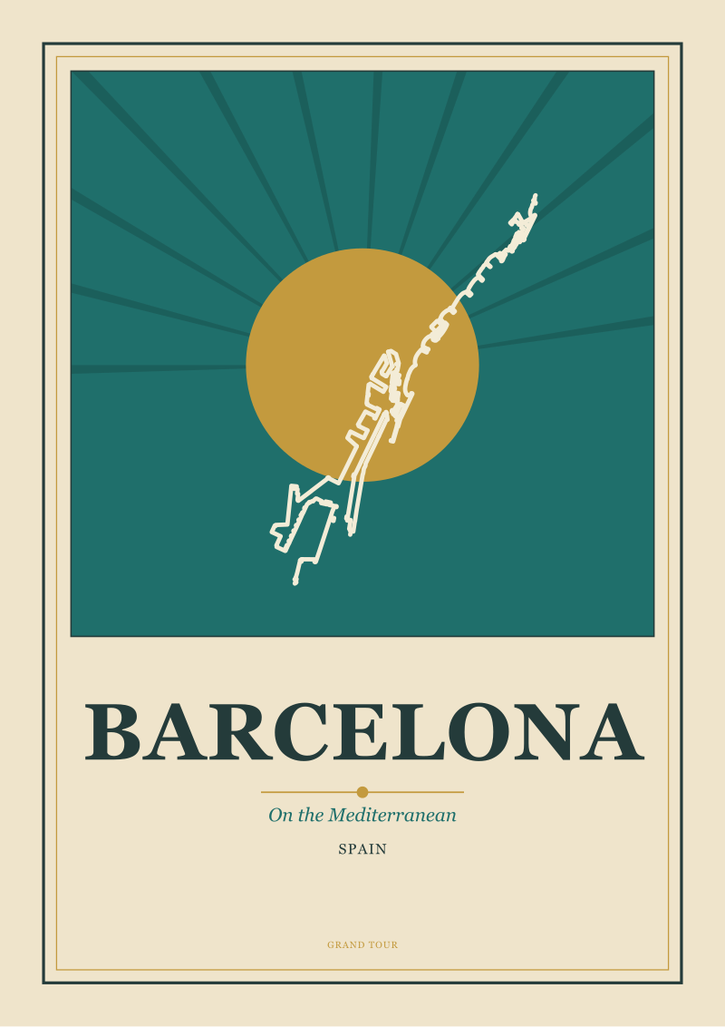
By public we mean a room you receive people in, or a room you work in for hours at a stretch. The poster will be looked at obliquely, in company, in the background of conversation, or dead-on across a desk in long working stretches. Two things follow. First, the composition needs to survive attention over time, which favours prints organised around a strong architectural or geographic gesture — a grid, a curved coast, a river reading vertically down the sheet — rather than a small anecdotal scene. Second, the image is going to be discussed. It will be pointed at. This favours destinations with a legible identity: places where the geography does the work of introducing itself, so you are not narrating a print to a guest. In our shop, Barcelona and the Amalfi Coast tend to hold public rooms best, for reasons that emerge under Question Two.
If It Is a Private Room — Bedroom, Hallway, Kitchen, Landing
Private rooms are looked at head-on, alone, often briefly, and often in low or artificial light. The relationship is quieter and closer. A print that shouts across a living room will bully a bedroom; a print that recedes politely into a dining room will disappear on a landing. Private rooms tolerate — and often want — the more introverted destinations: rivers rather than coasts, an interior geography rather than a panorama, palette handled at a lower volume. Amsterdam and Chamonix belong here more often than not, though not exclusively. Note also that a hallway is a private room with a public entrance, and it is the single most forgiving position for a poster: passed through quickly, viewed briefly, held at close range, it lets you commit to a strong print without asking the whole room to negotiate with it.
Question 2: Coastline, River, or Mountain — Which Geometry Answers the Wall?
Every travel poster in the shop is, before anything else, a shape. The Amalfi Coast is a horizontal ribbon of cliffs falling into a horizontal ribbon of sea; Barcelona is a coastline pressed against the graphic grid of the Eixample; Amsterdam is a system of curved and straight canals reading as vertical channels down the page; Chamonix is a vertical stack — town, valley floor, tree line, rock, snow, Mont Blanc — beneath the epithet the mountain has lent it. The wall has a shape too: portrait or landscape, tall and narrow above a stair, wide and low above a sofa. Match the shape of the geography to the shape of the wall before you match anything else, and half the work is done.
If the Wall Reads Horizontal — Sofa, Sideboard, Bed, Long Console
Horizontal walls want horizontal images. Coastlines are the shortest answer. A coast is inherently a line — one edge of land, one edge of water — and the eye moves along it the way it moves along a mantelpiece. The Amalfi Coast reads as a warm, southward line, the Costiera pressed between sea and cliff; Barcelona reads as a cooler, more architectural line, the Mediterranean meeting a city drawn in geometry rather than in cliffs. Both fill wide walls without straining. A river print, hung horizontally, can also work above a long sofa, but you are rotating a vertical image against its will, and the print will feel restrained rather than resolved.
If the Wall Reads Vertical — Between Two Windows, Above a Stair, Narrow Hall, Beside a Doorway
Vertical walls want vertical images, and the two vertical geographies in the shop are Amsterdam and Chamonix. They are opposite in almost every other respect. Amsterdam's verticality is domestic and horizontal in its subject — canals seen in plan, gabled facades in elevation — organised into a tall composition that reads downward like a page of writing. Chamonix's verticality is dramatic and elevational: town at the bottom, Mont Blanc at the top, a section drawing of a place that only makes sense read from valley floor upward. On a narrow wall in a hallway, either works; above a stair, Chamonix tends to win because the stair itself is a section drawing, and the two geometries agree.
 Chamonix
The print from this article · from €29.95
View the print →
Chamonix
The print from this article · from €29.95
View the print →
Question 3: Does the Wall Already Have a Dominant Colour, or Is It Waiting for One?
The last question is the one most people ask first, which is a mistake. Palette is decided by two prior facts — the room and the shape — and only then by the wall's own colour. But once you are here, this question does most of the remaining work. A wall with a dominant colour (a green study, a terracotta kitchen, a deep-blue bedroom, even a strongly painted white) is negotiating with the print; a neutral wall (pale grey, off-white, warm plaster) is providing a backdrop and letting the print set the palette.
If the Wall Already Has a Dominant Colour
The rule here is echo, not match. A print that repeats the wall's exact hue disappears; a print that ignores it fights; a print that picks up one of the wall's colours and answers it with a related but distinct one settles into the room. Warm walls — terracotta, ochre, deep pink, warm cream — take the Amalfi Coast, whose cobalt and lemon and ochre palette answers warm walls without matching them, and the Chamonix print, whose cool alpine palette provides the counter-tone that warm walls need. Cool walls — grey, greenish grey, deep blue, slate — take Barcelona, whose Mediterranean palette runs across the same cool range but pushes it toward blue, and take Amsterdam, whose canal palette of grey-green water and warm brick lets a cool wall keep its temperature while adding an interior warmth to it.
If the Wall Is Neutral and Waiting
A neutral wall is asking the print to make the decision. This is the easiest situation and also the one that gives you the most freedom, because you are no longer negotiating with an existing colour, only choosing one. Here the geography does the deciding. Coastal prints — Amalfi and Barcelona — bring the Mediterranean into a neutral room, which reads as warmth and light in the Amalfi case, structure and calm in the Barcelona case. River and mountain prints — Amsterdam and Chamonix — bring quieter palettes: canal greys and warm-brick browns for Amsterdam, alpine whites, greys and one cold blue for Chamonix. On a truly neutral wall the choice reverts to Question Two: match the shape.
If You Answered Everything: The Combination Table
The three questions produce eight possible answer combinations. Below is our recommendation for each. In every case, the recommendation is a starting point rather than a verdict — the last decision belongs to the person living in the room — but in the exchange that began this piece, and in most exchanges since, the table is where the conversation settles.
| Q1 (Room) | Q2 (Geometry / Wall Shape) | Q3 (Wall Colour) | Recommendation |
|---|---|---|---|
| Public | Coastline / horizontal | Wall has dominant colour | Barcelona — its graphic grid answers a coloured wall without competing |
| Public | Coastline / horizontal | Wall is neutral | Amalfi Coast — warm Costiera palette carries the room's temperature |
| Public | River or mountain / vertical | Wall has dominant colour | Amsterdam — canal greys and warm brick echo a coloured public room |
| Public | River or mountain / vertical | Wall is neutral | Chamonix — the sectional stack anchors an empty wall in a working room |
| Private | Coastline / horizontal | Wall has dominant colour | Amalfi Coast — warm palette answering warm private walls, quietly |
| Private | Coastline / horizontal | Wall is neutral | Barcelona — the Mediterranean at a lower volume, right for a bedroom |
| Private | River or mountain / vertical | Wall has dominant colour | Chamonix — the alpine palette provides the counter-tone a warm room needs |
| Private | River or mountain / vertical | Wall is neutral | Amsterdam — greys speaking to greys, the quietest print for the quietest wall |
The table is deliberately eight rows rather than four or sixteen. Fewer would flatten the distinctions; more would pretend to a precision that neither we nor the wall possess. If you would like to see the four prints referenced here — Amalfi Coast, Amsterdam, Barcelona, Chamonix — they live in the studio's shop, photographed at scale against real walls rather than in isolation, so the geometry decision above can be made by eye as well as by argument.
 Amsterdam
The print from this article · from €29.95
View the print →
Amsterdam
The print from this article · from €29.95
View the print →
FAQ
How large should a travel poster be for the wall I have?
As a rough studio rule, the framed print should occupy between two-thirds and three-quarters of the width of the furniture directly below it — a sofa, a sideboard, a bed. For a stand-alone wall with no anchoring piece of furniture, take the narrower dimension of the wall and use around sixty percent of it. Anything smaller than that reads as a postcard pinned to plaster; anything larger overwhelms the geometry of the room and tends to make the ceiling feel lower than it is.
Does the poster need a mount and a frame, or can it hang unframed?
For a public room and for any wall the poster is meant to hold for years, a mount and a frame are worth the outlay: they protect the paper, they add the visual weight that separates a print from a page, and they let you tune the temperature of the wall further through the choice of frame material. For a private room or a temporary arrangement, an unframed poster hung with rails is a legitimate choice — it is the way travel posters were displayed in railway stations and it reads as honest rather than provisional.
What should I do if I like two prints and cannot decide?
Almost always this means the two prints belong on different walls, not on the same one. Two coastal prints from the same series can sit together — Amalfi and Barcelona hung on facing walls of a dining room work well — but a coast and a mountain hung side by side compete for the same argument and lose. The studio's usual advice is to place the two prints in two separate rooms, and let the walk between them do the comparing.
Do travel posters date the room, or are they timeless?
The vernacular is old — railway posters emerged around the turn of the twentieth century, art deco travel posters flourished between the wars — and that historical weight is part of what makes the format survive contemporary redecoration. A poster drawn from real geography, in a palette that answers the destination rather than a fashion, tends to outlast the wall paint it hangs against. What dates a room is a poster that is generic; a poster that is specific to a place ages the way the place does, which is to say very slowly.
How do I match a poster to a room with mixed warm and cool tones?
Rooms with mixed temperature — warm wood floors under cool grey walls, terracotta tile beside white plaster — are actually the easiest case, not the hardest. A poster with two-temperature palettes fits them naturally: the Amalfi Coast (cool sea against warm cliffs) and Chamonix (cool alpine against warm valley floor) are the two obvious answers. Avoid a single-temperature print in a mixed-temperature room, because it will lean toward one side of the room and unbalance the whole.
Can more than one travel poster hang in the same room?
Yes, provided they are in dialogue rather than in competition. The simplest way is to hang prints from the same visual series — same paper, same frame, same drawing register — so the eye reads them as a set. The second-simplest way is to pair one horizontal print (a coast) with one vertical print (a river or mountain) on different walls, so the room contains two geometries rather than one repeated. What does not work is two large prints of similar shape hung on the same wall — they collapse into a symmetry that flattens both.
Where should I hang a travel poster in a room with low ceilings?
Hang the centre of the print at eye level for a standing adult — around 150 to 155 centimetres from the floor — rather than centred on the wall. In a low-ceilinged room this places the print lower than instinct suggests, but the composition then relates to the eye rather than to the empty space above the picture rail. Vertical prints (Amsterdam, Chamonix) are also more forgiving of low ceilings than horizontal ones, because their internal geometry keeps the eye travelling downward through the sheet rather than upward toward a ceiling you would rather not draw attention to.


New city prints and 10% off your first order.
One email now with your code. No noise after.