A city map and a city poster are not the same object made prettier; they are opposite arguments about what a place is. The map is a court record. It says: here is Amsterdam, to scale, with every canal accounted for and the ring of the Singel closing on itself, in the north, exactly. The poster is closer to a courtroom summary delivered by someone who wants the jury to remember one thing. It says: Amsterdam is water, and the water is the point. The distinction sounds precious. It is not. It is the entire reason one hangs on a wall and the other lives in a glove compartment.
A Map Is Written for the Traveller Who Has Arrived. A Poster Is Written for the One Who Hasn't.
The difference is temporal before it is anything else. A map is consulted mid-journey, by someone already inside the place, trying to work out how to leave a specific address for another one. It has to be right about distance, about one-way streets, about where the tram runs and where it stops. It assumes the reader is negotiating friction and needs it removed. It is a tool for the present tense.
A poster is looked at, almost always, by someone who is not there. It hangs above a desk in a city the poster was not made for, and its job is to answer a much older question: why bother going at all. That question does not benefit from the tram schedule. It benefits from an argument.
Consider the Singel — the innermost of Amsterdam's canals, the medieval moat that eventually closed on itself and made the city, geographically, a spiral. On a map, the Singel is a line among many lines, weighted no more than the Herengracht or the Prinsengracht, because a map cannot afford to have favourites. On a poster, the Singel might be the only water shown at all, or all the canals might be present but drawn as though the light were falling on them at the same hour of the same afternoon in late September, which never actually happens. The poster is telling a lie the way a portrait tells a lie: by choosing.
Chamonix works the same way. On the topographic sheet, Chamonix is a valley town on the Arve, tightly hemmed by contour lines that show the aiguilles on one side and the Mont Blanc massif on the other in equal, patient detail. On a poster, Chamonix is almost always the massif — Mont Blanc taking up two-thirds of the sheet, the town small at the bottom, made small on purpose. The map is being fair to what is there. The poster is being fair to what the traveller came for.
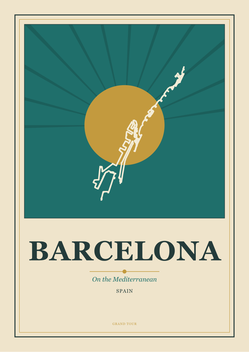
Barcelona sharpens the case. Cerdà's Eixample, drawn onto a survey, is a grid of chamfered blocks stretching from the medieval city out to the Diagonal, useful and boring in the exact ratio that all successful urban planning is useful and boring. Drawn onto a poster, viewed from above and cropped tight, the same grid becomes graphic design. The chamfered corners resolve into a repeating motif; the diagonal streets cut across as accents. Nothing in the survey has been contradicted. Everything about how you experience the survey has been.
The Amalfi Coast Shows Both Formats at Their Extreme
There are destinations where the gap between map and poster narrows — a compact old town, a symmetrical square — and there are destinations where the gap yawns open. The Costiera is the second kind, and it is instructive because it is honest about what each format is for.
The map of the Amalfi Coast is a demanding document. The coastline itself is fractal in the mathematical sense: measure it at any scale and the answer changes, because there is always another cove hidden behind the promontory you just resolved. The road that stitches Positano to Amalfi to Ravello is a switchback drawn as a switchback, with elevation notes and hairpin markers, because if the map softened those turns it would become a lie that people would drive off. The map is legally responsible in a way we do not usually think of maps as being. It shows the ferry pier, the church set back from it, the elevation of Ravello above sea level, and the length of the tunnel below Conca dei Marini. If any of those numbers were wrong, the map would fail at its job.
The poster is a different creature entirely. A poster of the Costiera is almost never the whole coast. It is almost always a single terraced village — Positano, more often than not — seen from the water, the houses stacked from the sea to the sky in pinks and ochres, a strip of dark green above them where the lemon groves and the maquis start, and a compressed slice of Mediterranean below. The road is not drawn. The tunnels are not drawn. Amalfi and Ravello and Praiano may not appear at all. The poster is not being lazy. It is doing what the poster has always done, which is answering the question the map cannot answer: what is the picture in the traveller's head when they say the word.
The two formats do not compete. They are not two answers to the same question. They are answers to different questions asked by different people in different moods. The confusion begins only when someone tries to make the map beautiful, or the poster useful, and produces something that fails at both — a hybrid tourist-office diagram that neither navigates nor argues. The Costiera is unforgiving of that kind of hedge. It is a coast that either demands the switchback or refuses everything except the terraces. There is no middle draft.
 Amsterdam
The print from this article · from €29.95
View the print →
Amsterdam
The print from this article · from €29.95
View the print →
The Real Cost of a Poster Is Everything It Refuses to Include
Every map is an act of generosity. It puts everything in and lets you choose. Every poster is an act of severity. It leaves almost everything out and does the choosing for you. This is not a minor difference of technique. It is the entire economic exchange the poster asks the viewer to accept.
To count the cost honestly, one has to count what disappears. A poster of Amsterdam does not contain the souvenir shops on the way out of the station. It does not contain the queue at Anne Frank House at eleven in the morning in July. It does not contain the fact that the ring of canals, seen from a bicycle, is often blocked by a delivery van reversing. A map of the same city would not lie about any of those things — it would show the Damrak wide and central, running straight from the station to Dam Square, no editorial comment attached. The poster's silence about the souvenir shops is not accuracy; it is argument.
A poster of the Amalfi Coast does not contain the traffic. It does not admit that the coast road can be closed by a rockfall in October and reroute everyone through Agerola for a week. It does not contain the coach parks above Positano or the fact that the ferry from Salerno sells out at ten in the morning in August. The refusal is not sloppy. The refusal is the point. The poster is saying: this is what the place is when it is being itself, when the light is right, when the shutters are open, when the lemons are heavy on the branch and the sea below is the specific colour it is only when the wind has dropped. It is not everything the place is. It is everything the place is *for*.
The reader who has been sold a map masquerading as a poster — the tourist-office fold-out with the smiling icon at every attraction — has been sold neither. They cannot navigate with it, because the icons obscure the streets, and they cannot look at it on a wall, because it contains too much information to argue anything at all. The reason posters of European cities, drawn in the tradition of the golden age of railway advertising, still hang on more walls than any survey ever will is that they made a decision the map is forbidden to make. They decided what the city was going to mean. When we draw a city at Grand Tour Prints, we spend more time deciding what to leave out than we do deciding what to draw in. The cost of a good poster is measured in absences.
This essay began as a straightforward comparison — one format versus another, which does what, which belongs where. It turned, somewhere in the middle, into something quieter: an argument about editorial responsibility. The map is responsible to the facts. The poster is responsible to the feeling. Both are responsible; neither is dishonest. This piece did not address the British ordnance survey tradition, which deserves its own treatment because it is one of the most beautiful map-making cultures ever produced. It did not address the twentieth-century American national park poster, which sits somewhere between the two forms and complicates them productively. And it did not touch the question of what a city photograph is — whether it is a third format entirely or a hybrid of the other two. Each of those is a separate argument for another week.
FAQ
Is a travel poster just a decorative version of a city map?
No, and treating it that way misreads both objects. A map's obligation is to the ground — it must be right about distance, elevation, and the position of streets. A poster's obligation is to the argument the place makes on the viewer. A poster of Amsterdam that omits half the canals is not an error; it is a choice about what the city means. A map that omitted half the canals would simply be broken. They are different forms with different responsibilities, which is why you rarely want either one doing the job of the other.
Why do city posters tend to age better than city photographs of the same place?
A photograph is dated the moment it is taken — a sign in a window, a make of car in the frame, a fashion on a passer-by. A poster in the railway tradition is deliberately reduced to elements that do not date: the coastline, the massif, the water, the roofline. The Amalfi Coast drawn as terraces above the sea in one decade and the same view drawn in another look, oddly, almost interchangeable. The poster survives because it refused to include the perishable material in the first place.
When did the poster begin to replace the map as travel imagery?
The shift belongs broadly to the second half of the nineteenth century, when railway companies began commissioning artists to sell destinations rather than describe them, and it intensifies through the interwar art deco period. Before then, engraved maps and topographical views did most of the work of imagining foreign places. After the railway poster, the image of a destination became increasingly a designed argument rather than a surveyed record. Both forms continued in parallel — but the wall belonged, from that point on, mostly to the poster.
Can the same designer make a good map and a good poster of the same city?
Occasionally yes, but rarely at the same time. The mental discipline of surveying — including everything, weighting nothing — is close to the opposite of the discipline of poster design, which is a series of deliberate exclusions. The cartographer who tries to make a poster tends to include too much; the poster designer who tries to make a map tends to omit what the traveller needs. The best studios keep the two crafts separate, or accept that a single person needs to switch modes fully between the projects, weeks apart.
Which format is more honest — the map or the poster?
Neither, if honesty is defined strictly. The map is factually accountable and would be broken if it lied about elevation or distance. The poster is editorially accountable and would be broken if it argued for a place it did not actually understand. A dishonest map is one with a wrong contour line. A dishonest poster is one that could have been drawn about anywhere — a generic Mediterranean village that is not really Positano, a generic alpine peak that is not really Mont Blanc. Both forms can fail; they simply fail in different ways.
Why do European cities seem particularly suited to the poster form?
Because most of them were built slowly, around a single defining geographical feature — a river, a coastline, a massif, a canal ring — and that feature survives as the visual argument of the place. Amsterdam is water. Chamonix is Mont Blanc. The Amalfi Coast is the terraced meeting of village and sea. Barcelona is the grid meeting the Mediterranean. Cities without that kind of single elemental spine tend to resist poster treatment, or force the designer to invent a spine that was not really there — which is usually the moment the poster stops being about the city and starts being about itself.
 Amalfi Coast
The print from this article · from €29.95
View the print →
Amalfi Coast
The print from this article · from €29.95
View the print →


New city prints and 10% off your first order.
One email now with your code. No noise after.