Most hallway gallery walls fail before a single frame is hung. Hear me out. The failure is not in the choice of posters — it is in the refusal to treat a corridor as a corridor. A hallway is a moving image: read at walking pace, from oblique angles, in borrowed light, almost never head-on. And yet the standard advice being handed around treats the wall like a living room, a place where a viewer stops and considers a composition. That confusion is why so many otherwise beautiful prints end up functioning as expensive wallpaper, and why the same four cities keep quietly outperforming the rest.
The Sightline Fallacy
There is a pattern we keep seeing in hallway galleries: the images were chosen as if the viewer were standing still. The pattern is easy to describe and, once you see it, difficult to unsee. A poster designed to reward long, contemplative looking is hung in a place where nobody looks long. A busy centred composition, a delicately layered skyline, a print that only resolves at three metres head-on — all of these are being asked to perform in a space where the eye passes them at an angle, in about two seconds, from a distance of perhaps sixty centimetres. The eye never gets the geometry it needs, and the image never gets the audience it was drawn for.
The reason this happens is that most poster advice was written for gallery walls in living rooms, where the viewer stops moving. That advice migrated, without adjustment, into corridors. But a corridor is a different optical instrument. The angle of approach is oblique, not perpendicular. The distance never stabilises. The light is almost always borrowed — spilled from a door, a landing, a bedroom window — and it moves as the viewer moves. The image is being read the way you read a passing train: in slices, from the side, with your attention half on the destination at the end of the hall.
What survives that treatment is not what a coffee-table book calls a beautiful poster. What survives is an image built on a strong silhouette, a legible large shape, and a colour identity that can be recognised in the peripheral field. The moment you accept that, half the advice you have been reading collapses into noise. The other half — the useful part — starts to look like something a set designer would say. Grand Tour Prints exists in this space because the studio began by drawing cities, not by curating them, and the drawings were made with corridors in mind before they were ever hung in one.
The Matched-Set Trap
There is a second pattern, and it is even more common than the first. Someone chooses four prints in the same palette, the same treatment, the same historical register — four dusty pastels, four sea-blue coastlines, four deco-gold skylines — and hangs them in a row down a hallway. The intention is coherence. The result is wallpaper. The wall reads as one continuous surface with four decorative interruptions, none of which the eye pauses on, because the eye has no reason to distinguish them from each other.
The trap is subtle because the individual prints are usually fine. Held up one at a time they are handsome, well-composed, worth the wall. It is the collective decision that fails. Matching palette across four posters flattens each of them; the visual system, faced with sameness, treats the sameness as texture and stops reading. This is not a hunch. It is what happens optically: when four prints share dominant hue and tonal range, they collapse into a single visual object at corridor distance, and that object has no internal structure to reward the eye that is moving past it.
What works instead is deliberate contrast held together by an editorial thread. Two coastal posters and two alpine ones. A city drawn from the water and a city drawn from above. A daytime image and a twilight one. The thread is that all four are portraits of European places, drawn from real geography, in the tradition of the travel poster; the contrast is what gives each frame permission to exist as its own image. A hallway is not a set. It is a sequence. And a good sequence, whether in cinema or on paper, moves.
A hallway is not a room; it is a piece of choreography, and the posters are its cuts.
The Ceiling Nobody Measured
The third pattern is the one nobody wants to admit to, because it is embarrassing to discover the wall you cared so much about was decided by a measurement you never took. Corridor height silently sets the ceiling — literally — on which images can survive on that wall. Yet almost nobody measures it before choosing prints. The consequence is a slow, quiet failure that gets blamed on the posters when it should have been blamed on the geometry.
Low ceilings compress the frame. A tall vertical poster — an alpine peak, a soaring cathedral spire, a portrait-format skyline — hung in a corridor with a ceiling under two-and-a-half metres will feel cramped, and the top third of the image will effectively vanish into the crown of the wall where the eye rarely lingers. Conversely, a wide horizontal poster in a hallway with a high ceiling will read as if it has been marooned in the lower half of the wall, floating without company, its own proportions arguing with the space it was hung in. Neither of these is a problem with the poster. Both are problems with the pairing.
A useful rule of thumb, drawn from watching hundreds of walls: if the corridor is narrower than one hundred and thirty centimetres, or shorter than two-and-a-half metres in ceiling height, verticals win, but only verticals whose subject reads in the middle third of the frame. If the corridor is generous — over one-fifty wide, over two-seven tall — horizontals in landscape format can carry the wall, and the eye has enough breathing room to travel across the composition rather than up it. Coastlines, rivers, valleys — the horizontal genres of the travel poster — belong in the second kind of corridor. Skylines and mountain portraits belong in the first, but only when the vertical mass is anchored low in the composition. Anything else is fighting the architecture, and architecture always wins.
The Drawable-City Test
The fourth pattern is the one that took us longest to articulate, and it is the one that finally explains why some cities do the work of a hallway and others do not. Some destinations are drawable in a way that survives corridor conditions. Others are photogenic but not drawable, and no matter how carefully the poster is composed it will not hold the wall. Grand Tour Prints draws cities before it writes about them, and the process reveals which places have a strong graphic identity — a large, legible shape that the eye recognises before the details resolve — and which do not.
The Amalfi Coast is drawable because its defining geography is a coastline, and a coastline is a line. The eye reads the meander of the Costiera the way it reads a signature. Even at oblique angles and walking pace, the profile registers: the horizontal band of the sea, the vertical stack of pastel houses, the diagonal cut of the road. It has a silhouette the size of the poster. That is a hallway image.
Amsterdam works for a different reason, and it is worth being precise about why. The city of canals is drawable because water gives it a grid, and a grid is one of the strongest large shapes a print can carry. The Amstel, the ring of the grachten, the way the streets bend to follow the water — these produce a plan-form logic that reads at a glance. What survives the corridor is not the picturesque gable detail, which is invisible at walking pace, but the underlying geometry: dark water, warm brick, a horizon that stays low. An Amsterdam poster that leads with the water instead of the buildings holds the wall.
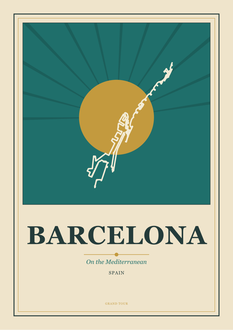
Barcelona is a harder case, and worth thinking about, because it is drawable in two entirely different registers and only one of them survives a hallway. The Mediterranean coast reads at a glance — the same coastline logic as the Amalfi — but the Eixample grid, seen from above, is one of the most graphically distinctive urban shapes in Europe, and it also reads instantly, because a grid of chamfered blocks is a pattern the eye recognises before it names. Either register can carry the wall; what does not carry is the compromise poster that tries to do both. Pick the shape and let the shape do the work.
Chamonix is the counter-example that proves the rule. The town is beneath Mont Blanc, and the defining geography of the poster is not the town at all — it is the mountain. Alpine posters have carried travel imagery for over a century because a mountain, drawn honestly, gives you a single dominant silhouette that reads from anywhere in the room. In a corridor, a Chamonix poster with the massif anchored in the upper two-thirds of the frame will hold the wall from the far end of a fifteen-metre hallway. It has that much silhouette. Cities without a defining silhouette — and there are many — cannot do that work, no matter how much detail is loaded into the composition. This is why the same handful of destinations keep appearing on hallway walls that actually succeed: they were drawable to begin with.
 Amsterdam
The print from this article · from €29.95
View the print →
Amsterdam
The print from this article · from €29.95
View the print →
So What Do You Actually Do
Measure the corridor first. Length, width, ceiling height, direction of natural light. Do this before you look at a single poster. The measurements are the brief. Any studio worth working with will ask for them; if the advice you are reading does not, treat that as a signal about the seriousness of the advice.
Then choose against silhouette, not against detail. Ask, of every poster you are considering, whether the image resolves into a single strong shape at three metres, from an oblique angle, in indirect light. If it does, it is a corridor poster. If it needs a viewer standing still at ninety centimetres to be understood, it is a living-room poster and should be hung somewhere the viewer will stand still. The Amalfi Coast, Amsterdam, Barcelona and Chamonix pass this test for structural reasons; other cities pass it too, but only when the composition has been built for the corridor rather than adapted to it.
Finally, treat the sequence as a sequence. Four posters in a hallway are not four decisions; they are one decision, made four times, held together by an editorial idea. Contrast the palettes. Alternate the formats. Let the viewer's eye move from a coastal horizontal to an alpine vertical and back, the way it would move from one platform to another in an old railway terminus. The hallway you are decorating is closer to a station concourse than to a drawing room, and it has always been a compliment to the travel poster to say so. If you would like to see how the studio draws for these conditions specifically, our own prints of the cities discussed above live at /shop/. The next question — the one this piece hands you rather than answers — is which city belongs at the far end of your corridor, the one the eye travels toward. That decision is a different kind of work, and it is where the real curation begins.
 Chamonix
The print from this article · from €29.95
View the print →
Chamonix
The print from this article · from €29.95
View the print →


New city prints and 10% off your first order.
One email now with your code. No noise after.