We spent a week tracing the Seine on OpenStreetMap before drawing a single line of Paris, and the exercise settled an argument the studio had been having for months. The river is not a feature of the city. It is the reason the city is drawable at all. Every icon poster of Paris that has survived the twentieth century — from the railway commissions of the interwar years to the deco travel plates that still hang in hotel lobbies — obeys the same geometry: a horizontal band of water, a vertical accent above it, and a skyline arranged as if the Seine were the horizon line of the picture. Paris was composed before it was built.
The River Came First, and the Poster Followed
Paris on OSM is roughly thirteen kilometers of Seine cutting a shallow arc from the Bois de Vincennes in the southeast to the Bois de Boulogne in the west. Trace that arc with the cursor and something odd happens. The city organizes itself around it. Everything that draws the eye — the two islands, the axis of the Champ-de-Mars, the twin towers of Notre-Dame, the pale stripe of the Louvre — sits within roughly a kilometer of the water. The rest of Paris, all twenty arrondissements of it, is context. Backdrop. The bones of the icon are on the river.
This is not a coincidence of composition. It is the sequence of the city itself.
The Parisii settled the Île de la Cité because it was defensible water, not because it was picturesque. The Romans widened the river crossings for the same reason. The medieval city walled itself in concentric rings that touched the Seine at every scale. When the Grand Tour arrived as a required curriculum for the northern aristocracy, its visitors were told to sketch Paris from the quays. When Haussmann rebuilt the city in the middle of the nineteenth century, he did not touch the river — he arranged the boulevards to arrive at it. And when the railway companies of the interwar years commissioned posters to sell the sleeper-train services that ended at the Gare de Lyon or the Gare du Nord, the artists they hired understood, without being told, that Paris meant the Seine.
The poster followed the river because the city followed the river.
There is a version of this argument that reads as monocausal — as if the Seine explains Paris the way a single variable explains a regression. It does not. Plenty of great river cities were never turned into an icon: Lyon has two rivers and yields one drawn portrait for every twenty of Paris. The Seine did not make Paris drawable by itself. It made Paris drawable in combination with something the studio finds more interesting: a horizontal geography that runs east-west, a set of vertical accents that came late enough to be arranged deliberately, and a light that flatters the pale limestone of the quays for most of the working day. The river is the first term of the equation. But it is only the first term.
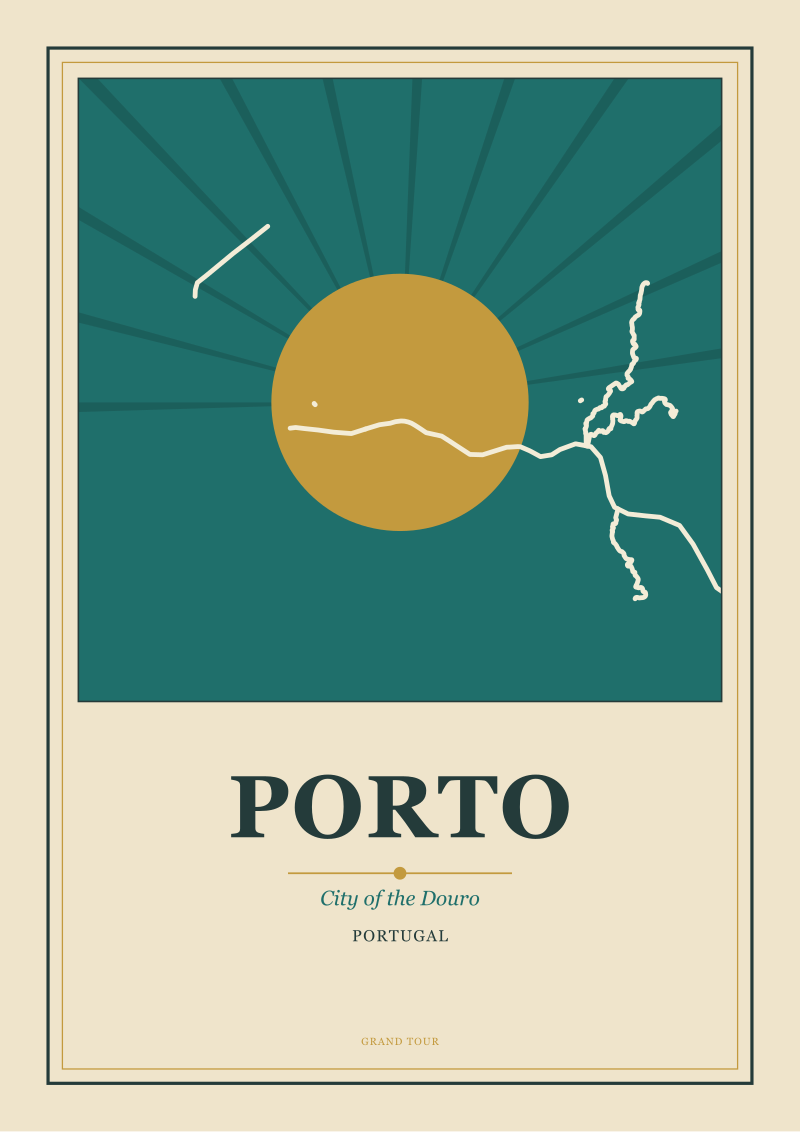
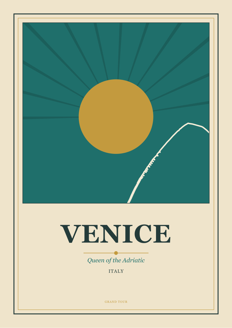
We have been tracing European rivers on OSM for the better part of two years now — the Tagus at Lisbon, the Douro at Porto, the Grand Canal at Venice, the Vltava at Prague — and Paris is the only case where the river's arc is gentle enough to sit inside a poster's frame without cropping. Porto's Douro drops. Prague's Vltava bends sharply. Venice has no river at all in the continental sense. Paris has geometry that fits a print at any orientation. That, we suspect, is closer to the real reason than anything a lyrical caption ever suggested.
Why the Seine Made Paris Legible in a Single Frame
A city is drawable when it can be read at a glance. That sounds obvious and turns out to be rare.
The Seine at Paris flows east-to-west across the frame at roughly the latitude of the picture's lower third. This is not a decision — it is a fact of the terrain. From any elevated vantage inside the city, the river appears as a horizontal band. Sacré-Cœur reads the river horizontally. The Panthéon reads the river horizontally. The Arc de Triomphe reads the river horizontally. The studio has tested this by rotating our own drafts ninety degrees; every one of them collapses. Paris is not a portrait-orientation city. It is a landscape city, and the landscape orientation was chosen for it by geology.
The horizontality of the river then does something the studio finds difficult to describe without sounding technical. It provides a single horizon line for every element of the skyline. In a city where the ground plane rises and falls sharply — think of the Prague castle hill or the Alfama of Lisbon — the eye has to work to establish where the horizon is. Vertical accents float against a shifting baseline. Compositions require perspective correction that a poster's flatness can rarely accommodate. In Paris, the Seine settles the argument. It is the baseline. Everything above it is a tower, a spire, a dome, or a rooftop line — and everything can be arranged in a relationship with it.
Two things then compound this. The first is the height rule. Paris has effectively kept skyscrapers out of the historical core for most of the twentieth century — the Tour Montparnasse is the exception that proved the rule so decisively the city imposed stricter interior limits afterward. This produced a skyline that runs, from the poster artist's point of view, at a nearly constant elevation. The dome of the Panthéon, the twin towers of Notre-Dame, the Institut de France, the Palais Bourbon, the Louvre pavilions — these differ from one another by tens of meters, not hundreds. Against a low horizon of water they form a punctuated line, not a jagged silhouette. A drawable line.
The second is the arrival of the Eiffel Tower. Whatever one thinks of it as architecture, it did something unrepeatable for the city's iconography: it added a single vertical accent close to 300 meters tall to a horizontal composition that already worked, and it placed that accent directly on the river, at a bend that positioned it perfectly for a poster's left-third or right-third. The interwar poster artists did not have to invent the composition of Paris. The composition was waiting for them. The Tower was the exclamation point at the end of a sentence that Haussmann and the river had already written.
There is a cold way to say this. Paris's iconographic robustness reduces to four geometric facts: the river's east-west orientation, the low-elevation banking of the quays, the height discipline of the interior arrondissements, and the single tall vertical placed on the river itself. Every other icon city we have drawn requires some form of editorial cheating — cropping, rotation, compression of distances, invented sightlines. Paris does not. A studio can draw Paris from the Seine and produce a picture that is topologically true. That is the technical claim underneath a century of travel posters.
 Paris
The print from this article · from €29.95
View the print →
Paris
The print from this article · from €29.95
View the print →
What Gets Left Out When a City Is Drawn From Its Water
The honest part of this essay is what the river leaves out.
Paris north of the Grands Boulevards barely appears in any poster ever printed. The 18th, 19th and 20th arrondissements — Belleville, the Goutte d'Or, Ménilmontant, the working-class north-east where much of the city actually lives — are outside the frame. The southern arrondissements past Denfert-Rochereau and the Cité Universitaire are equally absent. The peripheral banlieues, home to millions, do not exist inside the iconographic Paris that the poster tradition inherited.
This is not a moral failure of the poster medium. It is a structural fact of composing a city from its river. Any city drawn from a single geographic anchor will lose the parts of itself that do not touch that anchor. The Seine is the frame. Whatever lies outside it is, by construction, cropped. The studio does not pretend otherwise. When we draw Paris, we draw the drawable Paris — the historical core, the quays, the axes that Haussmann arranged. The Paris that is not on the poster is a Paris we know we are omitting.
There is a second omission that is subtler. The Seine we draw is the Seine of roughly the last hundred and fifty years — the walled and quayed river, the arrangement of bridges that dates mostly from the nineteenth century, the stone embankments that make the water a horizontal band. The medieval Seine, with its mills and floating baths and shifting mudflats, was a different river entirely. Grand Tour visitors of an earlier century were sketching a Paris that was closer in its water culture to a Dutch canal town than to the icon we now recognize. Poster geography is a snapshot of one particular Paris — the Paris that emerged from Haussmann and stabilized before the Second World War. It is not the eternal Paris. It is a Paris of a very specific span of years.
We say this because the studio's own posters carry the omission. The frame we choose is the frame the twentieth century chose. When someone hangs a Paris poster on their wall, they are hanging a composition that agrees, quietly, that the interwar poster artists got the city right. We think they did. But we also think it is worth naming the argument rather than smuggling it in as neutrality. The compositional choices discussed here are visible in the drawings themselves at see the Paris print, where our current Paris prints treat the river as the horizon line and let everything else arrange itself accordingly.
This piece does not address the specific poster artists of the interwar period, whose lives and dates deserve their own essay rather than a paragraph. It does not address the printing technology that made the golden age of the travel poster possible — chromolithography and its successors — which is its own subject. And it does not address how the Seine's iconography has been contested by contemporary Parisian artists working outside the poster tradition. Each of those is an argument we intend to make separately.
This started as a technical brief on how the studio traces European rivers in OSM before drawing them, and turned into something else halfway through the week: an argument about why one river settled the visual identity of a city so completely that the poster medium never had to look for another composition. We did not expect the essay to end where it did, on the parts of Paris the river does not include. But once we had drawn the river honestly, the omissions were the interesting part.
FAQ
Why is the Seine so central to how Paris is depicted in art?
The Seine determined where Paris was built, how it grew, and what could be seen at a single glance. Its east-west arc through the city runs at nearly constant elevation, which allowed the medieval and Haussmannian city to organize itself around a horizontal geometry. Nearly every major icon of Paris — the two islands, the cathedrals, the axial monuments — sits within roughly a kilometer of the water. Poster artists inherited that geometry rather than inventing it, which is why the compositions repeat across a century of prints.
What is the golden age of the travel poster, and where does Paris fit into it?
The golden age of the travel poster runs roughly from the last decade of the nineteenth century through the interwar years, when chromolithographic printing and railway company commissions produced a distinctive graphic style. Paris was one of the medium's most-drawn subjects because its geometry — a horizontal river, a low skyline, a single tall vertical accent — mapped cleanly onto the poster's flat, framed composition. The city's iconography and the poster's technical constraints reinforced each other over decades.
Did Haussmann's redesign of Paris affect the way the city is drawn?
Substantially. Haussmann's boulevards arranged the city into long sightlines that terminate at the river, at monumental buildings, or at civic squares. Those sightlines are exactly what a poster composition needs — deep space that reads at a glance. The city we now consider iconographic Paris is largely the city Haussmann left, viewed from the quays that the same period stabilized. The studio treats his work as the compositional grammar underneath the modern icon rather than as decorative background.
Why do so few posters show the northern or eastern arrondissements of Paris?
Because those neighborhoods sit outside the geographic frame the Seine defines. When a city is drawn from a single dominant feature — its river, its bay, its harbor — the parts of the city that do not touch that feature fall outside the picture. The 18th, 19th and 20th arrondissements, and most of the working-class north-east, are structurally absent from the iconographic Paris that the poster tradition inherited. That is a fact of composition, not a judgment about which parts of the city matter.
Is the Eiffel Tower really that important to how Paris is composed?
Yes, but not for the reasons commonly given. The Tower's role in the city's iconography is geometric rather than symbolic: it provides a single vertical accent, close to 300 meters tall, placed directly on the river at a bend that suits a poster's rule-of-thirds composition. Without it, the horizontal skyline of the interior arrondissements would have no dominant vertical to counterbalance. It is the punctuation at the end of the sentence the river and Haussmann had already written for the artists who followed.
What makes a city drawable in the poster tradition, in general terms?
A drawable city usually has three properties: a dominant horizontal geographic feature that can act as a horizon line, a controlled skyline that reads at a nearly constant elevation, and one or two vertical accents placed deliberately against that skyline. Cities that lack any of those — that have chaotic elevations, no water feature, or a jagged high-rise silhouette — tend to be photographed rather than drawn. Paris satisfies all three, which is why the poster tradition returned to it so relentlessly across the twentieth century.
Do contemporary poster studios still work in the interwar style, or is that pastiche?
The honest answer is that most contemporary studios working in the travel-poster idiom, ours included, are drawing in a graphic vocabulary that was substantially settled by the interwar decades. We do not treat that as pastiche. We treat it as a mature medium whose grammar has proved unusually durable. The choice is whether to draw a city the way its geometry actually wants to be drawn, or to invent a new grammar for its own sake. We have chosen the first, and the Seine is the reason it works.
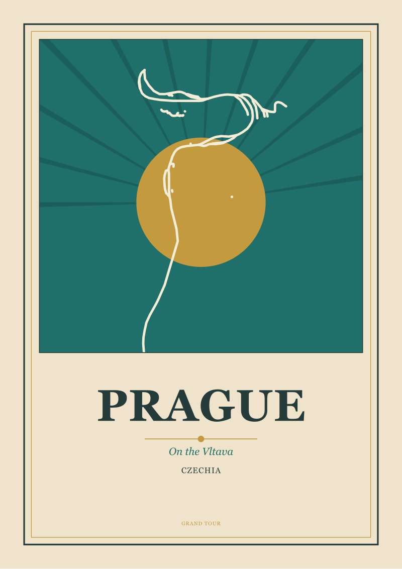 Prague
The print from this article · from €29.95
View the print →
Prague
The print from this article · from €29.95
View the print →

New city prints and 10% off your first order.
One email now with your code. No noise after.