---
Most cities are drawn in plan, from above, as if the artist were a bird. Porto refuses that. Porto is a section drawing — a vertical slice cut across the Douro — and the only honest way to draw it is to first decide where you are standing when you look at it. This piece is arranged as a flowchart in prose. We will ask three questions of the drawing, in the order a studio actually asks them, and each branch will point to a different Porto. The questions are not preferences. They are the forks the geography imposes on anyone who tries to put this city on a rectangle of paper.
Question 1: Are You Drawing Porto From the Ribeira Bank or the Gaia Bank?
This is the first question because it decides almost everything else — the profile of the skyline, the colour of the tiles, whether the bridge is a foreground object or a backdrop, and whether the barrels of the wine lodges enter the composition at all. The Douro is not an ornamental river running through the middle of a symmetrical city. It is a working canyon with two very different banks, and Porto proper stands on the north side while Vila Nova de Gaia sits opposite on the south. The travel-poster tradition almost never treats them as one image. It picks a side and commits.
If Yes — You Are Drawing From the Ribeira (North) Bank
Drawing from the Ribeira side means you are inside Porto, looking outward. Your foreground is the tiled facades of the old town rising in tight, stacked layers up the hillside behind you — which you cannot see, because you are in front of them. Your middle ground is the river itself, and your subject, whether you like it or not, becomes Gaia across the water: the low, dark-roofed wine lodges with their painted names stretched across the ridges. This is the composition that treats Porto as an observer of its own reflection. It reads as calm, horizontal, almost recessive. The poster wants to be wider than it is tall.
If No — You Are Drawing From the Gaia (South) Bank
Drawing from Gaia is the more famous choice, and there is a reason nearly every historical travel image of the city was made from this side. From Gaia, Porto rises in front of you as a wall. The tiled and rendered facades stack up the north bank in bands of pale ochre, white, and blue, and the whole hillside reads as a single vertical composition punctuated by the towers of the Sé cathedral at the top and the Clérigos bell tower further inland. This is Porto as a stage set. The composition wants to be tall — a portrait-orientation rectangle, the classic railway-poster proportion, because the city itself is already doing the work of stacking.
Question 2: Are You Including the Ponte Dom Luís I?
The second fork is about the bridge, and it is not a small question. The Douro is spanned by the two-level iron arch that has become the city's single most recognisable object, and the decision to include it or exclude it changes the entire register of the drawing. Including it makes the poster about engineering, about the industrial century that built the river as infrastructure, about a geometry so specific it can be read from a stamp-sized thumbnail. Excluding it makes the poster about the city as a piece of hillside — older, quieter, closer to the medieval town beneath the industrial overlay. Both are legitimate. They are different arguments about what Porto is.
If Yes — The Bridge Is the Composition
When the arch is in the frame, it stops being a bridge and starts being the drawing's structural spine. The upper deck cuts a horizontal line across roughly the top third of the composition; the arch itself sweeps beneath in a single dark curve that ties the two banks together into one continuous read. Everything else — the wine lodges, the tiled facades, the boats on the river — arranges itself around that geometry. This is the Porto poster that reads as modern, confident, almost graphic. The bridge does what the Eiffel Tower does for Paris: it gives the eye an unmistakable anchor and lets the rest of the city settle into a supporting role.
If No — The Hillside Is the Composition
Leaving the bridge out is the harder, more editorial choice, and it produces a very different Porto. Without the iron arch to organise the frame, the drawing has to earn its structure from the stacking of the buildings themselves — the way the roofs climb the slope in staggered ranks, the way the Sé sits at the top like the final chord of a sequence. This is a slower poster. It rewards the viewer who already knows the city, or who is willing to read it the way one reads a landscape painting rather than a graphic. It also aligns closer to the pre-industrial image of Porto: the town as a hillside settlement above a working river, before the nineteenth century put an iron sentence across the water.
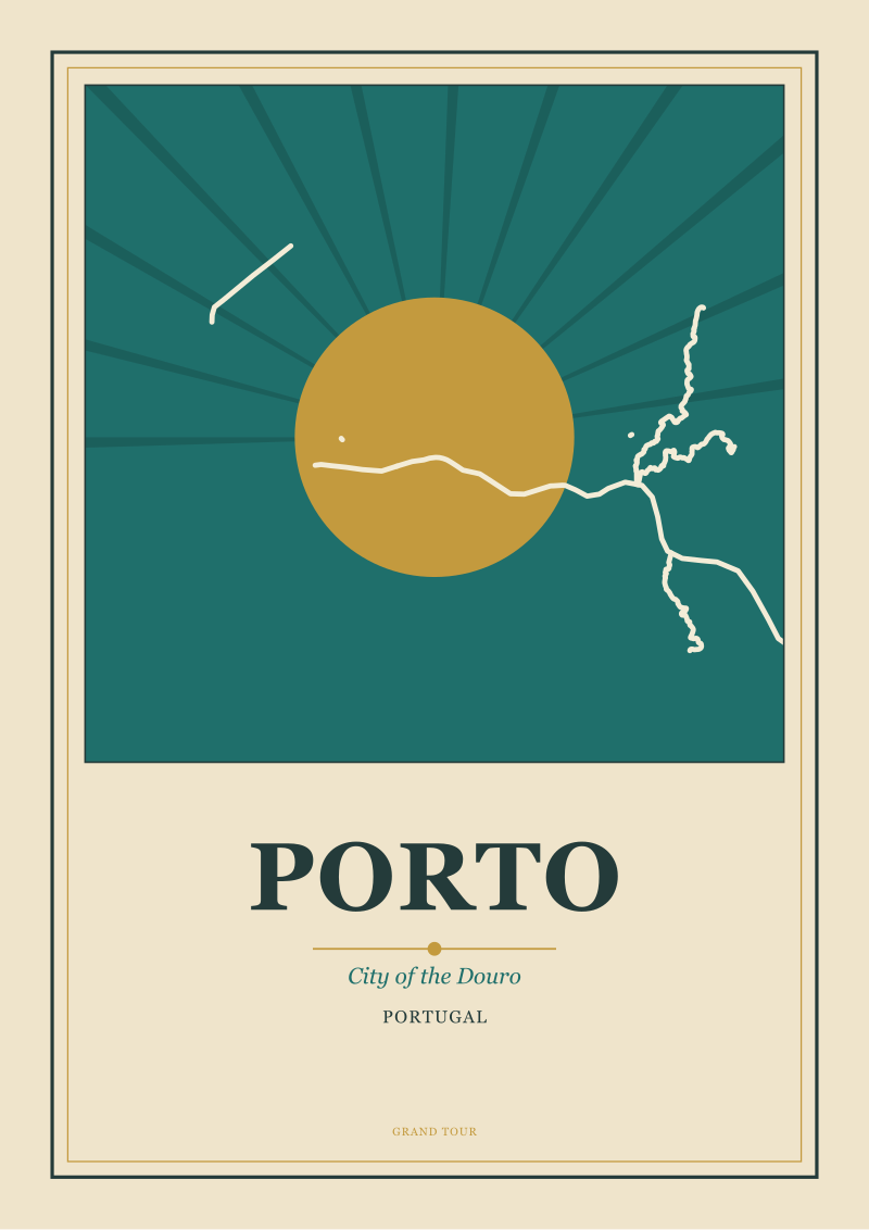 Porto
The print from this article · from €29.95
View the print →
Porto
The print from this article · from €29.95
View the print →
Question 3: Is the Light in Your Poster Morning or Late Afternoon?
The third question is about time of day, which in Porto is really a question about which bank is lit and which is in shadow. Because the river runs roughly east-to-west through the city centre, and the two banks face each other across a north-south axis, the sun does not treat them equally at any hour. Morning light rakes across the north bank — the Porto side — from the east, catching the tiled facades and throwing the Gaia lodges into cooler shadow. Late afternoon light does the opposite: it flattens against the south-facing wall of Porto itself, warming the ochres and whites into their most saturated register, while Gaia sits with its back to the sun.
If Yes — Morning Light
Morning is the analytical light. It picks out detail. From either bank, the shadows are long and horizontal, the colours are cooler, and the whole composition reads as observed rather than performed. Morning is the light that suits an architectural drawing more than a travel poster — it is the light of the section, the light in which you can count the storeys of a facade and see that the tiles are actually a hundred small squares and not a single field of blue. A poster made in morning light tends toward restraint. It looks like a print made from a study.
If No — Late Afternoon Light
Late afternoon is the poster light, and it is not an accident that most historical images of Porto were composed at this hour. The sun sits low over the river's mouth to the west and floods the north bank with warm, almost horizontal light. The tiled facades go from pale to gold. The river surface, seen from Gaia, becomes a bright band that separates the dark foreground of the lodges from the illuminated hillside beyond. This is Porto at its most drawable — the moment the city looks the most like a picture of itself. Every serious poster of the Douro riverfront has been made in some version of this light.
If You Answered Everything
The three questions produce eight possible combinations. Here is what each one points to, in one line:
| Q1: Bank | Q2: Bridge | Q3: Light | Recommendation |
|---|---|---|---|
| Ribeira | Yes | Morning | Analytical section drawing of Gaia's lodges under raking east light. |
| Ribeira | Yes | Afternoon | Warm study of Gaia in shadow with the arch reading as a dark silhouette. |
| Ribeira | No | Morning | Quiet horizontal composition of the far bank without industrial-era anchors. |
| Ribeira | No | Afternoon | Reflective, painterly Porto: river surface and Gaia rooftops, no bridge. |
| Gaia | Yes | Morning | Modern graphic poster: bridge geometry over a cool, precisely lit hillside. |
| Gaia | Yes | Afternoon | The canonical Porto poster — arch, tiled wall, golden late light. |
| Gaia | No | Morning | The pre-industrial Porto: hillside, Sé at the top, no iron overlay. |
| Gaia | No | Afternoon | Warm hillside portrait, Sé glowing, closer to a landscape than a poster. |
None of these are wrong Portos. They are eight different arguments about the same city, and the studio's job is only to know which argument the drawing is making before the pencil goes down. The commercial travel-poster tradition, from the railway era onward, overwhelmingly chose the Gaia bank, included the bridge, and used late afternoon light — the sixth row of that table — because it produces the image that reads fastest from across a station concourse. That does not mean the other seven are decorative. Some of the quietest, best drawings of Porto sit on the Ribeira side in morning light and leave the bridge out entirely.
If a print of one of these Portos would live well in your rooms, our shop keeps a small run of the city drawn from the river, in the late-afternoon reading — the composition the travel-poster tradition settled on, redrawn from the geometry rather than copied from the archive.
FAQ
Why is Porto almost always drawn from the Gaia side rather than from within the city?
Because Porto's defining feature is the way it stacks up the north bank of the Douro, and the only place you can see that stack whole is from the opposite bank. From inside Porto, you are on the hillside rather than looking at it. Gaia gives the artist the horizontal distance needed to read the city as a single vertical composition, which is why the travel-poster tradition committed to that viewpoint almost without exception.
What role does the Douro itself play in the composition of a Porto poster?
The Douro is not scenery. It is the structural line that separates foreground from background, and it is the reason Porto reads as a section drawing rather than a plan. The river's surface — bright in late afternoon light, matte at other hours — acts as a horizontal band that anchors the eye and forces the hillside behind it to read as a wall. Take the river out of the frame and Porto stops being Porto.
Why does the Ponte Dom Luís I appear in so many images of Porto?
Because it is one of the few objects in the city whose geometry is legible at any scale. The double-decked iron arch reduces cleanly to a silhouette that a poster viewer can identify at thirty paces. Historically, it also marked Porto's entry into the industrial visual vocabulary of the nineteenth century, which is exactly the era when the travel poster as a form was being invented. The two arrived together.
Is late afternoon really the best light for drawing Porto, or is that a cliché?
It is a cliché because it is true. The city's north-bank orientation means the tiled and rendered facades face roughly south and receive warm, low, direct light in the hours before sunset. That light saturates the ochres and whites into their most graphic register and turns the river into a bright band. Morning light is beautiful but analytical; it suits studies. Late afternoon suits posters, which is what the tradition rewarded.
What is the difference between drawing Porto and drawing Lisbon, from a poster-artist's point of view?
Lisbon is drawn in plan, as a spread of hills and squares open to a wide estuary. Porto is drawn in section, as a vertical slice through a narrow river canyon. Lisbon rewards wide compositions and multiple focal points; Porto rewards tall compositions and a single dominant one. They are different structural problems, and the same artist would approach them with almost opposite instincts.
Do the Gaia wine lodges belong in the composition or do they crowd it?
They belong, but they do specific work. From the Ribeira bank they are the subject; from the Gaia bank they are the foreground the viewer is standing inside, so they leave the frame entirely and become implied. A poster made from Gaia usually shows their rooftops at the bottom edge, dark and horizontal, acting as a base line that lets the illuminated Porto hillside rise cleanly above. Leaving them out altogether tends to make the drawing feel unmoored.
Why do so few Porto posters include the sea, given how close the river's mouth is?
Because the mouth of the Douro is several kilometres downstream from the historical city centre, and including it forces the artist to zoom out to a scale at which Porto itself becomes small. The travel-poster tradition prefers the intimate view — the tiled wall, the bridge, the river as a defined band — over the geographic overview. A Porto poster that includes the Atlantic is really a poster of the Douro estuary, which is a different subject.
 Lisbon
The print from this article · from €29.95
View the print →
Lisbon
The print from this article · from €29.95
View the print →
Honest Limits
This piece did not address the interior geography of Porto — the streets climbing back from the river, the Clérigos tower's role in the inland skyline, or the way the Ribeira district reads on foot rather than from across the water. Each of those is a different drawing problem and deserves its own argument. It also did not address the history of the port wine trade whose lodges define the Gaia bank; that is an industrial and commercial history the studio is not qualified to write, and it belongs to a different desk. And it did not address Porto in weather other than clear light — the city under river fog, under winter rain, under the flat grey that arrives from the Atlantic — which is a whole separate register of image that the travel-poster tradition largely declined to draw, and which is worth its own piece.


New city prints and 10% off your first order.
One email now with your code. No noise after.