There is a pattern we keep noticing whenever someone asks us for a map of Porto to hang on a wall. They send reference images — usually five or six, pulled from print-on-demand shops and stock illustration libraries — and the images almost always share the same flaw. They render Porto as a rectangle. Streets in fine hairlines, the odd landmark inked in, the Douro squeezed to a blue ribbon along the lower edge like an afterthought. It is technically a map of the city. It is also, in the sense that matters to a poster artist, not a map of Porto at all.
The Grid Fallacy: Why Flat Street Maps Fail Porto Specifically
The pattern is this: printable city maps almost always begin from the same silent assumption, which is that a city is a street network seen from directly above. That works, more or less, for cities that grew on flat ground. It fails Porto in a specific, diagnosable way, because Porto is not a plan. Porto is a section.
The Grid Fallacy is what happens when a designer opens a data layer of streets, exports it at high resolution, and calls the file a map of the city. The lines are correct. The buildings, if any, are in the right places. What is missing is the reason Porto looks the way it looks in every travel poster ever made of it, which is that the city drops. The old center sits above the water on a shelf of granite and slate, and every street eventually finds an edge and falls toward the river. A top-down street plan of Porto is like a portrait of a face drawn without the nose: you get the outline of the head, you lose the thing that made the face memorable.
You can test this by looking at what the eye registers first when it stands on the bridge and looks north. It is not the grid of streets. It is a wall of houses in tiled elevations, stepping upward in bands, each band a slightly different height above the water. That is a section drawing. A map that pretends this information does not exist is a map of a different city — a version of Porto flattened into the shape of somewhere less interesting, like a coastal town on a plain.
There is another symptom of the grid fallacy worth naming. The maps that reduce Porto to hairlines almost always overweight the modern peripheral streets — the ring roads, the industrial arteries, the geometry of the twentieth century — because those streets are long and straight and take up screen space. The old riverfront quarters, where the streets are short and the changes in level are constant, become a tangle of noise near the bottom of the page. The city as most travelers picture it disappears into a smudge. The city as the highway engineer sees it dominates the print. Nobody wants to hang the highway engineer's version on a wall.
The Douro Blindspot: The River Reduced to a Blue Line at the Bottom
The second pattern is more specific, and in some ways more painful, because it concerns the single element that our own grounding calls the defining geography of Porto: the river.
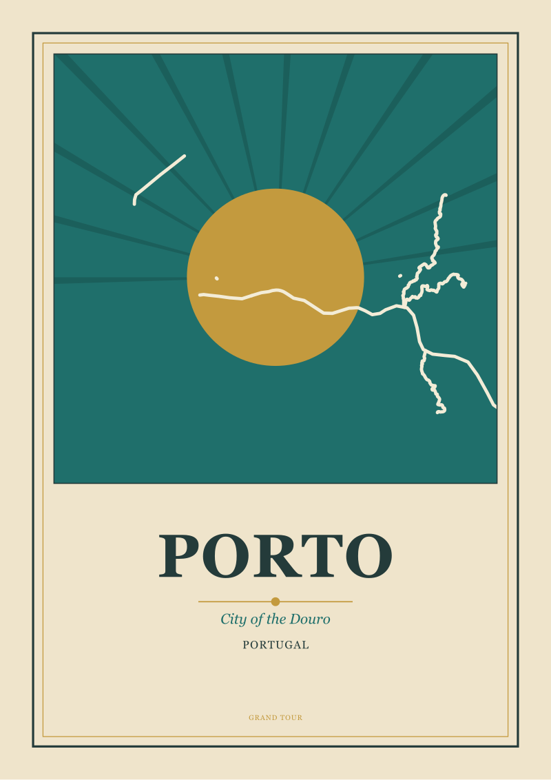
We keep seeing the Douro treated as a boundary condition. It is drawn as a horizontal strip of pale blue running along the bottom edge of the frame, sometimes tapering out of the image before it reaches the sea, sometimes cropped altogether so that the mouth of the river simply is not shown. The composition seats the city inside a rectangle and leaves the river outside it. This is exactly backwards. In Porto, the city sits on the river the way a face sits on a jaw. Remove the jaw and the face collapses.
The Douro is not scenery in Porto. It is the reason there is a Porto at all. The city grew where a defensible high bank met a navigable estuary; every economic activity that ever mattered here — the wine trade, the shipping, the crossing points, the bridges — is a story about the relationship between land and water. A map that treats the river as a blue accent is drawing the setting and calling it the subject.
You can see the blindspot most clearly in the way most printable maps handle the far bank. Vila Nova de Gaia — the whole southern side of the river, where the port wine lodges stack up the slope with their painted names on the roofs — is either cropped off entirely or drawn as a thin strip labelled "Gaia" in small type. The composition treats the river as an edge instead of a spine. But Porto and Gaia are one visual event. They face each other across the water the way two pages of an open book face each other across the gutter. Drawing one and calling it the map is like photographing a book with a finger over the left-hand page.
The Douro is not the border of the Porto map. It is the axis the map should be composed on.
 Porto
The print from this article · from €29.95
View the print →
Porto
The print from this article · from €29.95
View the print →
The Souvenir Trap: Illustrated Postcards That Pretend to Be Maps
The third pattern is the one that fills most of the top-selling print-on-demand results, and it is worth separating from the first two because it fails in a different way. Where the grid map fails by omission, the souvenir illustration fails by substitution.
Here is the shape it always takes. An illustrator sketches a set of Porto landmarks — the Clérigos tower, the Ribeira facades, the Dom Luís bridge, a tram, a rooster, a glass of port, sometimes an azulejo tile motif around the border — and arranges them on a background of stylized streets. Each landmark is drawn at roughly the same size regardless of its actual scale in the city, so a bell tower and a tramcar end up occupying comparable real estate. The layout is decorative rather than geographic; a landmark appears where the composition needs it, not where it stands. The word "Porto" is set across the top in a hand-lettered script.
The result is an illustrated postcard with a compass rose on it. It is a genre — a legitimate one, warm and appealing and easy to sell — but it is not a map. A map has to answer the question "where is this in relation to that." An illustrated postcard answers a different question, which is "what does the destination feel like as a small collection of memorable objects." Both are honorable questions. Only one of them is asking for a map.
The souvenir trap is that the illustrated postcard, printed at poster size, borrows the authority of cartography while doing none of its work. Buyers assume that anything with streets and a compass on it can be read as a spatial document. They discover, once it is hung, that they cannot actually locate anywhere in the city on it, because the piece was never composed to make that possible. It reads as decoration. That is fine, but it should be labelled honestly as decoration. Calling it a map sets up a disappointment that the wall then has to live with for a long time.
There is a subtler version of this trap worth naming. Some souvenir illustrations do draw the coastline and the river more or less to shape, but treat every building as an isolated cartoon standing on top of an otherwise blank city. Porto without its urban fabric is a strange creature — six or seven famous silhouettes floating on a color field. That version has the opposite problem to the grid map. Where the grid map draws every street and no city, this version draws no streets and no city and only a handful of monuments.
The Section Drawing Nobody Prints: What the Contour Lines Would Show
The fourth pattern is the absence, and it is the reason we keep drawing our own. There is a version of the Porto map that would answer the query honestly, and almost nobody prints it, because it requires beginning the drawing from a different premise.
The premise is that Porto is best understood in section — that is, in a cut through the terrain, showing what happens vertically as much as horizontally. If you took the OpenStreetMap street data that most printable maps are built from and combined it with a topographic layer, and then rotated the composition so that the Douro ran through the center of the page as the primary horizontal, and drew the northern bank climbing up above the river and the southern bank climbing up on the other side, you would end up with a document that most viewers would call a landscape rather than a plan. It would still be a map. It would just be a map organized by the axis the city itself is organized by.
Contours would do the work that street lines cannot. A ten-meter contour interval would reveal that what looks, from the top down, like a solid mass of old city on the north bank is actually a series of terraces climbing away from the water — that the Ribeira, the Vitória parish, the cathedral hill, and the streets north of Aliados are on different landings of the same staircase. Contour lines are geometry the eye reads as depth without being told. A print that puts them under the streetwork instead of over it, or leaves them off entirely, is throwing away the single most useful drawing tool for describing what Porto physically is.
The reason nobody prints this map is not that the data is unavailable. It is that most templates for city posters were built for cities without a defining geography, and applying those templates to Porto strips out precisely what makes Porto worth drawing. A poster of Brussels, or Warsaw, or Lyon can absorb the flat-plan format without much loss. Porto cannot, because Porto's identity is topographic in a way those cities' identities are not. What is missing from the printable-map market is not a better rendering of the same idea. It is a different idea about what the map is for.
So What Do You Actually Do
If you are looking for a map of Porto worth printing, the first thing to do is stop asking whether a given piece is well drawn and start asking what it thinks it is drawing. Held up against the four patterns above, most candidates on the market fail at the level of premise before they get to the level of execution. That is not something you can fix at the framing stage. A bad idea about what Porto looks like will not become a good print because the paper is thick.
The test we apply, when we ourselves are drawing the city for our shop at see the Porto print, is a simple one, and you can apply it to anything you are considering buying. Cover the top half of the image with your hand. If what is left below your hand — the river, the mouth of the Douro, the far bank at Gaia, the way the two sides sit in relation to each other — does not by itself communicate that this is Porto and not another city, the composition has failed. A map of Porto in which the river is optional is a map of somewhere else with Porto's name printed on it.
The second thing to do is give up the expectation that a single sheet has to answer every question. A section-drawn Porto tells you what the city is; a good street-index of the old center tells you how to walk it; an illustrated portrait of the Ribeira facades tells you what to remember. These are three different documents doing three different jobs. The failure mode we keep seeing in the print-on-demand market is a single image trying, and failing, to be all three at once. The next question worth asking is not which map of Porto is best. It is which map of Porto is honest about what it is for, and that is a question the market has barely started to answer.
FAQ
What actually makes a map of Porto different from a map of any other Portuguese city?
The defining variable is topography. Porto is built on a granite shelf that drops sharply toward the Douro, and the city reads vertically as much as horizontally — a fact most flat street maps discard. A map that treats Porto the way it would treat a plains city loses the very thing that gives the skyline, the poster tradition, and the historic waterfront their shape. Vertical relief is not a decoration in Porto. It is the subject.
Why does the river matter so much to how the city should be drawn?
Because the Douro is not scenery around the city; it is the axis the city is organized on. Porto grew where a defensible bank met a navigable estuary, and the entire historic economy — wine trade, shipping, bridge crossings — was a conversation between the two sides of the water. A map that crops the river to a strip at the bottom edge is drawing a coincidence rather than a cause. The river belongs at the center of the composition.
Are illustrated souvenir posters of Porto ever worth hanging?
They can be, if you buy them as illustrated postcards rather than as maps. A well-drawn souvenir print of the Ribeira facades or the Dom Luís bridge is a legitimate object; the problem starts when the piece is sold under the label "map" but composed as decoration. The disappointment is a mismatch of expectation, not of quality. Judge each piece on what it is honestly trying to be, not on the word printed above the price.
What is a section drawing, and why does the article keep using that term?
A section is an architectural drawing convention: instead of showing something from above, you show it as if a vertical plane were cut through it, revealing what happens at different heights. Applied to a city, a section reveals terraces, ridges, and drops that a top-down plan flattens away. Porto rewards this kind of drawing more than almost any other European city, because its identity lives in the vertical relationship between the granite shelf above and the water below.
Does Vila Nova de Gaia need to be included for a print to count as a map of Porto?
For any print concerned with the historic city, yes. Porto and Gaia face each other across the Douro as a single visual event; the port wine lodges on the southern bank are as much a part of what a viewer recognizes as Porto as anything on the northern side. Cropping Gaia off amputates half the composition. If a map excludes the far bank, it should at least be honest that it is drawing only the municipal boundary, not the city as seen.
What should I actually look for when choosing a printable map of Porto?
Look for three signals. First, whether the river is treated as the compositional spine rather than a border. Second, whether the terrain — the climbs, the terraces, the drops — is legible in some form, whether through contour lines, tonal shading, or a section view. Third, whether the far bank at Gaia is drawn with the same care as the near bank. A print that passes those three tests will hold up on a wall for years, regardless of style.
Why do so many printable city maps ignore topography?
Because most templates for city-poster design were built for cities where topography is not a defining feature, and the templates got reused. A flat-plan format works reasonably well for Brussels, Warsaw, or Lyon, so it becomes the default across the entire market. Applied to Porto — or to Lisbon, Naples, Edinburgh, San Francisco, any city whose identity is topographic — the default format quietly deletes the point. The problem is not the drawings; it is the assumption behind them.
Is there a "correct" orientation for a Porto map — north-up or river-along-the-horizontal?
There is no absolute rule, but a strong argument exists for orienting the composition along the river rather than along the compass. North-up puts the Douro at the bottom edge and the sea at the lower-left corner, which is exactly the composition that produces the blue-line-at-the-bottom problem. Rotating the map so the river runs horizontally through the center gives both banks equal weight and treats the water as the subject. Cartographic convention is a tool, not a commandment.
 Lisbon
The print from this article · from €29.95
View the print →
Lisbon
The print from this article · from €29.95
View the print →


New city prints and 10% off your first order.
One email now with your code. No noise after.