How did a city map poster end up as something you can generate in a browser in under a minute, for free, from a coastline someone in Rotterdam traced on a Tuesday? The short answer is four hundred and fifty years of people trying to draw a place on a single sheet of paper and argue about what belongs on it. The longer answer runs through a Cologne printshop in 1570, a French railway posting bills at Gare Saint-Lazare, a London draughtsman who refused to be geographically honest, and a database in the Netherlands. We draw cities for a living at Grand Tour Prints; this is the lineage we work inside.
1570: Braun and Hogenberg Bind the First City-Portrait Atlas
The lineage begins in Cologne, with a theologian and an engraver who decided a city was something you could hold in your hands. Georg Braun wrote the text; Frans Hogenberg cut most of the plates. The first volume of the *Civitates Orbis Terrarum* appeared in 1572, and by the time the sixth volume came out in the early seventeenth century, the project had accumulated more than five hundred views of cities across Europe, the Mediterranean rim, and beyond.
What matters, for the argument we are pursuing here, is the choice of view. Braun and Hogenberg did not draw plans in the modern sense — the flat, orthogonal, God's-eye rendering that later cartographers would treat as the neutral default. They drew cities from an angle raked between forty-five and sixty degrees off the vertical. You could see the streets, but you could also see the walls, the church towers, the harbours, the ships in the harbours. A city was a portrait, not a schematic. A viewer in Antwerp, buying a bound edition, was meant to recognise their own town the way one recognises a friend: by silhouette, by carriage, by the shape of things above the eye line.
This is the ancestor of every city poster hanging on every wall today. Not because the modern poster imitates the copperplate style, but because Braun and Hogenberg codified the assumption that a city is worth drawing in one piece, on one sheet, for the pleasure of looking. Before them, urban imagery lived in the margins of Bible manuscripts and the backgrounds of donor paintings. After them, the single-sheet city view was a thing you bought.
1889: The Railway Age Turns City Maps Into Advertising
Three centuries later, the same idea walked into a print shop in Paris wearing different clothes. The steam railway had done what cathedrals and merchant fleets never quite managed: it had made every provincial town a destination and every station wall a canvas. By the 1880s, French railway companies were commissioning artists to produce colour lithographs the size of a bedsheet, pasted onto the walls of terminals to sell tickets to places most passers-by had never seen.
The map, in this new commercial art, migrated from the plate to the poster. Sometimes the railway map itself was the poster — the branching lines of the PLM or the Chemins de Fer du Nord rendered as a decorative armature over a stylised coast. Sometimes the map appeared as an inset, a small locator tucked into the corner of a full-page portrait of Nice or Trouville or Menton. The Riviera as we know it — the strip of coast from the Estérel to Ventimiglia, sold as a single continuous experience — was largely a poster invention, promoted into existence by railway offices with lithographic budgets.
What Braun and Hogenberg had done for the individual town, the railway did for the region and eventually for whole coastlines. The Amalfi Coast, farther south and slower to industrialise, followed the same logic once the road engineers of the twentieth century finally cut a serviceable route along the cliff face. The Costiera became a poster before it became a package holiday, and the poster taught people what to look at when they arrived. The map was doing commercial work now, and it was doing it beautifully, but it had not yet abandoned the copperplate promise of showing a place in one image.
1933: Harry Beck Redraws London and Ends the Argument About Accuracy
The most consequential city map of the twentieth century was drawn by an engineering draughtsman in his spare time and initially rejected by the transit authority that commissioned nothing at all from him. Harry Beck, working for the London Underground signals office, took the tangled geographic reality of the Tube network and did something no cartographer had done before: he threw the geography away.
His 1933 diagram straightened every line to a horizontal, vertical, or forty-five-degree diagonal. It squashed the crowded centre and stretched the outer suburbs. It abandoned scale entirely. What it kept was the topology — the pattern of connections between stations, which is the only information a passenger standing on a platform actually needs. The Underground publicity department, having previously turned Beck down, printed a trial run of seven hundred and fifty thousand pocket cards. They vanished from the racks in an afternoon.
Beck's map is not usually classified as a city poster, but its influence on the poster tradition is total. It proved, once and for all, that a map of a place could be drawn for legibility rather than fidelity, and that people would prefer the legible version. Every stylised city print produced since 1933 — the ones that hang in kitchens with the Seine simplified to three curves, the ones that reduce Barcelona's Eixample to a beige grid, the ones that render the canals of Amsterdam as five perfectly concentric arcs — owes Beck a debt it rarely acknowledges. He gave designers permission to lie about geometry in exchange for telling the truth about pattern. Modern browser generators, when they let you thicken a river or drop out every street below a certain rank, are working inside the licence Beck signed.
 Amsterdam
The print from this article · from €29.95
View the print →
Amsterdam
The print from this article · from €29.95
View the print →
2005: The Slippy Map Arrives and the City Becomes a Tile
For most of the twentieth century, a city map was still a discrete object — a sheet, a fold-out, a printed plate in an atlas. That changed on 8 February 2005, when Google Maps launched in the browser and introduced a technique that had existed in academic prototypes for years but had never reached a mass audience: the slippy map. Instead of loading one large image, the browser stitched together small square image tiles and let you drag the seam.
The consequences for the poster tradition were not immediate but were profound. First, the slippy map made cartography feel free. You could look at any city on earth without paying anyone, and the psychological baseline for what a map costs shifted overnight. Second, and more subtly, it introduced the world to the Web Mercator projection at every zoom level, teaching a generation of viewers to associate that particular flavour of distortion with the very idea of "a map". Third, it made every square of every city addressable by URL. A view of central Amsterdam or the Costiera was now a link you could send.
None of this yet produced a poster. The tiles were rendered for the screen, at screen resolution, in the tile provider's chosen style. Blowing one up for print looked, and still looks, terrible. But the slippy map established the interface that browser-based poster generators would eventually inherit: pan, zoom, draw a box, export. It also established the expectation that the underlying data — the roads, the water, the coastlines — was a public good that ought to be freely usable. That expectation would not survive its collision with the actual licensing of Google's data, and out of that collision the next chapter came.
2012: OpenStreetMap Opens the Coastline, and the Browser Generator Is Born
OpenStreetMap had been running since 2004, quietly amassing a volunteer-drawn map of the world under a share-alike licence. In September 2012 the project relicensed its data under the Open Database License, the ODbL, and the shift mattered more than the acronyms suggest. Under the ODbL, a designer in any country could take the coastline of the Amalfi Coast, the canal rings of Amsterdam, the shoreline of Barcelona, or the valley floor beneath Chamonix and turn it into a print product — provided they credited OpenStreetMap and shared derivative databases under the same terms.
This is the licensing scaffolding underneath the "free city map poster generator" you can now open in any browser tab. When such a tool lets you type "Amsterdam" and produces a printable rendering of the canals, it is almost certainly querying an OpenStreetMap mirror through the Overpass API, pulling the geometry the volunteers have traced, and passing it to a client-side renderer that draws the water in one colour and the streets in another. The generator itself is a thin veneer. The heavy lifting is being done by a database of somewhere north of ten million contributors' worth of edits, held together by a licence written by lawyers who understood that data wants to be quoted.
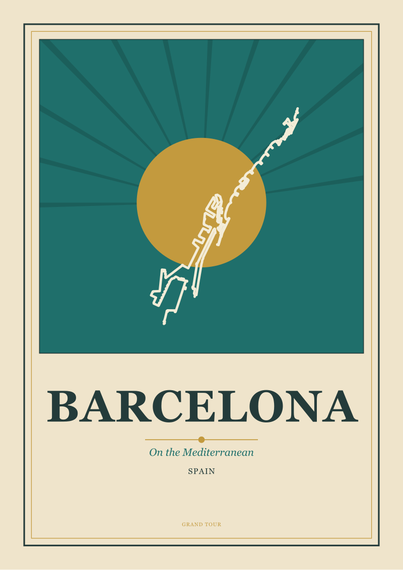
We build our own drawings on this same foundation. The Amsterdam we render, the Costiera we render, the Mediterranean edge of Barcelona, the river braid beneath Mont Blanc at Chamonix — the geometry underneath all of them comes from Overpass queries against OpenStreetMap. The stylistic decisions are ours, but the coastline is a public good, traced over years by people who will never be paid for the tracing. Every browser generator you have ever used is drinking from the same well; the question that separates them is what they choose to do with the water.
 Amalfi Coast
The print from this article · from €29.95
View the print →
Amalfi Coast
The print from this article · from €29.95
View the print →
What It All Means
Four moments, four and a half centuries, and one continuous argument about what belongs on a single sheet of paper. Braun and Hogenberg said: a city belongs on the sheet, drawn as a portrait, sold to people who love the place they live in. The railway posters said: the sheet can sell you a place you have not been to yet, and it can lie beautifully about the weather. Beck said: the sheet does not owe geography anything except the connections that matter. Google's tiles said: the sheet is dead, long live the endless surface. OpenStreetMap said: the surface belongs to everyone, and the sheet can come back now, printed at home, drawn from open data.
The browser generator, then, is not a rupture in this history. It is the newest chair at a very long table. What it does well — free, fast, printable, drawn from a shared database — is the twenty-first-century version of what the copperplate atlas did for the sixteenth. What it does poorly is what every mass-production technology has always done poorly at first: it treats every city the same. The default output of most generators is a black-and-white line drawing at a fixed zoom, with roads all the same weight and the coast rendered as a single unemphatic edge. That is not a portrait. That is a diagram of a portrait, waiting for someone to make choices about it.
The choices are where the drawing lives. What weight the river gets. Whether the coast is a hairline or a fat, confident band. Which streets survive the cull below a certain rank and which get quietly deleted. What the paper wants to feel like. Whether the palette is warm ochre, terracotta, deep railway green, or the cool grey of an architectural blueprint. Whether Amsterdam's canals are drawn as five arcs or as the raggeder truth of what they actually are. Whether the Amalfi Coast is shown as a coastline alone or with the ridge line above it, because along the Costiera the ridge is half the drawing. Whether Chamonix is a settlement or the river valley beneath a wall of contour lines. These are the questions that separate a generator output from a poster. If the shape on your screen has begun to feel like a place worth looking at, the shop is the next stop on this history: see the Amsterdam print, where the same four hundred and fifty years of decisions are still being made, one city at a time.
FAQ
Is it legal to sell a poster made from an OpenStreetMap-derived generator?
Yes, provided the licence terms are respected. OpenStreetMap data is released under the Open Database License, which requires visible attribution to OpenStreetMap contributors on any published product and requires derivative databases to be shared under the same terms. A printed poster is not a derivative database — it is a produced work — so the practical obligation reduces to attribution. Most reputable generators handle this automatically; check the fine print of any tool before commercial use.
Why do most free city map poster generators produce similar-looking output?
Because they are drawing from the same underlying database and applying similar default styles. The geometry — coastlines, roads, water bodies — comes from OpenStreetMap in nearly every case, queried through the Overpass API. The defaults tend toward black roads on white paper because that style renders predictably at any zoom and any city. Distinctive posters come from making explicit choices the generator leaves off by default: line weights, palette, which classes of road to keep, how to treat the water.
What is the difference between a city map poster and a wayfinding map?
A wayfinding map is designed to get you from one point to another; a city map poster is designed to make you love the shape of the place. The two disciplines borrow from each other but optimise for different things. Wayfinding tolerates ugliness in service of clarity — Harry Beck's Underground diagram is the canonical example. A poster tolerates omission in service of image, dropping any street or label that does not earn its place in the composition.
Why does the Amalfi Coast look different in every poster of it?
Because the Amalfi Coast is fundamentally a coastline with a mountain wall behind it, and every designer has to decide how to weight the two. Some show only the sea edge, which produces a graceful curved line and a legible outline of towns like Amalfi, Positano and Ravello. Others render the ridge line above the coast, which is closer to the visual experience of driving the road but harder to keep from feeling cluttered. Both are honest choices.
Can browser generators draw cities outside of Europe?
Yes, wherever OpenStreetMap coverage is dense enough. Coverage is essentially complete for Europe, North America, and most of urban Asia; it is patchier for parts of Africa and some remote regions, where volunteer contributions have been thinner. The visual quality of any generator output tracks directly with the quality of the underlying data: a well-mapped city produces a rich drawing, a sparsely mapped one produces a diagram with obvious gaps.
What resolution do I need for a printable city map poster?
For a poster printed at roughly A2 size — around forty by sixty centimetres — you want vector output rather than a rasterised image at any resolution. Generators that export SVG or PDF preserve every line as a mathematical curve and scale to any print size without pixelation. Generators that export only PNG or JPEG at screen resolution will look soft or jagged the moment they leave the browser. The format matters more than the pixel count.
Why is Amsterdam so often drawn as concentric arcs when the canals are not quite that regular?
Because the poster tradition inherited Harry Beck's licence to simplify. The three main canal rings — Herengracht, Keizersgracht, Prinsengracht — do describe a roughly semicircular pattern radiating from the old harbour, but the geometry is looser and more angular in reality than most posters suggest. Drawing them as clean concentric arcs sacrifices a little geographic honesty for a lot of graphic clarity, and the trade has been considered worth it since the first tourist-office poster of the city.
Do you use the same data sources for your own prints?
Yes. Our drawings of Amsterdam, the Amalfi Coast, Barcelona, and Chamonix are all built on geometry queried from OpenStreetMap via Overpass, released under the ODbL. What we add is the editorial layer: which lines survive, how the water reads against the paper, what the palette does at the size the print will actually be viewed. The database is a public good; the drawing is a set of decisions.


New city prints and 10% off your first order.
One email now with your code. No noise after.