The color palettes of vintage travel art were not, for the most part, honest. That is the first thing worth saying, calmly, because almost every modern piece about them begins with the opposite claim — that the great railway posters of the 1920s and 1930s captured some essential truth about the light of the Amalfi Coast or the blue of Barcelona's water or the white of Chamonix beneath Mont Blanc. They did not. They captured what a four-color lithographic press could hold at speed, in a train station, at fifty paces, in bad light. The palette came from the machine first and the place second. Hear me out.
There is a whole genre of modern writing that treats the golden-age travel poster as a kind of visual memoir — a truthful record of what the Riviera felt like before the war, of the exact quality of Mediterranean light before mass tourism supposedly ruined it. It is a lovely idea and it is largely wrong. The posters were commercial art. They were made to move people onto trains. They were designed by working artists on tight deadlines for railway companies and steamship lines that measured success in ticket receipts.
None of that makes them less beautiful. It makes them beautiful for a different reason than the one usually given, and understanding the difference is the whole point of looking at them carefully.
Vintage Travel Palettes Were Not Looking at the Place. They Were Looking at the Press.
The technology matters. A lithographic press of the interwar period could print, cleanly and at scale, a limited number of separate ink layers on a single sheet. Four was the reliable ceiling for commercial work; six was possible but expensive; anything beyond that started to introduce registration problems, drying problems, and the kind of production costs that turned a poster from a profitable object into a hobby project for the printer. So the designer sat down knowing, before the first sketch, that the whole visible world had to be reduced to a small stack of flat, opaque ink areas that could survive being read from across a concourse.
This is why deco travel posters look the way they look. The famous simplification — the flattened coast, the geometricised mountain, the sky rendered as one clean field — was not primarily a stylistic decision borrowed from cubism or from Japanese woodblock prints, though both influences are real. It was, first, a printing constraint made virtuous. Flat areas of ink lie down cleanly. Gradients bloom and drift on a lithographic stone. Fine tonal work on a fast press turns into mud by the tenth thousand impression, which is the impression at which the poster is still supposed to sell tickets.
Once you know this, the palettes read differently. That singular, glowing orange used across so many Côte d'Azur posters is not a description of the setting sun over the Mediterranean. It is one of the four inks the artist had to spend, deployed as the maximum-volume accent because it registered from farthest away. The deep blue behind it is not the actual colour of the sea at Amalfi in late afternoon. It is the ink that provided the greatest tonal drop against the orange, so the whole thing would hold together seen from the far end of the platform at Gare de Lyon.
The great designers of the period understood this at the level of instinct. They designed for the ink, not away from it. The palette was not a lie exactly — it was a translation, from a real coastline into a system of four inks that had to do the work of a coastline in the mind of a commuter who glanced up for two seconds while carrying a suitcase. Everything follows from that constraint. The high-contrast silhouettes, the airbrushed vignettes, the aggressive complementary pairings — all of it is the machine talking through the artist. Once you can hear the machine talking, the posters open up.
The Mediterranean Coasts Were Not Blue. They Were Sold Blue.
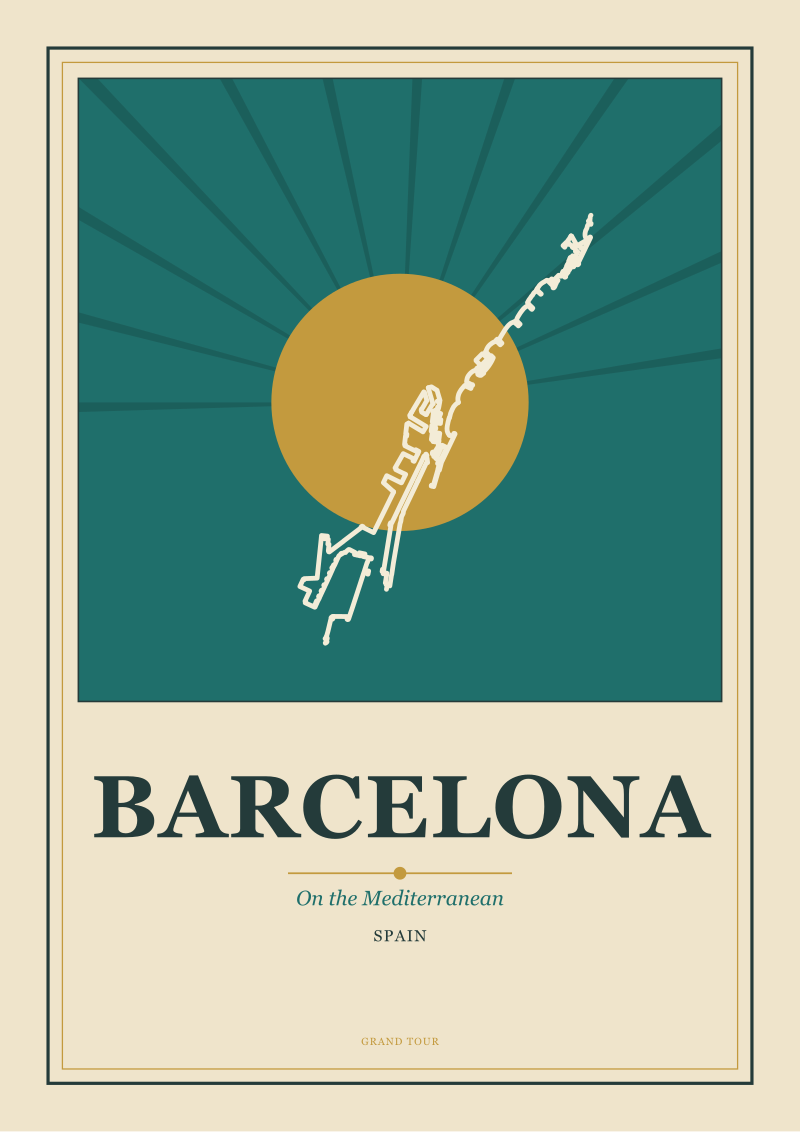
Take the coasts. The Amalfi coastline and the coast at Barcelona are, in life, not the same colour and neither of them is a pure cobalt. The Costiera is a place of vertical rock, of pale limestone weathering to buff and grey-pink, with a sea that turns green over shallow reefs and reads as dark bottle glass in the shadow of the cliffs. Barcelona's stretch of the Mediterranean, coming off the Balearic sea, sits between a working port and a beach and shows every shade of harbour water — a slate that goes silver at noon and drops toward mauve at dusk. Neither place is a poster. Neither has ever been a poster.
The posters made them blue anyway. They made them a very specific blue: a saturated cobalt-to-ultramarine, sometimes pushed into cerulean, always cleaner and hotter than any body of water on the actual Mediterranean coast. There is a reason for this and the reason is not aesthetic. It is commercial. The great buyers of railway tickets to the south of France, to the Ligurian coast, to the Balearics, were not people who lived there. They were northern Europeans in winter — Parisians, Londoners, Berliners, Amsterdammers — sitting in coal-heated rooms in February, deciding whether to spend part of their savings on a train ticket to somewhere warm.
The palette was aimed at those people. The saturated blue was not a colour of water. It was a colour of contrast against grey. It was designed to sit in a station poster next to a Paris sky that was, for four months of the year, actually grey, and to shout warmth at the passer-by. The orange-red so often paired with it, the salmon and geranium tones used for figures and awnings and roof tiles, were the complementary colour that made the blue feel warmer still. The palette worked by opposition to the buyer's climate, not by fidelity to the seller's coastline.
You can test this by looking at the posters made for the same audiences about their own cities. The interiors of the northern capitals, when they were rendered for locals, used gentler, more accurate palettes — the muted greys and creams and browns of a city seen every day. The saturated primary language was reserved for the exotic, and the exotic, in this period, meant the south. Amalfi and Barcelona were painted the way they were painted because the market for those images sat six hundred miles north and needed the volume turned up. The Costiera is a coastline in Italy. In the graphic imagination of 1930, it was also a colour swatch aimed at a Parisian in a winter coat.
This is not a cynicism. It is closer to the way a stage designer thinks. The posters were performances of place, tuned for a specific audience in a specific room. Once you accept that the room was a cold railway station in the north, the palette makes complete sense.
 Chamonix
The print from this article · from €29.95
View the print →
Chamonix
The print from this article · from €29.95
View the print →
The Alps and the Canals Prove the Point in Opposite Directions.
The interesting cases are the two that break the coastal formula: Chamonix and Amsterdam. They break it in opposite directions and both of them, once you look, confirm the underlying rule.
Chamonix, beneath Mont Blanc, is a place whose defining feature is a mountain that is genuinely, at altitude, a colour close to the white the posters give it. In principle this should be the one case where the vintage palette matches the geography. And it does, almost — the classic Chamonix poster is a study in extreme reduction, sometimes only three inks: a hot blue for the sky, a warmer accent for a figure or a small pool of foreground colour, and a huge, unbroken field of white paper standing in for the mountain itself. The white is not printed. The white is the sheet.
That is the tell. Even here, where the palette could have been an honest description, the artists chose to make white the absence of ink rather than the presence of it, because it was cheaper, cleaner, and it read louder from across the station. The mountain was rendered by not rendering it. The blue of the sky was pushed toward a colour no alpine sky ever actually reaches at midday — a saturated navy-cobalt that makes the paper look brighter by contrast. Chamonix was drawn with the same commercial grammar as the Riviera; it just used silence where the Riviera used shouting. The absence of colour was itself a colour choice, made against the printing press, not against the mountain.
Amsterdam runs the other way. The city of canals is not, in life, a blue city. The water of the grachten is a dark, tannic brown-green most of the year, sometimes silvered by sky, often the colour of used tea. The brick fabric of the seventeenth-century houses is a deep red-brown weathering to soot. The sky over the Netherlands is grey for a majority of the calendar. There is no natural blue anywhere in an honest portrait of the city.
The posters gave it blue anyway. They pushed the canals toward a mid-cobalt not because that is what the water does but because that is what the word "canal" needed to look like when read at a distance. They lightened the brick, they simplified the gables into flat silhouettes, and they let the sky go a pale duck-egg that no Amsterdam sky has ever produced. The grammar is the same as the Mediterranean grammar, only tuned down in saturation to feel northern rather than southern — cool where the Riviera was hot, restrained where the Riviera was declamatory, but still a translation and not a description.
The two cities together are the proof. Chamonix used the press to leave the mountain alone. Amsterdam used the press to overwrite the city. Neither is realism. Both are graphic decisions made in service of a poster's job, which is to make a place legible in the mind of someone who has not yet been there, in about two seconds, from about fifty paces, in a room lit by gaslight and full of coal smoke. The palette was doing that job. The place was a starting point.
This piece started as a note on why our own drawings of the four cities in the grounding — the Costiera, Amsterdam, Barcelona, and Chamonix — keep coming back to a narrower range of colours than the photographs would justify. It turned into an argument about why the vintage posters we take those cues from were themselves already an argument, not an observation, and why the palette we inherited from them is really the fingerprint of a printing press and a winter market, dressed up as the memory of a coast. That is a more interesting fact about travel art than the one usually printed under it. It is also, we think, the more useful one if you are the person now sitting down to draw a place from scratch — because it means the honest thing to do is not to reproduce the old palette, but to understand what job it was doing, and then to decide what job your own drawing is for.
 Amsterdam
The print from this article · from €29.95
View the print →
Amsterdam
The print from this article · from €29.95
View the print →


New city prints and 10% off your first order.
One email now with your code. No noise after.