The minimalist travel poster revival is not a revival. Hear me out. The 1920s and 1930s poster canon — Cassandre for the French Line, Broders for the PLM railway, the work commissioned by the Empire Marketing Board — was already minimal by the standards of its own era's advertising. What the 2010s wave revived was not a technique but a silhouette: flat color, sans-serif type, one landmark reduced to geometry. The terms below are what separates a poster that draws Chamonix from a poster that draws the idea of Chamonix. Both exist. They do different work, and the vocabulary is worth knowing before choosing.
Flat Color Blocking
Flat color blocking means an area of a single, unmodulated hue doing the work of representing a form. No gradient. No airbrush softness. No painterly transitions. The edge of the color is the edge of the object.
The technique is not a stylistic choice in the original canon. It is a printing constraint. Stone lithography and later screenprinting priced each additional ink pass, so the cheapest expressive image was one that treated the poster as a stack of solid plates. Designers stopped fighting the constraint and started composing for it.
The revival wave imports the visual result without the constraint. Digital printers can render a gradient at no additional cost, which means flat color today is a decision, not a limit. That decision reads honestly on the Amalfi Coast: a poster of the Costiera in three flat bands — sea, cliff face, sky — draws the coastline the way the rock actually meets the water, in a hard line. A gradient here would lie about the geology.
Limited Palette
A limited palette is the deliberate restriction of colors used in a single composition, typically to between three and six. It is enforced in the original canon by ink cost and press capacity, and adopted in the revival wave as a discipline.
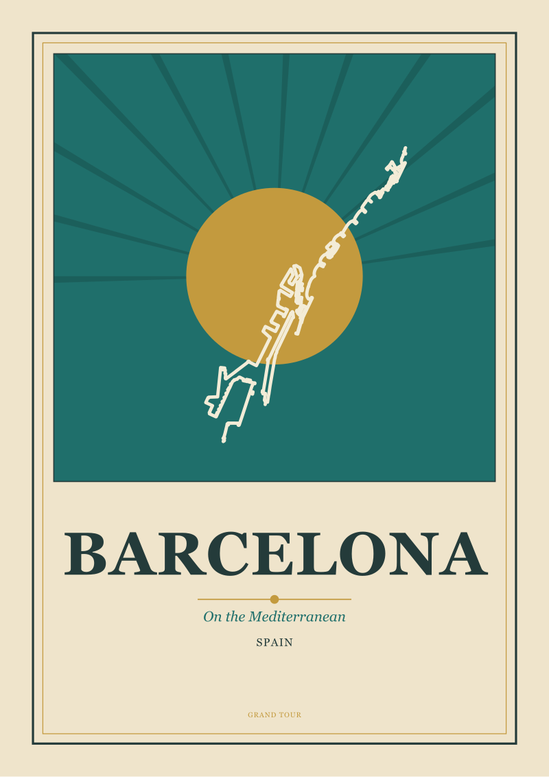
The palette is not chosen from a color wheel in the abstract. It is pulled from the tonal register of the place itself. Barcelona on the Mediterranean sits on a warm, dry palette — the ochre and terracotta of the low light on the Eixample facades, the specific blue of the water on the Costa, a bone-white for the sky at midday. The Amalfi Coast pulls from a different register even though both are Mediterranean: a bluer sea, a lemon that is not decorative, a limestone gray that is not warm.
The test of a limited palette is subtractive. Remove one color from the composition. If the poster still reads as the place, that color was ornament. If it stops reading, the palette was correct.
 Chamonix
The print from this article · from €29.95
View the print →
Chamonix
The print from this article · from €29.95
View the print →
Negative Space
Negative space is the portion of the composition where nothing is drawn. It is not empty. It is doing structural work — establishing scale, isolating the subject, providing the eye somewhere to rest between the two or three elements that carry meaning.
In the original poster canon, negative space was often the untouched paper itself, its color functioning as one of the limited palette. In practice this meant that the "sky" of a Broders poster was frequently not printed at all. The absence was the image.
The revival wave underuses negative space, on average. A poster of Chamonix that fills the frame with the massif reads as illustration. A poster that gives two-thirds of the frame to the sky, with Mont Blanc placed low and the valley of the Arve suggested by a single hard line at the base, reads as a mountain. The scale is not in the mountain. The scale is in the space above it. This is the single technique that most reliably separates the trained hand from the imitation.
Geometric Simplification
Geometric simplification is the reduction of an organic form — a coastline, a mountain, a canal house — to a small number of primitives: triangle, arc, trapezoid, straight line. The word is not stylization. It is closer to abstraction, but stops before the referent is lost.
The canonical example is Cassandre's Étoile du Nord, which resolves a railway into two converging lines and a single star. The image is not a train. It is the idea of arrival, drawn using the geometry a train produces.
Applied honestly, geometric simplification asks what a place actually is at its lowest resolution. Chamonix is a valley floor, a river, and a triangular peak. The Amalfi Coast is a diagonal line where cliff meets sea, repeated at slightly different angles for each village along it. Amsterdam is a series of nested arcs — the concentric canals of the Grachtengordel are literally arcs of circles offset from a common center. A geometric poster of Amsterdam that ignores this and draws a row of gabled houses has chosen the postcard over the map.
 Amalfi Coast
The print from this article · from €29.95
View the print →
Amalfi Coast
The print from this article · from €29.95
View the print →
Silhouette Hierarchy
Silhouette hierarchy is the rule that one shape in the composition must read first, before color, before type, before any secondary element. It is the shape a viewer sees at a distance of ten meters, or at thumbnail size, or in a rearview mirror as the poster passes.
The original railway and shipping-line posters were designed to work at speed. The client's brief was often literal — the image must be legible from a passing car or a moving platform. This produced a discipline: one shape wins, the rest support.
The revival wave frequently violates this by drawing three or four elements at roughly the same visual weight — a landmark, a wave, a sun, a bird — and calling the ensemble a poster. It is not. It is a collage.
For Chamonix, the winning silhouette is the mountain, and everything else — the town below, the trees, the chair-lift cable if it appears at all — must be quieter by an order of magnitude. For Amsterdam it is the arc of a canal or the stepped gable of a single house. Pick one. Draw the rest at half strength.
Horizon Line
The horizon line is the compositional axis where sky meets subject. Its placement is the single most consequential decision in a landscape poster, and the one that most quickly reveals whether the artist has looked at the place.
A high horizon — sky occupying less than a third of the frame — pushes the viewer down into the terrain and reads as intimate, terrestrial. A low horizon — sky occupying two-thirds or more — pushes the viewer back and reads as monumental. The Amalfi Coast poster tradition places the horizon high because the interesting geometry is below it: the cliffs, the villages stacked on them, the terraces. A low-horizon Amalfi poster would be a poster of Mediterranean weather with the coast as an afterthought.
Chamonix inverts this. The interesting geometry is the mountain, which is above the horizon by definition. A Chamonix poster with a high horizon crops out its own subject. Barcelona sits ambiguously — the Mediterranean argues for a low horizon, the Eixample from above argues for none at all.
The horizon is not a default. It is a claim about what the place is.
Sans-Serif Typography
Sans-serif typography is the family of typefaces without terminal strokes on the letterforms. The original canon relied heavily on the geometric sans-serifs of the interwar period — Futura, Kabel, Erbar in the German-speaking market, Gill Sans in the British commissions, and various proprietary lettering hand-drawn by the poster artists themselves.
The choice was ideological before it was practical. Sans-serif was modern. It aligned the poster with progress — railways, ocean liners, aviation, the new tourism the poster was selling. A serif face on a 1930s French Line poster would have read as a nostalgic error.
In the revival wave, the typographic vocabulary has narrowed to a small set of contemporary geometric sans-serifs — Futura still, plus the widely available digital descendants. The risk is that the type reads as retro pastiche rather than as a design decision.
The test is spacing, not selection. The original poster canon set type with generous letter-spacing — often 100 units or more in modern terms — because it was drawn or hand-lettered rather than mechanically set. A tight-spaced Futura on a poster of Barcelona reads as a wine label. A wide-spaced one reads as travel.
Screenprint Registration
Screenprint registration refers to the alignment of successive color layers as a screenprinted image is built up, one plate at a time. Each color is printed as a separate pass, and the plates must line up to within a fraction of a millimeter or the image fails.
The technique matters historically because it defined what was possible. A poster with five colors required five plates, five passes, five registrations. This is the physical reason the original canon uses limited palettes and flat color blocking — not because the designers were minimalists by philosophy, but because the print shop was minimalist by economics.
The revival wave is printed digitally in the majority of cases, which eliminates registration as a constraint. Some studios — including ours — still screenprint short runs, which reintroduces the discipline. A screenprinted poster of the Amalfi Coast built in four passes forces the designer to decide which four elements of the coast are the coast. Everything else must go.
This is the most instructive exercise in the vocabulary of the poster. The constraint teaches faster than the theory.
Landmark Reduction
Landmark reduction is the practice of representing a place through a single recognizable element, stripped of context. Mont Blanc without the valley. The Eiffel Tower without the Champ-de-Mars. A canal house without the canal.
The technique is honest when the landmark carries the identity of the place, and dishonest when it does not. Chamonix without Mont Blanc is not Chamonix. Mont Blanc alone, however, is not Chamonix either — it is a mountain shared with Courmayeur and Saint-Gervais. The Chamonix poster tradition solves this by including the specific angle of the massif as seen from the valley floor of the Arve, which is a signature no other viewpoint reproduces.
Amsterdam resists landmark reduction more than most European cities because it does not have one. There is no Eiffel Tower of Amsterdam. The city is drawn instead through repetition — the row of gables, the canal ring, the bicycle — which is a different discipline entirely and closer to pattern than to portrait.
The Amalfi Coast, likewise, is a coastline rather than a landmark. A poster that reduces it to one town — Positano, most often — reduces the coast to its most photographed fifteen minutes.
Grid Composition
Grid composition is the underlying geometric scaffolding on which the visible elements of the poster are placed. It is invisible in the finished image, but it is what makes the image feel resolved rather than assembled.
The canonical grids in the poster tradition are simple: rule of thirds, golden-section rectangles, or a plain division into halves and quarters. The horizon line sits on a grid line. The landmark sits on an intersection. The type block occupies a rectangle defined by two grid modules.
A grid does not produce a good poster on its own. What it produces is a poster that can be looked at for a long time without the eye finding a wrong measurement. The absence of a grid is felt before it is seen — the viewer registers unease before locating the cause.
Barcelona is the instructive case. The Eixample is a literal grid on the ground — Cerdà's plan of 1859, a square lattice of 113-meter blocks with chamfered corners. A poster of Barcelona that ignores this and treats the city as a picturesque skyline has abandoned the strongest structural fact about the place. The grid is not just the compositional discipline of the poster. It is the subject.
The vocabulary above is not the whole of it, but it is the working set. A poster of Chamonix, of Amsterdam, of the Amalfi Coast, of Barcelona — one that draws the place rather than the idea of the place — will use most of these terms as constraints rather than as decoration. The prints we produce at the studio shop are built to this vocabulary because the vocabulary is what the tradition is. The revival, such as it is, begins when the terms are held rather than borrowed.


New city prints and 10% off your first order.
One email now with your code. No noise after.