We spent a winter cataloguing every railway and shipping poster we could find from the years 1920 to 1939, filed by studio, printer, and destination. What surfaced was not a movement but a workshop. Fewer than twenty artists produced the images that taught Europe what its own coast, its own mountains, its own capitals were meant to look like. Cassandre in Paris. Roger Broders for the PLM. Ludwig Hohlwein in Munich. The catalogue reads like a small guild, and the geography of tourism as we now recognise it was largely drawn by their hands.
The finding is uncomfortable if you have inherited the standard story, which treats the interwar poster as a broad democratic wave — a whole continent's graphic exuberance answering a whole continent's new leisure. The archives do not support the wave. They support a bench of specialists, largely trained in the same handful of ateliers, printed by a shorter list of lithographers still, commissioned by a small number of railway and shipping company art directors who knew each other by first name.
What follows is a portrait of that guild, and of the economic and technical conditions that made it possible for so few artists to draw so much of the continent's self-image in barely two decades.
The Golden Age Was Really a Small Guild
Count the signatures on the wall of any serious poster room and the same twelve to eighteen names recur. Cassandre — A. M. Cassandre, born Adolphe Mouron in Kharkov, working out of Paris — is the towering figure, remembered above all for the shipping and rail work of the late 1920s and early 1930s. Roger Broders produced, over roughly fifteen years for the Paris–Lyon–Méditerranée railway, the majority of the visual identity France still assumes for the Côte d'Azur and the Alps. Ludwig Hohlwein carried the German-speaking world almost single-handedly from the Munich end. On the British side, the London and North Eastern and the London Midland and Scottish drew from a small, recurring roster: Tom Purvis, Frank Newbould, Fred Taylor, Terence Cuneo later. In Italy, Marcello Dudovich for the state railways and the shipping lines. In Switzerland, Herbert Matter and, before him, Emil Cardinaux at the Alpine end.
That is close to the entire senior bench. The tier below — house designers at the printing firms, art students taking piecework — was larger, but the images that survive in the canon, the images the algorithms of contemporary auction houses treat as the reference set, are concentrated in those hands. Concentrated to a degree that is hard to overstate: for several destinations, a single artist essentially owns the visual archive. The Amalfi Coast as a legible graphic idea in the interwar period is Dudovich and a couple of contemporaries; almost everything else was made for domestic Italian consumption at smaller printers and has not entered the international canon. The Alps beneath Mont Blanc, as it was published for the French-speaking market, is disproportionately Broders.
The reason is not mystery. It is training, printing, and patronage. The chromolithographic poster of this era was not a design brief handed to a freelancer. It was a plate on a stone press, cut by the artist or by an atelier working directly with the artist, printed at a small number of shops — Hachard in Paris, Bemporad in Milan, Wall & Cie, Waterlow in London — whose plate-makers were part of the collaboration. To produce a poster that could hold up at four sheets tall on a station wall, at reading distance and at running distance, required a specific hand and a specific relationship with the printer. Very few artists had both.
The Railways Commissioned the Style, Not the Other Way Around
The received wisdom treats the modernist poster as a stylistic revolution that then found its commercial application. The archives argue the reverse. The railway and shipping companies commissioned a look — flat colour, radical simplification, unified typography set within the image rather than beneath it — because it solved a specific commercial problem. The images were being read at speeds and distances that punished detail. A poster on a platform wall competed with signage, with steam, with a moving eye. What a lithographic reduction to three or four colours does very efficiently is register at fifty metres and hold at five. The Bauhaus vocabulary reached the poster wall through a purchase order.
The Paris–Lyon–Méditerranée is the cleanest case. In the years after 1920, the PLM was selling a new product — winter on the coast, summer in the Alps — to a middle class it had itself produced by making the routes affordable. Broders' brief was straightforward: draw the destination as an idea, not as a photograph. Chamonix, in Broders' hand, is a sharp diagonal of skier or climber set against the massif, with Mont Blanc simplified almost to a graphic gesture. There is no attempt at topographic accuracy; there is a rigorous attempt at emotional accuracy. The mountain reads as vertical, cold, drawable. The commercial function of that reading is direct — it makes the place look like something you go to.
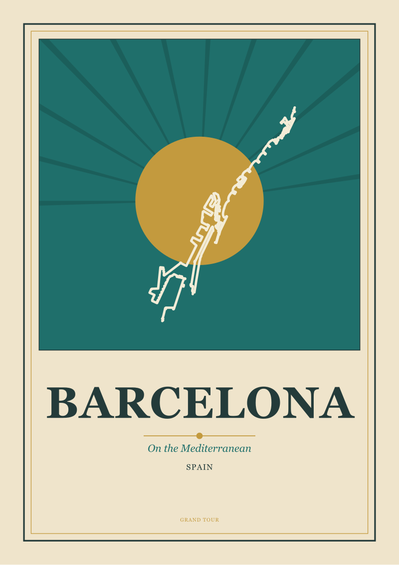
Similar logic drove the shipping posters. Cassandre's ocean-liner work reduces a ship to a geometry the eye can hold in one pass — hull, funnel, sky, water — because the poster was competing for the attention of first- and second-class passengers considering an Atlantic crossing on which several lines were quoting comparable fares. The image had to do the differentiation that price could not. Amsterdam, Barcelona, and the other port cities of the era received the same treatment when they were being sold as embarkation points: canal or coastline reduced to a graphic device, the rest cleared. Amsterdam as a city of canals is a poster convention before it is a tourist experience. Barcelona on the Mediterranean, as an interwar poster image, is coastline first and city second.
The point is not that the artists were commercial hacks. Cassandre, Broders, and Hohlwein each had a substantial fine-art practice, and each spoke about the poster with the seriousness of a discipline. The point is that the discipline was funded, shaped, and constrained by transport companies with unusually clear ideas about what they wanted their routes to signify. The stylistic coherence of the interwar poster is, at least in part, the coherence of a client base.
 Paris
The print from this article · from €29.95
View the print →
Paris
The print from this article · from €29.95
View the print →
What the Poster Artists Understood About a Place That Photographers Did Not
Photography was available. It was in fact routinely used for the interior of the folded brochure, for the postcard rack, for the illustrated magazine feature that accompanied the poster campaign. It was almost never used for the poster itself. The reasons are worth naming precisely, because they explain why the drawn image, ninety years on, still carries the idea of a European destination more firmly than any photograph of the same place.
A photograph of Chamonix in 1930 shows a valley with a town in it, a peak behind, weather. A photograph is a record of a moment. What Broders drew instead was a compressed argument about what Chamonix is. The mountain is enlarged relative to the valley because in the experience of being there, the mountain is enlarged. The sky is reduced to a single tone because the sky, at that altitude, in memory, is a single tone. The skier is placed on a diagonal that the eye reads as descent, because descent is the point. None of this is present in a photograph, which democratically records the sky as it happened to be that morning and the mountain as it happened to be lit. The poster is a compressed judgement about a place; the photograph is a sample from it.
The same argument holds for the coast. A photograph of the Amalfi coast records a stretch of geology under whatever weather occurred; a poster of the same coastline collapses fifty kilometres of cliff and sea into the single visual idea that survives the visit — a vertical of pastel town over a horizontal of blue, at an angle that does not exist from any real vantage but that corresponds exactly to what the coast feels like. Amsterdam becomes canal-and-gable in the poster because canal-and-gable is what the city compresses to in memory. Barcelona becomes the geometry of coast meeting grid. In each case the drawn image is doing something the photograph cannot do: it is producing the destination as a stable mental object, portable and repeatable, the kind of thing you can want to visit.
That is the deepest reason the guild was small. Very few people in any generation can perform that compression well. Cassandre could. Broders could. Hohlwein could. The rest of the workshop drew handsomely and forgot easily. What made the golden age golden was not the number of hands but the quality of a very small number of them, working within a commercial system that was, for two decades, willing to pay for compression rather than for record.
This piece began as a note on why a Broders and a Cassandre from the same year sell at very different prices at auction, which is a market question with a market answer, and turned into an argument about how few people it actually took to draw a continent's idea of itself. The catalogue was the thing that changed the argument. Once you file the images by hand, the guild becomes visible, and the guild is the story.
FAQ
Who is generally considered the most influential travel poster artist of the golden age?
A. M. Cassandre is the figure most often placed at the top of the interwar canon, on the strength of his shipping work for the French Line and his railway posters of the late 1920s. His images are treated as the reference point for the reduced, geometric, typographically integrated style that defined the era. That said, for specific destinations Roger Broders and Ludwig Hohlwein are more decisive — Broders for the French Riviera and Alps, Hohlwein for the German-speaking market.
What years count as the golden age of the travel poster?
The tightest definition covers roughly 1920 to 1939 — the interwar decades, when the railway and shipping companies had both the budgets and the modernist visual vocabulary to produce work at the level the era is now remembered for. A looser definition stretches back to the late nineteenth century, when chromolithography first made large colour posters commercially viable, and forward into the late 1940s, before photography and offset printing gradually displaced the lithographic tradition.
Why did railway companies rather than tourist boards commission most of the great posters?
Because the railway and shipping companies were selling the journey and the destination as a single product, and they were the ones with the direct commercial incentive to make places look like something worth going to. National tourist boards in the modern sense were, in most of Europe, still small or non-existent in the 1920s. The PLM, LNER, Deutsche Reichsbahn, and the shipping lines were effectively acting as their countries' tourism marketing offices.
How were the posters actually printed?
By chromolithography — successive stone or later zinc plates, one per colour, printed on large sheets that were pasted together on the station wall. The artist typically prepared a maquette and then worked with the printing atelier to separate the image into plates, choosing colours for their behaviour on the press rather than only on paper. The three- and four-colour reduction that gives the era its look is partly aesthetic choice and partly a limit of what could be printed at scale.
Why do so few women appear in the canon of golden-age poster artists?
The commercial poster ateliers of the 1920s and 1930s were, like most commercial art of the period, structurally closed to women in senior signed roles. A number of women worked as designers within the printing firms, and a small number — including some at the Beggarstaffs' extended circle and later in the Swiss school — did publish signed work, but the transport-company patronage that produced the canonical images went almost entirely to male artists. The narrowness of the canon reflects the narrowness of the commissioning system, not the talent that was available.
Are original posters from this period still affordable to collectors?
Prices vary widely. A signed Cassandre or a first-printing Broders in good condition trades at auction in the mid four to low five figures in euros or dollars, sometimes higher for the most celebrated images. Second-tier artists of the same period, and unsigned or later reprints, remain far more accessible. Condition matters enormously — most posters from the era were pasted up and thrown away, so survival is the primary driver of value.
Why does the poster style still feel current, ninety years on?
Because the visual problem the interwar poster solved — how to make a place register instantly, at distance, on a crowded surface — is the same problem faced by contemporary digital imagery competing for attention on a scrolling screen. The reduction to a few colours, the integration of type into the image, the elevation of a single graphic idea over descriptive detail: those decisions travel well from a station wall to a phone. The medium changed; the constraint did not.
 Amsterdam
The print from this article · from €29.95
View the print →
Amsterdam
The print from this article · from €29.95
View the print →
From the collection


New city prints and 10% off your first order.
One email now with your code. No noise after.