In the winter of 1890, if you walked through the concourse of the Gare de Lyon in Paris, you would have passed a wall of lithographs commissioned by the PLM — the Paris–Lyon–Méditerranée railway — advertising a coast most Parisians had never seen and could not, in any strict sense, imagine. The posters showed a Mediterranean pitched between cobalt and turquoise, gardens in February, women in white walking beneath palms. Within a generation the Côte d'Azur — a phrase then newly coined — was a place people knew before they arrived. The poster had drawn the destination into being before the tourist ever boarded the train. This is not a metaphor. It is, we will argue across three composite scenarios, how modern tourism was actually built.
The question of how travel posters shaped tourism history is usually answered as a matter of persuasion: posters were pretty; posters sold tickets; more tickets meant more tourists. This answer is not wrong so much as it misses the interesting part. The poster did not merely persuade; it composed. It decided, on behalf of the traveler, what a place was going to look like on arrival — and then arranged, through millions of impressions, for arrival to confirm the picture. The order of operations matters. The image came first, and the destination formed itself around the image.
To see how, it helps to walk through three composite scenarios — not real people, but plausible reconstructions of the working lives that produced the posters we now hang on walls. The first is a railway commercial director in Paris around 1895. The second is a steamship copywriter in Rotterdam or London in the late 1920s. The third is a tourism board director in the French Alps in the years just after the Second World War. Each was solving a different problem. Each produced posters that survive, physically or in reproduction, on studio walls today. And each, in a different register, was doing the same thing: teaching a place how to be seen.
Scenario 1: The PLM Commercial Director Selling a Coast Nobody Had Seen
Imagine a commercial director at the PLM in the mid-1890s. Let us call the position, not the person, since we mean a role rather than a biography. The railway has laid track along the Mediterranean coast for a decade. The stations exist. The trains run. The customer, however, does not — or rather, exists only in the persons of a thin clientele of British aristocrats and consumptive gentry who have wintered on the coast since mid-century. The director's problem is not building a market. It is inventing one, in the head of the French bourgeois in Lyon or Paris who has never once in his life imagined a February without snow.
Picture him commissioning a set of lithographs. He does not ask for realism. Realism, at that latitude in February, would show a coast that is often grey, sometimes windswept, and dressed in the ordinary browns of a working fishing economy. He asks instead for a proposition: a coast rendered as its most possible self. The palette is decided before the drawing begins — an azure that will later be spoken of as if it were a natural fact rather than a printing decision, oranges and pinks for the built architecture, a green for gardens that in reality is really the green of the Riviera's introduced species rather than its native scrub.
Now the mathematics of the campaign. Assume, in a plausible reconstruction, an initial print run in the low thousands per image, distributed across major stations in the north. Assume six to ten images across a season, refreshed as the railway's timetables change. Assume the poster's working life on a wall is measured in weeks rather than years, and that the total impressions across a decade run comfortably into the tens of millions. This is a saturation medium, not a niche one. The Parisian who has not travelled south does not see one poster; he sees a coast, over and over, until the coast is a fact in his head that predates his ticket.
The Amalfi Coast is not, in this specific case, the PLM's territory — the Costiera lies south of the Italian border and belongs to a different commercial imagination, principally the Italian state railways and later the steamships out of Naples. But the logic is the same one, applied along a different arc of the same sea. A coastline is reduced to a defining gesture — the drop of cliff into water, the pale road cut into the rock, the pastel stack of houses — and that gesture is repeated until the traveler, arriving, recognises what the poster taught him to see. Recognition, not discovery, becomes the point of the trip.
Scenario 2: The Interwar Steamship Copywriter Composing Amsterdam into a Silhouette
Picture, now, a copywriter working for a shipping line in the late 1920s. The office might be in Rotterdam or in London; the specifics do not matter, because the constraint is a general one. The steamship has become a mature technology. The North Sea and the Channel crossings are competitive. The line needs foreign passengers — American, in particular, since the transatlantic dollar has recently become the largest single lever in European tourism — to choose its route to the continent. The copywriter's assignment is Amsterdam.
The problem with Amsterdam is that it is, from the point of view of a poster, almost too much. A city built on water, cut by more than a hundred kilometres of canal, densely built in brick and gable, entirely without a single defining landmark of the sort that other capitals conveniently provide. There is no Eiffel Tower, no Colosseum, no distant mountain to place in the background. There is, instead, a pattern — a grammar of water, bridge, gable, and tree — which resists reduction the way Venice does not.
Let us say the copywriter and the artist arrive together at the same solution, because this is how these decisions were typically made: not by writer or artist alone but by the small collaborative team producing the sheet. They decide to reduce the city to a silhouette. Not a place but a profile. Gables in a row, the arch of a bridge, a canal in the foreground rendered as a horizontal band of blue, perhaps a single figure on a bicycle for scale and modernity. The palette narrows: brick red, canal blue, a warm cream for the gables' plaster, and the black of window frames. Once the silhouette is set, it can be repeated across a decade of campaigns with minimal variation — different seasons, different steamship lines, different destination cards — and it will still read, at fifty paces, as Amsterdam.
The reader of this piece who has visited the city knows the strange consequence. The visitor arrives, walks the first bridge, and experiences the sensation of having already been there. This is not déjà vu. It is the poster having done its work. The copywriter's silhouette has become the tourist's shorthand — the specific frame through which the whole city is now read. The canals become, in the visitor's photographs, the same three or four canals shot from the same three or four bridges: the ones the poster taught the visitor were the canonical ones, whether or not the copywriter ever intended so narrow a legacy.
 Amsterdam
The print from this article · from €29.95
View the print →
Amsterdam
The print from this article · from €29.95
View the print →
Scenario 3: The Postwar Alpine Tourism Board Rebuilding Chamonix as an Image
Now consider a tourism board director in Chamonix in the late 1940s. The valley has been a destination for more than a century — the birth of Alpinism in the 1780s, the first winter Olympics in 1924, the interwar climbing boom — and it has just come through six years in which almost none of that mattered. The war did not physically damage the valley the way it did other parts of Europe, but it interrupted the economy of leisure completely. The director's problem is that the muscle memory of going to the mountains for pleasure has, in an entire generation, gone slack.
The answer, again, is a poster. But the poster is not selling the mountains; the mountains are still there. It is selling the idea that going to look at them is a normal thing to do. Imagine the director commissioning a sheet that fixes the viewpoint decisively — the valley floor, the church tower or the town in the middle distance, Mont Blanc rising as an unmistakable mass in the upper third of the composition. The palette is narrowed further than any Riviera lithograph would ever narrow: white for the peak, a cold blue for its shadow, a warm ochre for the wooden chalets, and green for the meadow that grounds the composition in the season of return.
The mathematics here are more modest than the PLM's. A regional tourism board in the late 1940s prints in the low thousands per image, with a working budget stretched across trains, hoteliers' associations, and the national tourism office. But the poster does not need to reach millions of new customers. It needs to reach the specific European bourgeoisie who used to come, and remind them of a viewpoint they already know. The poster is doing memory work, not discovery work. It is saying: here is the frame you loved; the frame is still available; the frame did not go away.
The result, decades later, is that the classic mid-century Chamonix poster has become the way the valley is drawn even when no poster is involved. Photographs, watercolours, tourist maps, ski resort branding — all cite, whether knowingly or not, the composition the postwar boards settled on. Mont Blanc is drawn from below, from the valley floor, framed by chalets and grounded by meadow. Other angles exist — the summit views, the aerial photographs, the specific glacial detail loved by climbers — but they are treated as specialist. The tourism poster's composition became the default.
What All Three Share: The Poster as Editorial Act, Not Advertisement
Read together, the three scenarios describe a single editorial move performed under three different commercial constraints. In each case the poster reduces a place to one defining element — coast, canal-and-gable, valley-and-peak — and holds every subsequent decision to that reduction. In each case the palette is narrowed hard, well beyond what the eye would actually see on site, so that the destination becomes recognisable at a glance across a crowded station wall. In each case the viewpoint is fixed. And in each case the poster is then repeated across enough impressions that the fixed viewpoint becomes the traveler's default before the trip is booked.
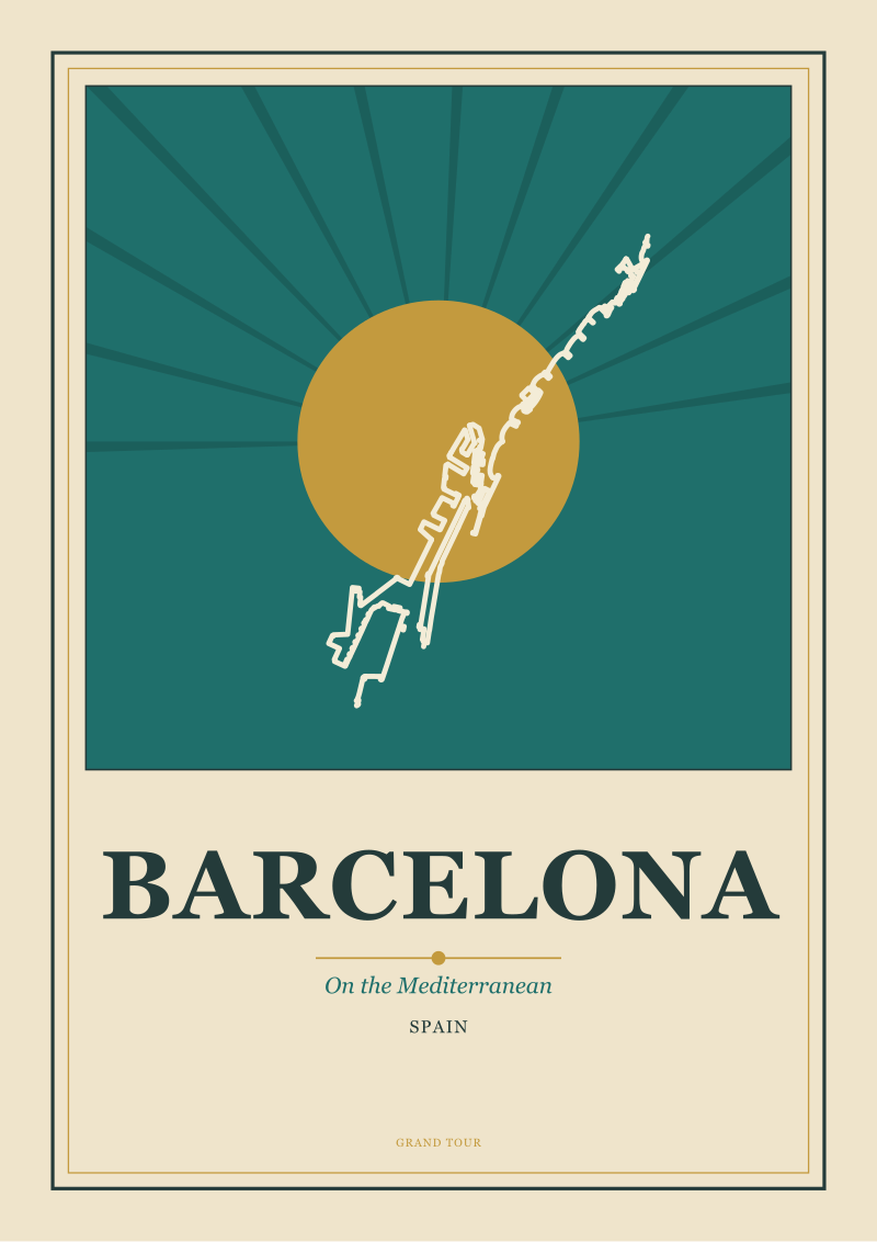
We have described three commercial cases — a railway, a steamship line, a postwar tourism board — and left the fourth confirming case for this section. Barcelona, in the same period, was being drawn by its own municipal and railway campaigns as a Mediterranean city — coastline first, Gothic core second, industrial modernity discreetly folded in. This is worth noting because Barcelona is, in strict geographic terms, at least as much a mountain city as a coastal one. The Collserola ridge sits behind it; the Pyrenean approach is not far. The posters chose sea. Once chosen, the choice became the city's public face — and remains it. The Eixample, one of the most consequential works of urban design in Europe, is rarely the subject of a travel poster. The beach and the medieval towers are. This is not because the Eixample is not drawable. It is because the earlier poster tradition decided otherwise, and later posters, quite reasonably, followed the audience.
None of this is advertising in the pure sense of the word. Advertising persuades a customer to prefer a product over another product. The travel poster did something upstream of that: it decided what the product was going to be. It composed the destination. The commercial director, the copywriter, the tourism board — each was, without necessarily thinking of themselves in the term, doing editorial work. They were choosing what a place would mean, and everything downstream — the guidebook photograph, the postcard, the eventual holiday snapshot, the studio print we sell today — inherits the choice they made.
 Paris
The print from this article · from €29.95
View the print →
Paris
The print from this article · from €29.95
View the print →
Which Scenario Is You: Reading a Poster on Your Own Wall
If you are reading this with a travel poster somewhere in the room — original, reproduction, or one of ours — the practical question is which of the three logics produced it. A coastal poster with a saturated palette, a fixed high viewpoint, and the graphic economy of a single sweeping line is almost certainly working in the railway tradition of the 1890s to the 1930s: it is teaching the coast. A city poster reduced to a silhouette or a repeatable graphic identity — canals, bridges, a compressed skyline — is almost certainly working in the interwar steamship or municipal tradition: it is fixing the city as a shorthand for foreign eyes. A mountain poster with a valley-floor viewpoint, a narrowed cool-warm palette, and a peak held in the upper third is almost certainly working in the postwar tourism-board tradition: it is doing memory work for a returning traveler.
The point of the taxonomy is not curatorial one-upmanship. It is that once you can see which logic your poster is running, you can also see what it was asking you to think — and, if you have travelled to the place, what it succeeded in making you see. That is, in the end, the interesting inheritance. Not that posters were pretty, but that they taught us how to look.
We have not, in this piece, addressed the specific artists whose signatures survive on individual sheets, because attribution is a separate discipline and we prefer to be sure before we name. We have not addressed the parallel American story — Union Pacific, the national parks, the WPA — which deserves its own scenarios and its own grounded facts. And we have not addressed the digital-era question of whether Instagram now performs the composing role the poster once did. Each of those is a longer argument, and each is on the desk.
From the collection


New city prints and 10% off your first order.
One email now with your code. No noise after.