For anyone about to order a travel poster because it reminds you of a trip you loved, we would ask you to stop first. Hear us out. Memory is the worst single predictor we have found of whether a print stays on a wall, and we know this because a series we designed around exactly that instinct is the largest loss in our studio's short history. What follows is the postmortem, and what the postmortem taught us about the psychology of the object.
The strongest version of the opposite argument is obvious, and we are not going to pretend it away. Memory is real. Nostalgia is real. A print that recalls a particular week in a particular light, hung above a desk, can hold a wall for years — we own two ourselves. What we found in the sales data, and in the returns, and in the emails from buyers who eventually took the print down, is that memory prints belong to a narrower category than most buyers imagine they are in. The prints that stay are doing something else. This is the story of learning to tell them apart.
The Amalfi Series We Lost Money On
We released a series of eight prints of the Amalfi Coast in the second week of a spring we would rather forget. The proofs were beautiful. The colors — a coastline calibrated to the last thirty minutes of sun, warm on the cliffs and unshadowed on the water — read on-screen the way an editor at a decoration magazine had told us they should. We priced them at the middle of our range. We were confident enough to press a full first run.
Eleven sold in the first month. Of the eleven, four came back within the return window, without complaint but without argument either. The prints had done nothing offensive. They had simply not held.
Reconstructing the failure took us the rest of that spring, and we identified four mistakes we had been making without noticing.
The first was that we had drawn the Costiera as if it were a photograph the buyer already had. The compositions borrowed exactly the angles a mid-range camera captures from the Amalfi belvederes. If a buyer had ever stood on that road, they had already seen the image. If they had not, we had given them nothing an image search would not.
The second was the color. Sunset light is a decorator's palette. It reads well against a couch and disappears against everything else. The prints looked correct in the two rooms our photographer staged them in and were background noise in any room lit by a north-facing window.
The third was that we had assumed the buyer wanted the memory. The buyer who orders an Amalfi print in March is more often planning a June that has not happened yet, or has never happened, than commemorating one that did. We had sold nostalgia and shipped it to people who were shopping in the future tense.
The fourth mistake was structural. We had photographed the coastline. We had not drawn it. There is a difference the wall notices.
A Wall Is Not a Photo Album — It Is an Argument With the Room
The psychological literature on why people hang art at all is thinner than one would expect, and most of what exists concerns museums, not living rooms. But the sales data from our own studio, cross-referenced with what buyers tell us six months after purchase, points in one direction with almost embarrassing consistency.
A wall does not hold your memory. A wall holds a claim.
When a buyer commits a plane of a room to an image of a place, they are telling anyone who enters the room what kind of person spends time there — and, more privately, telling themselves. This is why the print above the desk of a novelist is Trieste and not the beach where the novelist actually vacations. It is why the print above the reading chair of someone who has never been to Amsterdam is often Amsterdam. The wall is arguing, not remembering. It is arguing for a particular version of the inhabitant.
Memory prints fail on the wall for the same reason a candid photograph does: they close the argument too quickly. A photograph of the vacation is not a claim. It is a receipt. A drawing of the same place is a claim, because a drawing is a decision — of what to leave in, what to leave out, which line to hold. The buyer who lives with the print is living with a decision, not a document.
This is why the prints that stayed up in our sales histories are almost never the ones designed around a specific view a buyer had of a specific place. They are the ones drawn as if the buyer had never been. Consider it another way: a photograph asks the room to agree with a moment. A drawing asks the room to argue for a place. Rooms tolerate the first for a season and hold the second for years.
 Amsterdam
The print from this article · from €29.95
View the print →
Amsterdam
The print from this article · from €29.95
View the print →
The Places That Draw Well Are Not the Places That Photograph Well
Four cities in our catalogue draw disproportionately well, and their reasons are geographic before they are aesthetic.
The Amalfi Coast draws well because the section between sea and cliff is unusually legible in two dimensions. A photograph flattens the drama; a drawing preserves the vertical relationship because it never had to negotiate depth of field to begin with. The Costiera is a section drawing that happens to be a real place.
Amsterdam draws well for the opposite reason. Its defining geography is a system of water that resolves into a plan. Photographs of Amsterdam are photographs of a house, or a bridge, or a boat. Drawings of Amsterdam are drawings of a city. The plan is the subject, and a photograph cannot easily see it.
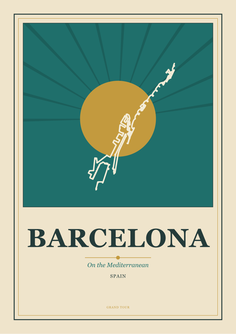
Barcelona sits on the Mediterranean, but the coastline is not what the wall wants from Barcelona. What draws well is the Eixample grid meeting the water — a geometry so deliberate that a drawing merely records what an urban planner already composed. The photograph fights the grid. The drawing prints it.
Chamonix, beneath Mont Blanc, is the extreme case. The valley reads like an elevation drawing, with the river tracing the base line. Photographs of Chamonix are photographs of weather. Drawings of Chamonix are drawings of the mountain's relationship to the town, which is what a viewer remembers when they close their eyes.
The pattern held across the four the same way. A place that draws well is a place whose defining geography can be resolved into a line, a plan, or a section. Places that only photograph well are places whose subject is atmosphere. Atmosphere ages badly on a wall; geometry does not.
| Dimension | Photograph-well places | Draw-well places |
|---|---|---|
| The subject is | atmosphere | geometry |
| Time of day matters | yes | no |
| Weather affects impact | high | none |
| Reproducibility on paper | limited | preserved |
| Ages on a domestic wall | poorly | well |
| What the buyer is buying | a moment | a claim |
The Travel Poster Golden Age Understood This
Between the two wars, when the European railways and steamship lines were selling seats before airplanes had made them cheap, the poster artists commissioned to fill the compartments of London, Paris, and Milan with images of the places their lines went were doing exactly what our failed Amalfi series was not.
They were not photographing anywhere. They were arguing for it.
The great railway posters of that era — the ones art historians credit with inventing the visual grammar of the modern travel image — reduced places to geometry, hierarchy, and a color. The Riviera as a single stripe of blue against a single stripe of red. The Alps as a triangle. The city as an outline of a spire. What the posters lost in fidelity, they gained in argument. A buyer who saw one on a station wall was not being shown a place. They were being asked to become the kind of person who went there.
Art Deco carried the same instinct forward with more discipline. The compositions are austere on purpose. The palette is a decision, not a documentation. The horizon is where it needs to be for the composition, not where the photograph would have found it. It is not an accident that Deco travel posters have never really left the wall market. They solved the room problem the modern feed keeps forgetting.
Contemporary travel prints, in the main, have forgotten it. The market is dominated by filtered photographs — a coastline in an approximation of sunset, an old town in an approximation of dawn — and they sell in volume because they are cheap and the argument they make is easy. They also come down quickly, because the argument is easy.
Our own return to the poster tradition was not a stylistic preference. It was a response to what the wall kept telling us. The prints buyers kept were the drawn ones. The prints buyers replaced were the photographed ones. The golden age understood the buyer better than the algorithmic feed does.
 Chamonix
The print from this article · from €29.95
View the print →
Chamonix
The print from this article · from €29.95
View the print →
What You Should Actually Do
If you are the buyer we described in the opening — about to order a travel print because a specific week in a specific place mattered to you — put the memory print in a photo book and keep it near the reading chair, where a receipt belongs. The wall is not asking for a receipt. Then ask a different question. Which place, of every place you have ever thought about, would you want a visitor to your room to think you spend your inner life? That place is your print. It may be somewhere you have been. It may be somewhere you have not.
Once you have the place, choose the drawing before the photograph. Choose the section, the plan, or the outline over the vista. Choose the palette that reads at every hour of the light in your room, not the one calibrated to the last thirty minutes of sun over somewhere else. Our own catalogue at see the Amsterdam print is organised around exactly these decisions, but the discipline applies whether you buy from us or from a market stall in a city we have never drawn. None of this tells you which specific city, out of every city that draws well, earns your particular wall. That question — how a place meets a room — is where the real work of picking a print starts, and it is not where this piece ends.
FAQ
Does this mean nostalgia prints never work?
No. Prints tied to a specific place-memory can hold a wall when the memory itself is unusually load-bearing — a childhood house, a place a relative lived, a location tied to a long relationship. What our sales data suggests is that recent-trip nostalgia is a weaker predictor than buyers assume. If the memory is a week from last summer, the print rarely lasts a year. If the memory is thirty years and layered, the print outlasts several rooms.
How can I tell if a place will draw well before ordering a print of it?
Look at whether the place has a legible geographic anchor — a coastline, a canal plan, an urban grid, a mountain-valley section — that a line drawing can preserve. If the place is famous for its light, its weather, or a single monument, it usually photographs better than it draws. If the place is famous for its shape, its plan, or the relationship between its parts, the drawing will hold up on a wall the photograph will not.
Is this specific to travel prints or does it apply to art in general?
The postmortem is specific to travel imagery — the category we design in — but the underlying claim about walls arguing rather than remembering is broader. It shows up in figurative painting, portraiture, and even abstract work: pieces that operate as claims about who the inhabitant is tend to outlast pieces that operate as records of what the inhabitant saw. Travel prints are simply the clearest case, because the subject is a place the wall can either endorse or refuse.
What is the practical signal that a print is photographed rather than drawn?
Beyond looking at the image itself, watch for prints marketed with the language of light and time — "sunset over," "golden hour at," "dawn on." That language is a tell. Photograph-based prints have to sell the moment because the moment is what they captured. Drawings sell the place, not the hour, and the copy around them reflects that. It is not a hard rule, but it is directionally reliable.
Why do Art Deco travel posters keep coming back into fashion?
Because they solved the wall problem before the market rediscovered it. Deco posters are compositions first and destinations second. The palette is a decision, not a photograph. The geometry is reduced until it can survive being looked at daily. Contemporary buyers do not necessarily know the history, but they respond to work built on the same principles because domestic walls have not changed their requirements. Deco understood the room.
Should I frame prints of places I have never been?
Yes, and this is where the psychology becomes most useful. The prints of unvisited places that our buyers keep longest are the ones that argue for a version of the inhabitant they are still becoming — a city they have read about, a coast that appears in a novel they love, a valley they have imagined for years. Those prints are load-bearing in a way memory prints often are not. The wall is a claim about who lives there. Unvisited places make quieter, longer claims.
How long should a print stay on a wall before you count it as held?
Our internal benchmark, drawn from buyer surveys, is roughly eighteen months. Prints taken down within the first season were usually mismatched to the room's light. Prints taken down within a year were usually memory prints whose emotional charge faded faster than expected. Prints that stayed past eighteen months tended to stay indefinitely, moving with the buyer from room to room, and sometimes from house to house.


New city prints and 10% off your first order.
One email now with your code. No noise after.