The claim that certain European coasts became art capitals because artists "discovered" them is one of travel writing's more durable inventions. The studio's own reading of poster catalogues suggests the opposite sequence. The Amalfi Coast entered the visual imagination through commissioned railway and shipping-line posters before it entered any painter's canon in a serious way. Barcelona's Mediterranean edge acquired its graphic identity around the Eixample's construction — a designed city drew graphic artists. Amsterdam's canals were etched for three centuries before tourism agreed they were picturesque. Three composite portraits follow. None of them met. All of them worked from the water.
A short note on method before the portraits begin. The three figures who follow are composites — invented illustrations assembled from patterns the studio has seen repeated across poster catalogues, gallery archives and the standing biographies of the golden age of travel art. We have not met them. They are not stand-ins for any single named artist. They are the shape a life takes when a working painter or designer decides that one coast, and one coast only, will hold their attention for a decade or more. The point of writing them this way is honesty: to say plainly what belongs to record and what belongs to pattern. When the numbers appear — the length of a coastline, the direction of a river, the shape of a grid — they come from the grounding of the places themselves. The rest is portrait.
Scenario 1: The Poster Designer Who Wintered on the Amalfi Coast
Imagine a poster designer trained in one of the Milanese lithography workshops in the years after the First World War, sent south on a commission for a shipping line that wanted the Costiera drawn as a destination rather than as a place people already lived. Let us say she takes the train down from Naples in early October, when the light along the coast begins to slant and the sea reads darker than the sky. She rents a room above a harbour in one of the fishing villages that line the coastline the shipping line has decided to sell. She stays through March. The next winter she comes back. The winter after that, she comes back again.
Picture how her working method settles into the geography. The defining fact of the Amalfi Coast, from a drawing point of view, is that the road hangs above the sea rather than running beside it. A poster artist working here has to choose an altitude before choosing a subject. She learns which switchbacks give her the angle where the town below reads as a single graphic unit — pale walls stacked against a dark cliff, the harbour a wedge of blue at the bottom of the composition. She learns that the coastline is a curve, not a line, and that the curve is what makes the poster: the eye follows it into distance the way it follows a horizon in a marine painting. Cliff, town, water, sail. Four elements. Everything she draws over the next decade is a rearrangement of those four.
The commercial logic of her return is worth naming plainly. The shipping line pays per poster, but the studio in Milan pays a retainer for a defined output — say a dozen finished lithographs a year. The Costiera gives her a subject bank she can draw at any hour of any month and know it will read. In February the light is unremarkable and the sea is grey; that becomes a poster for the off-season crossing. In September the almond trees are past bloom and the harbour is busy; that becomes a poster for the autumn timetables. She is not chasing the picturesque, in the way a painter would. She is farming a coastline.
What the studio notices, reading her hypothetical catalogue, is that she almost never draws the coast in full sun. The high-contrast midday version is what a tourist photograph does. Her posters live in the two hours before sunset, when the cliffs go warm against a cooling sea, and in the flat grey light of winter, when the towns register as pure architecture. Both are commercial choices. Both are also the choices of someone who has stopped visiting and started living.
Scenario 2: The Plein-Air Painter Who Followed the Barcelona Light
Let us say a French plein-air painter, trained in the Provençal tradition and comfortable working outdoors in wind, comes down to Barcelona for the first time in his early thirties. He arrives in a city that has already decided what it wants to look like. The Eixample — the nineteenth-century grid that extended Barcelona out from its medieval core toward the Mediterranean — has been under construction for decades by the time he sees it, and its geometry is legible from any rooftop. He rents a studio in one of the corner buildings, the ones cut on the diagonal so that every intersection becomes a small plaza, and stays for eleven years.
Imagine his first summer. He does what a landscape painter is trained to do: he tries to paint the coastline as landscape. He works down at the harbour with a portable easel and finds that Barcelona's Mediterranean, at least the version that meets the port, refuses the picturesque. It is too worked, too commercial, too framed by cranes and warehouses. So he does what a serious painter does when the obvious subject fails, which is to look for the light rather than the view. And what he finds — the studio would argue this is the specific thing that keeps him — is that Barcelona's light is Mediterranean but pulled slightly north. It has a longer summer evening than Marseille. It has a winter that never quite goes cold. The coastline shapes it, but the grid organises it. Streets running toward the sea catch a different sun than streets running along it.
He develops, over the years, a small typology of paintings that the studio would recognise instantly if it saw them today. There are the seven-in-the-evening paintings, done from the same balcony every June, when the shadow of the block opposite falls at a specific angle across a cross-street. There are the after-rain paintings, when the paving of a Passeig reflects the sky the way a tidal flat does. There are the paintings made from the base of Montjuïc, looking down at the Eixample as a piece of graphic design — a hundred blocks each identical in plan, and the sea beyond as a horizontal band that closes the composition. The point of these paintings is not the buildings. The point is that a designed city reveals what a natural landscape hides: the geometry of light itself.
He never becomes famous. His work sells to visiting Northern Europeans who take it home to Belgium and Denmark. But the coastline holds him, in a way the Riviera never quite did — because Barcelona is a coast that has already agreed to be a picture. The Eixample is what an artist gets to work with when the ground beneath the easel has itself been composed.
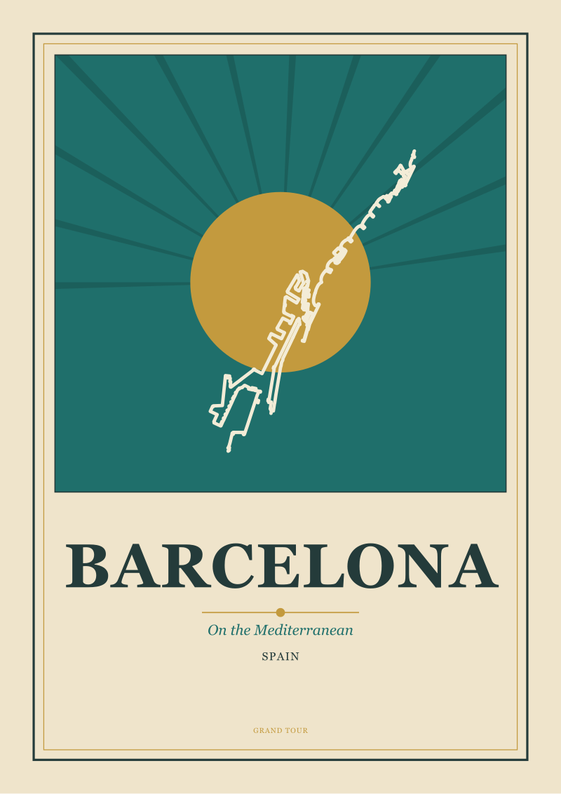 Barcelona
The print from this article · from €29.95
View the print →
Barcelona
The print from this article · from €29.95
View the print →
Scenario 3: The Etcher Who Kept Returning to Amsterdam's Canals
Now picture a Northern European etcher, trained in the late nineteenth century in the discipline of copper plate and acid bath, who first travels to Amsterdam in his twenties on a commission to produce a folio of city views for a publisher back home. He is expected to deliver twelve plates in six months. He delivers eighteen in eight months, and then returns the following spring on his own account. Over the next thirty years he comes back to Amsterdam somewhere in the range of forty times. He never keeps a permanent studio there. He works from rented rooms, always on the same three or four canals, always with the water at his back and a bridge in his composition.
The etcher, unlike the poster designer, is not commissioned by the destination. Amsterdam has been drawn for three hundred years before he arrives. The great Dutch tradition of city etching — the picture of a canal at low light, the barge, the reflected façade, the receding perspective under a bridge — is a genre he inherits rather than invents. What is worth naming is why he keeps coming back to a subject that is arguably exhausted.
The studio's answer, watching this pattern from a distance, is that Amsterdam's canals are the closest thing in European geography to a working printing plate. Every canal is a straight line ruled through a city, and every façade along it is a repeat unit in a slightly varied pattern. An etcher's eye — trained to see composition as line-work and value blocks rather than as colour — reads a canal the way a musician reads a stave. The water is a horizontal, the bridge is a vertical, the row of houses is a modulated line above the horizontal, and the reflection doubles the composition into a symmetry. There is no landscape in Europe that gives a printmaker more directly what a printmaker uses.
His work becomes, over decades, a portrait of the same three canals in every season and every weather. Winter mornings when the water is dark and the sky is high. Late summer evenings when a barge crosses the composition. Foggy November afternoons when the far end of the canal disappears into paper white and the etcher lets the plate do less work than usual. The publishers back home reorder his folios. He never grows bored. He gets, instead, more specific. And what he leaves behind is not a body of work about Amsterdam so much as a body of work about how a European water-city teaches a Northern European artist to compose.
What All Three Share
The three composites are separated by medium, temperament and century — a commercial lithographer in the south, a plein-air painter on the Mediterranean's northern edge, a Northern European etcher on freshwater canals. What the studio notices, laying their imagined outputs side by side, is the same underlying pattern in all three.
Each of them found a coast whose geometry did the compositional work their medium wanted. For the poster designer, the Amalfi coastline is a curve seen from above, and a poster is a curve organising a rectangle. For the Barcelona painter, the Eixample is a grid legible from the sea, and plein-air painting is the practice of finding grid inside apparent chaos. For the etcher, an Amsterdam canal is a ruled line with variation along its axis, and etching is the medium in which ruled lines with variation are what one does. Coast met tool. Neither could have done this work in the wrong place.
Each of them, too, returned in the off-season more than in the high season. This is not a small detail. Every one of these three composites — and every real artist the pattern is drawn from — did their most sustained looking when the destination was empty of visitors. That is when the geography reads as itself rather than as its picture. The postcard version of a coast is a summer noon. The artist's version is October dusk, February morning, November fog.
And each of them stayed long enough to stop drawing what a coast looks like and start drawing what it is. This is the difference between visiting a place and knowing it, and it is the difference the studio, drawing cities for a living, still spends its own time trying to earn.
 Amsterdam
The print from this article · from €29.95
View the print →
Amsterdam
The print from this article · from €29.95
View the print →
Which Scenario Is You
If you have found yourself returning to a European coastline more than once — not on a bucket-list rotation but on a genuine second and third visit to the same place — one of the three composites above probably describes the shape of your attraction more accurately than the others. If what pulls you is the drama of a coastline seen from height, the way a road hangs above a sea, and the compression of town-cliff-water into a single image: you are reading the coast the way the Amalfi lithographer read it. If what pulls you is a light that never quite goes cold, and the small pleasure of a designed city meeting the Mediterranean at a right angle: Barcelona is doing to you what it did to the plein-air painter. And if what pulls you is a water-city drawn in flat grey November light, where the composition is line-work rather than colour: you are the etcher, and Amsterdam has already told you so. Chamonix, up in the Alps beneath Mont Blanc, is a separate essay for another day — the drawing of mountains and the drawing of coasts are not the same discipline. The studio keeps posters of all four in the shop for exactly this reason: different eyes, different edges, different reasons to return.
FAQ
Why does this piece not name the specific artists these portraits are based on?
Because the three figures are composites, assembled from patterns visible across many biographies rather than drawn from one named life. Attaching real names to imagined careers would misrepresent the record — poster designers, plein-air painters and etchers who worked these coasts existed, but the specific commissions, years and studios described here are illustrative. The studio prefers to state that plainly rather than dress invention as biography.
Is the Amalfi Coast really a poster invention rather than a painter's subject?
The sequence the studio observes in poster catalogues is that commercial commissions — from shipping lines and railway companies — did much of the early work of making the Amalfi Coast legible as a destination in the visual imagination. Painters certainly worked the coast, but the graphic identity most people carry of the Costiera is the poster's version: town stacked on cliff, sea below, an aerial curve. That is a graphic-design idea before it is a painting idea.
Why is the Eixample relevant to a coastal artist's work in Barcelona?
Because Barcelona's Mediterranean edge is inseparable from the grid that runs down to meet it. The Eixample is a nineteenth-century designed extension of the city that made the coast a horizontal line at the bottom of an orthogonal composition. A painter working the light in Barcelona is working with two geometries at once: the coastline itself, and the grid organising the streets that lead to it. Neither city nor coast reads alone.
What makes Amsterdam's canals appealing to an etcher specifically?
Etching rewards subjects that read as line-work with tonal variation, and an Amsterdam canal is one of the most legible such subjects in European geography. Straight water, ordered façades, a bridge as a vertical accent, and a reflection that doubles the composition into symmetry. Colour is not the point of these views; value and line are. That is precisely what an etcher's plate is built to render.
Why does the article mention Chamonix at the end without a scenario?
Because Chamonix, beneath Mont Blanc, sits in the grounding of the studio's wider work but belongs to a different visual grammar. Alpine subjects — vertical, geological, snow-lit — are drawn with different conventions than coasts. Including Chamonix would have collapsed two distinct traditions into one. The studio prefers to hold that essay for its own occasion rather than crowd it into a piece about water.
Do these portraits describe how a working artist should approach a coast today?
They describe patterns the studio sees repeated across the historical record — return in the off-season, stay long enough for geography to become subject, choose a coast whose geometry your medium can use. Whether any of that is prescriptive depends on what an artist wants from the work. It is at minimum a description of what the coasts themselves rewarded, over long careers, in painters and printmakers who kept coming back.
Where can I see the studio's own posters of these coasts?
The Grand Tour Prints shop at /shop/ holds the studio's ongoing series of European city and coast posters, including views drawn from the Amalfi Coast, Barcelona, Amsterdam and Chamonix. The posters follow the same discipline the article describes: the geography of each place is read first, and the graphic composition is built from what the coast, canal or valley actually gives. No invented skylines.
Why frame all three scenarios as hypothetical rather than telling a real story?
Because the alternative — naming a real artist and putting invented commissions or timelines into their life — is the exact failure mode that has made a lot of travel writing untrustworthy. The studio would rather write portraits that are honestly labelled as composites than biographies that quietly aren't. The pattern the three portraits describe is real. The specific figures are illustrations of the pattern.



New city prints and 10% off your first order.
One email now with your code. No noise after.