For the traveller who has stood on the Riva degli Schiavoni at six in the morning and found their photograph disappointing, the drawn Venice is the better default — not out of nostalgia, but because the city's geometry was made for ink long before it was made for sensors. The likely objection is obvious: a modern camera can resolve every stone of the Doge's Palace, and Venice has been photographed continuously since Ponti and Naya in the 1850s. We will defend the drawn city anyway. The Queen of the Adriatic is not a subject that yields to capture; she is a subject that yields to editing, and editing is what a pen does.
The steel-man is worth conceding. A good photographer with a good lens on a good morning does produce Venetian images of extraordinary fidelity, and no drawing will ever match a photograph for the census of a facade. If your project is inventory, take the camera. Our argument is not that photography fails at Venice. It is that Venice is a subject organised around a set of problems — reflectivity, atmospheric haze, the compression of a horizontal city read against a horizontal lagoon — that the pen was invented to solve and the sensor was not.
The Camera Flattens What the Pen Can Weight
Photography's original sin, in a city like this one, is that it cannot decide what matters. A lens records the mooring pole and the cornice of San Marco with the same fanaticism, which is another way of saying it records neither with any argument. Venice punishes this democracy. Half the reason the city looks the way it looks is that its landmarks are separated by long low runs of dwelling — warehouses along the Zattere, the flat back-brick of the Cannaregio — and the eye, walking, edits those runs out in favour of the campanili that puncture them. The pen edits the same way. The camera does not.
A drawn Venice can lower the volume on a hundred metres of unremarkable stucco and raise the volume on a single dome, because the hand chooses line weight before it chooses subject. Look at any nineteenth-century engraved view of the Bacino di San Marco: the Salute is drawn with a heavier contour than the buildings on either side of it, not because the artist has cheated the geometry but because he has correctly reported the way a walker sees the skyline. Photographs of the same view, technically superior in every measurable sense, are almost always worse as pictures. They give the Salute the same weight as the customs house next door, and the composition collapses.
This is not a limitation of photography as a medium so much as a mismatch of temperament between medium and subject. A city built around a small number of very loud buildings and a much larger number of very quiet ones needs an editor. The pen was born as an editor. The sensor was born as a witness. Witnesses are, in this specific case, a nuisance.
A City Built on Water Behaves Like an Illustration Before You Draw It
The second reason has to do with what the lagoon does to light. Venice sits on a coastline in the strict sense — the defining geographical fact of the city, per our own grounding, is coastal — but the coast in question is not a beach. It is a horizontal sheet of shallow water that operates as a second sky. Every facade in the city is lit twice: once from above by the actual sun and once from below by the reflection off the canal. The result is a distribution of light that is fundamentally graphic before anyone draws it. Verticals are outlined against water; darks are lifted from beneath; the whole city presents itself as though pre-illustrated.
Photography records this doubled light literally, and the literalness is the problem. A photograph of the Grand Canal at eleven in the morning contains an enormous amount of reflected information — the underside of a bridge, a wobble of colour from a passing vaporetto, a smear of cloud — and the eye reading the photograph does not know where to rest. A drawing solves this by convention. Ink stops. Watercolour pools. The reflection is signalled with three lines rather than three thousand pixels, and the mind fills in the rest correctly, because the mind has done this work before, in every canal it has ever seen depicted.
The vaporetto matters here as more than a picturesque prop. Venice is one of the few major destinations whose primary transport surface is water, which means every viewpoint the visitor occupies is either on a boat, on a bridge over a boat, or on a fondamenta being looked at by a boat. This is illustration's ideal viewing condition. The Grand Tour draughtsmen of the eighteenth century understood it perfectly: they drew Venice from the water, because from the water the city is already a strip composition, already a frieze. That the poster designers of the twentieth century would go on to inherit this frame is not surprising. It was there waiting.
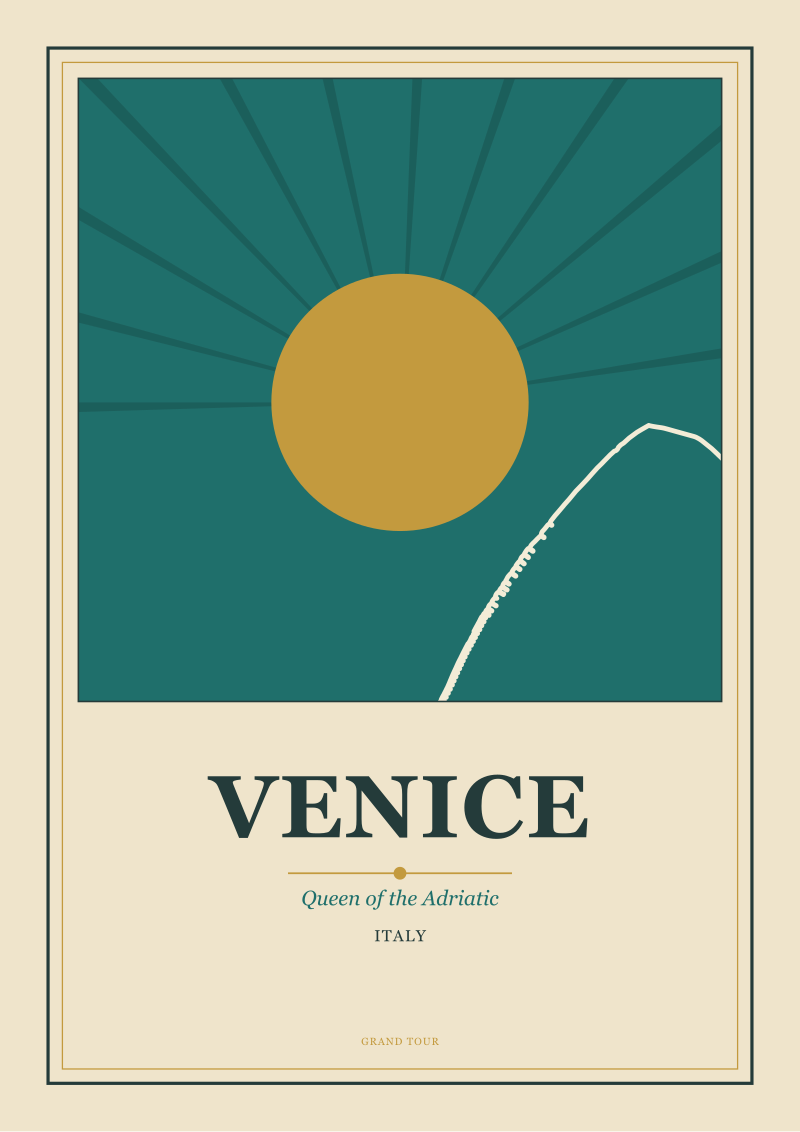 Venice
The print from this article · from €29.95
View the print →
Venice
The print from this article · from €29.95
View the print →
The Nineteenth Century Trained Us to See Venice as a Print
There is a historical debt to acknowledge. By the time photography arrived in Venice — Ponti and Naya, as we conceded above, worked from the 1850s onward, and their glass plates are still the best archival record we have of the city as it stood — the visual habit of representing the place had already been established by two full centuries of printmakers, watercolourists, and view-painters. The vedutisti of the eighteenth century, chief among them Canaletto and Bellotto, drew and painted Venice for the Grand Tour market as much as for the local one. Ruskin, in the 1840s and 50s, drew it obsessively and taught a generation of English readers to look at it through his hand. Whistler etched it in the 1880s and taught them how to look at it again, differently.
None of this is unique to Venice — Rome and Florence had their vedutisti too — but the concentration is unusual, and the consequence is that the modern visitor arrives with a set of visual expectations that are already graphic. When we say the Rialto looks a certain way, we frequently mean it looks the way Canaletto drew it, which is not the way it presents itself to a modern camera at any hour. The pre-photographic image industry set the terms. Photography, arriving late, has been playing catch-up in a room whose walls were already covered.
This is why the postcard rack in Venice, even now, sells so many reproductions of drawings and paintings. It is not sentimentality. It is that the drawn image continues to look more like the city than the photographed one does, because the drawn image is the one the tourist's memory is comparing everything to. Photographs of Venice are frequently disappointing because they contradict a mental picture that was itself never a photograph.
| Dimension | Photograph | Drawing |
|---|---|---|
| Handling of reflected light | Records literally, doubles information | Encodes by convention, three lines suffice |
| Editing of skyline weight | Democratic, gives cornice and campanile equal claim | Hierarchical, contour weight follows importance |
| Compatibility with water-level viewing | Struggles with horizontal strip composition | Native to frieze format since Canaletto |
| Fit with existing visual memory | Contradicts a memory built from prints and paintings | Matches the two centuries of imagery that trained the eye |
| Suitability for reproduction at small size | Loses subject at postcard scale | Retains legibility down to stamp scale |
Poster Logic: Why the Adriatic Reads Better in Ink Than in Pixels
The railway poster tradition of the first half of the twentieth century inherited all of the above and codified it. When the state railway companies and the great shipping lines commissioned artists to advertise Venice — as they did for every Adriatic and Mediterranean destination — they were solving a design problem that photography had already conceded. The image had to work at a distance of ten metres in a station concourse, at the size of a postage stamp on a timetable, and at the scale of a folded brochure held in the hand. It had to communicate the idea of Venice before the eye had time to read details. It had to survive being reproduced by a lithographic process that could not carry photographic subtlety anyway.
Ink solved every one of these problems by refusing to try to solve any of them literally. A poster of Venice from the 1920s or 30s is typically a violent simplification: two or three colours, a silhouette of the Salute or the campanile, a single gondola prow, a horizontal band of water. It is not attempting to record the city. It is attempting to sign it, the way a hand signs a letter. The signature is legible at every scale because it was designed to be. A photograph, cropped and printed at postcard size, becomes muddled at exactly this scale. The poster does not.
We think about this every time we sit down to draw a new print. The question we ask, before touching the paper, is not "what does Venice look like?" but "what is the smallest set of marks that will still mean Venice?" It is the question the railway posterists asked, and the vedutisti before them, and Whistler in his etchings. It is not a question a camera is built to entertain.
If the argument matters to you as a wall — a poster print that has to live in a room and be looked at, rather than an image that has to live on a phone and be scrolled past — the same reasoning applies. A drawn Venice, at the scale of a framed print, does what a photograph at that scale mostly cannot: it survives being lived with. This is one reason the studio's shop exists.
What the Drawn Venice Keeps That the Photographed Venice Loses
There is a temptation to end this argument on a mystical note about the soul of the city, and we will not indulge it. What the drawn Venice keeps is not soul. It is three specific things.
It keeps the horizon line. A photograph taken from the level of a walking human being on the Riva includes far more foreground and far less sky than any pre-photographic image of the same view. The pen, given the same subject, tends to raise the horizon or lower it deliberately, because the pen has to decide, and the decision usually favours composition over accuracy. Every good drawing of the Bacino is a drawing in which the horizon has been placed on purpose. Every good photograph of the same view is a photograph in which the photographer got lucky with a horizon that was placed for them by geography.
It keeps the silhouette. Venice, seen from the water — which is the only way it was ever meant to be first seen — is a silhouette punctuated by five or six vertical shapes. The pen can render those shapes at full weight against a blank sky, in the manner of Canaletto or of a 1930s railway poster. The camera renders them against whatever the sky happens to be doing at that moment, which is usually a haze that softens exactly the edges that ought to be sharpest.
And it keeps the argument. A drawing of Venice is always a drawing about something — about the Salute as a hinge in the skyline, about the length of the Riva as a slow horizontal, about the geometry of a single bridge. It has been edited to make a claim. A photograph, in its neutrality, refuses to make claims and thereby refuses one of the things visitors come to Venice looking for: a picture of what the city means, not just of what it contains.
The traveller who wants a record should take the camera. The traveller who wants an image — the thing that will hang on a wall and continue to say Venice long after the trip has faded — should look at what a pen can do.
This piece does not address the specific technical history of the twentieth-century Italian railway poster commissions, which is a subject deserving its own essay and which we will return to. It does not address how Venetian light differs across the seasons in ways that shift the case for either medium. And it does not address the entirely separate question of the moving image — cinema and Venice — which belongs in a different studio conversation. Each of those is a piece we owe.
FAQ
Was Venice being drawn before it was being painted for tourists?
Yes. The tradition of Venetian view-making predates the eighteenth-century Grand Tour trade by a considerable margin — printmakers, cartographers, and topographical draughtsmen were producing images of the city for centuries before the vedutisti industrialised the practice for foreign buyers. What Canaletto and Bellotto did in the 1700s was formalise a market and set a compositional standard; the underlying habit of seeing Venice as a subject for the pen was already old by the time they arrived.
Isn't it just nostalgia to prefer a drawing to a photograph in 2026?
We do not think so, and the piece above sets out why. The argument is structural: Venice's skyline is organised around a small number of dominant verticals separated by long low runs, and it sits on water that lights everything twice. Both conditions favour a medium that edits — assigns weight, discards detail, encodes reflection by convention — over one that records democratically. The preference for drawn Venice is not sentiment but a match between subject and tool.
Who were Ponti and Naya, and why do you mention them?
Carlo Ponti and Carlo Naya were among the earliest photographers to make a sustained visual record of Venice, working from around the 1850s onward. We mention them because their existence is the honest answer to the objection that Venice has never been well photographed — it has, and by them, from very early. The point of the essay is not that Venice cannot be photographed but that the photographed city and the drawn city do different work, and the drawn one continues to serve the traveller's memory better.
Why does the city being on a coastline matter to the argument?
The coastal geography — a shallow lagoon rather than an open sea — is the reason for the doubled light we describe. Venice is not built above the water; it is built into it, which means every facade functions as one side of a mirror composition. A pen can imply the reflected half of that composition with almost nothing; a sensor is obliged to record it in full. This is why the essay opens on the coastal identity of the city rather than treating the water as scenic backdrop.
Does this argument apply to other water cities like Bruges or Amsterdam?
Partly. Bruges and Amsterdam share the doubled-light condition and were also drawn extensively before being photographed extensively. But their skylines are lower and more even than Venice's, so the editing case is weaker — the camera has less compositional damage to do in a city whose profile is already democratic. Venice is an unusually strong case because its skyline is unusually hierarchical.
Where does the twentieth-century railway poster fit into this history?
It is the industrial synthesis of everything the pre-photographic image tradition had already worked out. The state railways and shipping lines needed images that would function at station-concourse scale, at postcard scale, and in the hand — and photography could not deliver at all three sizes with the same reliability that a lithographed drawing could. The poster tradition did not invent a way of seeing Venice; it inherited one, refined it for reproduction, and set the visual vocabulary most modern travellers still carry unconsciously.
If I want to bring home an image of Venice, should I take a camera at all?
Take the camera for the record — for the specific meal, the specific window, the accident of light that you will want to remember accurately. But treat the record and the image as separate projects. The photograph is for the private archive. The framed drawn print, on the wall at home, does the different work of continuing to mean Venice for the years after the trip. The two mediums are not competing for the same job.
 Amsterdam
The print from this article · from €29.95
View the print →
Amsterdam
The print from this article · from €29.95
View the print →

New city prints and 10% off your first order.
One email now with your code. No noise after.