We have read, at this desk, more articles about iconic skylines than we can honestly count. They arrive in the studio inbox as reference material, as pitch decks, as the polite background music of the poster industry we work in. They almost all miss the same three things, in the same order, for the same reason.
The reason is that they treat the skyline as a height contest. That framing sounds neutral. It is not. It quietly determines which cities are allowed to be beautiful and which are not, and it produces a canon that a poster artist — someone who has to actually draw a place with a limited number of lines — recognizes as false the moment they sit down at the desk. Hear us out.
What They All Get Wrong
The dominant framing across conventional coverage treats "iconic skyline" as a synonym for tall-building density seen from across a body of water. That is a specific and narrow visual grammar — Manhattan from Brooklyn, Shanghai from the Bund, Hong Kong from Kowloon — dressed up as a universal test. It smuggles a mid-twentieth-century American definition of a city into a discussion that pretends to be global.
Once you accept that framing, the errors compound. Cities without skyscrapers are downgraded or omitted. Cities whose silhouette is defined by something other than office towers are described as "not really" having a skyline, as if the skyline were a checkbox rather than a shape. Amsterdam becomes a "charming" city rather than a city with one of the most instantly recognizable urban profiles in Europe — a repeating rhythm of stepped and bell gables above a horizontal of water. Under the height-contest rubric, Amsterdam is not competing. Under the rubric a poster artist actually uses — can this place be reduced to a single stroke and still be legible? — Amsterdam wins outright.
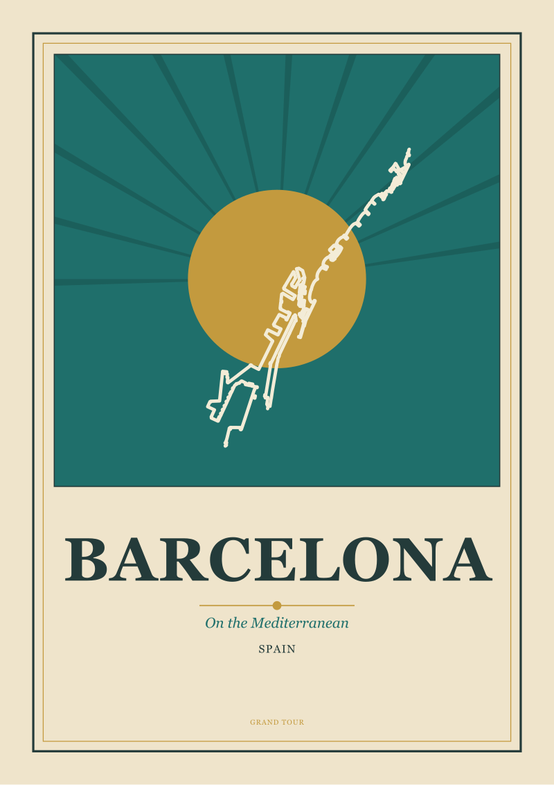
The same articles then treat coastal cities as skyline problems to be solved rather than as their own category. Barcelona sitting on the Mediterranean is described in terms of the Sagrada Família's height, or a comparative ranking of towers along the Diagonal, when the visual fact of Barcelona is a grid pressing against a coastline — the Eixample's rigid geometry meeting a soft, given edge. That relationship between the drawn and the given is the entire subject. It cannot be reached by counting floors.
The third recurring error is the omission of places that do not read as cities at all in the conventional grammar. The Amalfi Coast is drawn constantly — on labels, on postcards, in the interwar poster tradition — and yet a piece about iconic skylines will not mention it, because its buildings are white stacks pressed against a cliff and its silhouette is drawn primarily by geology. The coverage cannot see what the poster artists have been seeing for a hundred years: that the Costiera is a skyline in every functional sense, made of a vertical stack of houses against a horizontal of water. It just happens to be a skyline the height-contest framing was never designed to notice.
The error is not that these articles are careless. It is that they inherited a definition and never audited it.
What Is Almost Always Missing
What is missing, in almost every case, is the horizontal.
A skyline is a line between two things. Coverage of iconic skylines discusses only one of them — the upper line, the built profile — and treats the lower one as an inconvenient background. But the reason certain cities are drawable and others are not lies almost entirely in what the built profile is being drawn against. Water. Mountain. Sky held by a defining ridgeline. Whatever the horizontal is, it is doing at least half the work.
Chamonix is the honest case. A poster of Chamonix is really a poster of Mont Blanc with a village at its base; the mountain does most of the drawing, and the village earns its place by scale contrast. This is not a defect of the composition. It is the composition. Coverage that treats mountain towns as failed skylines — because the buildings are low — misreads what a skyline is for. It is a silhouette that tells you where you are. Chamonix's silhouette tells you exactly where you are the moment you see it, precisely because most of the line is not architecture.
Amsterdam is the same argument in a different key. The horizontal there is not geology but hydrology — the canal edge, running level and repetitive, against which the gable line reads as pattern. Remove the water and the gables become a decorative frieze. Add the water and they become a portrait of a specific place. Articles about Amsterdam's skyline almost always describe the gables. They almost never describe the canal as the co-author of the image.
What is also missing is any acknowledgment that the iconic skyline is a made object, not a found one. Someone drew it first. The stylized profile of a city that we now recognize on tea towels and refrigerator magnets was, in most cases, first proposed by a poster artist or a printmaker who chose which elements to keep and which to drop. The Riviera as a visual idea was largely constructed in the early twentieth century by the poster industry — a codified palette, a codified silhouette, a codified relationship between town and sea. Iconic-skyline coverage almost never notices this authorship, and so it discusses skylines as if they were natural facts. They are not. They are edits.
The last missing piece is scale. An iconic skyline has to survive at postcard scale, at postage-stamp scale, at logo scale. Most of the cities held up as icons in conventional coverage fail this test badly once you shrink the image. The tall-building grammar collapses into a bar chart. The cities that hold up are the ones whose silhouette resolves to one or two strokes.
 Amsterdam
The print from this article · from €29.95
View the print →
Amsterdam
The print from this article · from €29.95
View the print →
What I Would Say Instead
The framing we would offer, at the desk, is this: a skyline is iconic when a place resolves to a single legible silhouette against a horizontal that is not architectural. That is the whole test. It absorbs the height cases without being defined by them, and it explains, without contortion, why the cities that actually get drawn — the ones that end up on posters, on labels, in the visual shorthand of travel itself — are the ones they are.
Under this test, Amsterdam is iconic because a repeating gable line above a canal edge produces a silhouette that a child can copy. Barcelona is iconic because the Sagrada Família's cluster of towers, rising out of a rigid grid that meets the Mediterranean, gives you a signature vertical against two horizontals — the coastline and the grid itself — that are unusually clean. Chamonix is iconic because Mont Blanc supplies the entire upper line and the village supplies the scale reference. The Amalfi Coast is iconic because a white stack of houses against a cliff face against water is one of the most reducible compositions in European visual culture, which is why the poster tradition has never left it alone.
Notice what is absent from this test. Height. Skyscraper count. GDP. Tourist volume. None of these matter to the silhouette. What matters is the geometry of the encounter between the built and the given, and whether that geometry produces a shape you could ink in three or four strokes and still recognize. The height-contest cities pass this test occasionally — Manhattan does, at a specific angle, from a specific bridge, at dusk — but they are not the reference case. They are one case among several, and they are not even the most drawable one. Manhattan is much harder to reduce to a single stroke than Amsterdam is. That difficulty is not a compliment. It is a warning.
If you accept this framing, the coverage rewrites itself. Cities that were described as failed skylines because they lacked towers become fully-formed silhouettes with a different upper line. Cities that were described as iconic because they had towers become one specific composition among many. The Mediterranean coast, the Alpine valley, the canal city, and the harbor city all become legitimate skyline categories with their own visual logic — which is what the poster artists have been treating them as for over a century, without waiting for the coverage to catch up.
The next question, and it is the one this piece deliberately does not answer, is which of today's cities will still resolve to a single stroke a hundred years from now. That is a question for planners and for whoever gets to decide what a horizontal is allowed to look like — and it is where the real work on this subject begins.
FAQ
Why isn't skyscraper density the right test for an iconic skyline?
Density is one visual grammar among several, and it happens to belong to a specific twentieth-century American case that got generalized into a universal rule. The actual test a poster artist applies is whether a place reduces to a legible silhouette at small scale. Height-based coverage frequently fails this test — a bar chart of towers does not survive being shrunk to a stamp — while low-rise silhouettes like Amsterdam's gable line above a canal survive it easily.
What role does the horizontal actually play in a skyline?
It plays roughly half the role, and it is almost never credited. A skyline is a line between two things: an upper line, which is the built profile, and a lower line, which is the water, mountain base, coastline, or defining horizon the built profile sits against. Chamonix is drawn against Mont Blanc, Amsterdam is drawn against a canal, Barcelona is drawn against the Mediterranean, the Amalfi Coast is drawn against a cliff meeting the sea.
Is the Amalfi Coast really a "skyline" in any technical sense?
Functionally, yes. The Costiera is a stack of white houses pressed vertically against a cliff face, meeting a horizontal of water. That is a skyline composition — a legible silhouette produced by verticals against a horizontal — even though it does not match the tall-building grammar most coverage uses. The interwar poster tradition treated it as a skyline city long before contemporary criticism was willing to.
Are iconic skylines discovered or invented?
Largely invented, in the sense that someone had to draw the reduction first. The stylized profile of a place that we now recognize as its "skyline" is usually the product of poster artists, printmakers, and travel-industry designers who chose which elements to keep. The Riviera as a visual idea was substantially codified by the early twentieth-century poster industry, and much of what reads today as a natural silhouette is in fact an inherited edit.
Why do coastal and mountain cities get dismissed in most skyline coverage?
Because the dominant framing treats a skyline as an architectural achievement rather than a compositional encounter. Under that framing, a city whose upper line is a mountain or whose lower line is a coast looks like a city that failed to build tall. Under the compositional framing, those cities are simply drawing with a different set of tools, and often producing more reducible, more durable silhouettes than the tower-based cases.
What does "resolves to a single stroke" mean in practice?
It means the silhouette is legible when reduced to a very small size and a very small number of lines. If you can ink a place in three or four strokes and a viewer still knows what city they are looking at, the silhouette is doing its work. Amsterdam's gable rhythm passes this test. Chamonix's mountain-plus-village scale contrast passes it. Many height-driven skylines pass it only from one specific angle at one specific moment.
Does this framing exclude New York, Hong Kong, or Shanghai?
No. It absorbs them without privileging them. Each of those cities produces a strong silhouette from a specific angle against a specific body of water, and each qualifies as iconic in the compositional sense. The correction is that they are examples of the pattern, not the definition of it, and the tall-building grammar they belong to is one grammar among several rather than the reference case.
 Chamonix
The print from this article · from €29.95
View the print →
Chamonix
The print from this article · from €29.95
View the print →


New city prints and 10% off your first order.
One email now with your code. No noise after.