For the reader who suspects Art Deco travel posters are simply nostalgia in a nice frame — a mid-century aesthetic that still sells because it flatters the buyer's taste — we want to argue the opposite. Deco travel posters still work because they were engineered as compressions of real geography, and the geography has not changed. The likely objection is that any style, given long enough on dorm walls and hotel corridors, calcifies into cliché; that what we are defending is a look, not a logic. We will defend the logic. The look is downstream of it, and the look is why the Amalfi Coast, Amsterdam, Barcelona and Chamonix are still drawn the way they were drawn ninety years ago.
The Steel-Man: Yes, Deco Is a Period Style, and Periods End
The honest version of the objection deserves the honest version of the answer. Art Deco is a period style. It has a birth window in the early twentieth century, a maturity in the interwar decades, and a long afterlife as reproduction. Every style with that arc eventually flattens into shorthand: the Palm Springs font, the ocean-liner speed lines, the sunburst behind a resort name. When something is copied at that scale, the copies start to reference each other rather than the world, and at some point the audience stops seeing an image and starts seeing a mood. That drift is real. It is what happens to almost every design language given ninety years of admiration.
Two other honest concessions. First, the geometric palette of Deco travel posters — the flattened horizon, the tall narrow format, the compressed distance — is not a neutral way of showing a place. It is a choice with a history, and part of that history is commercial: railway companies and steamship lines needed images that could be read at a distance from a station wall or a ticket-office window, so the drawing was pushed toward clarity by the business, not just by the artist. Second, once a poster style becomes a signal of taste, buyers start to buy it for the signal. A Deco print in a hallway can mean "I have travelled" the way a well-shelved paperback can mean "I have read." Those uses of the image are legitimate. They are also not what we are defending.
What we are defending is more specific. The Deco travel poster of the twenties and thirties is not just a look that happens to survive. It is a solved problem in visual translation: how to render a real coastline, a real range, a real canal city so that a viewer at a distance recognises the place from its geometry alone. The look kept working because the underlying problem is the same one a drawing today has to solve.
Deco Was Engineered for the Distances We Still Travel
Consider what the poster had to do at the moment it was invented. It hung, usually, on a wall in a station hall or a passenger terminal. A traveller walked past it, or waited across the concourse from it, and the image had a few seconds to identify a destination. It could not depend on caption reading, because the caption was small and the light was often bad. It could not depend on photographic detail, because the reproduction technology of the period rendered detail into mud. What it had was flat colour, hard edge, and the silhouette of the place.
The Deco travel poster's answer was to strip the destination to the two or three geometric facts that made it unmistakable. A coast became a curve against a plane of sea. A mountain became a triangular mass with a specific proportion. A canal city became a horizontal band of gables above water. This is not stylisation for its own sake. It is compression toward the shapes a viewer already carries in memory.
The reason this method has not aged is that the viewing conditions have barely changed. A traveller today scans a phone screen at the same speed and with the same tolerance for detail as their grandparent scanned a wall. The Instagram thumbnail, the Airbnb hero image, the search-result card — all of them ask an image to identify a destination in under a second, from a distance, with no caption doing the work. Photographs almost always lose this contest because they carry too much information. A drawing built on geometry wins it, because geometry is what memory stores.
The Deco poster, in other words, was not designed for the world it grew up in. It was designed for the exact viewing conditions that came back with the smartphone. It just had to wait.
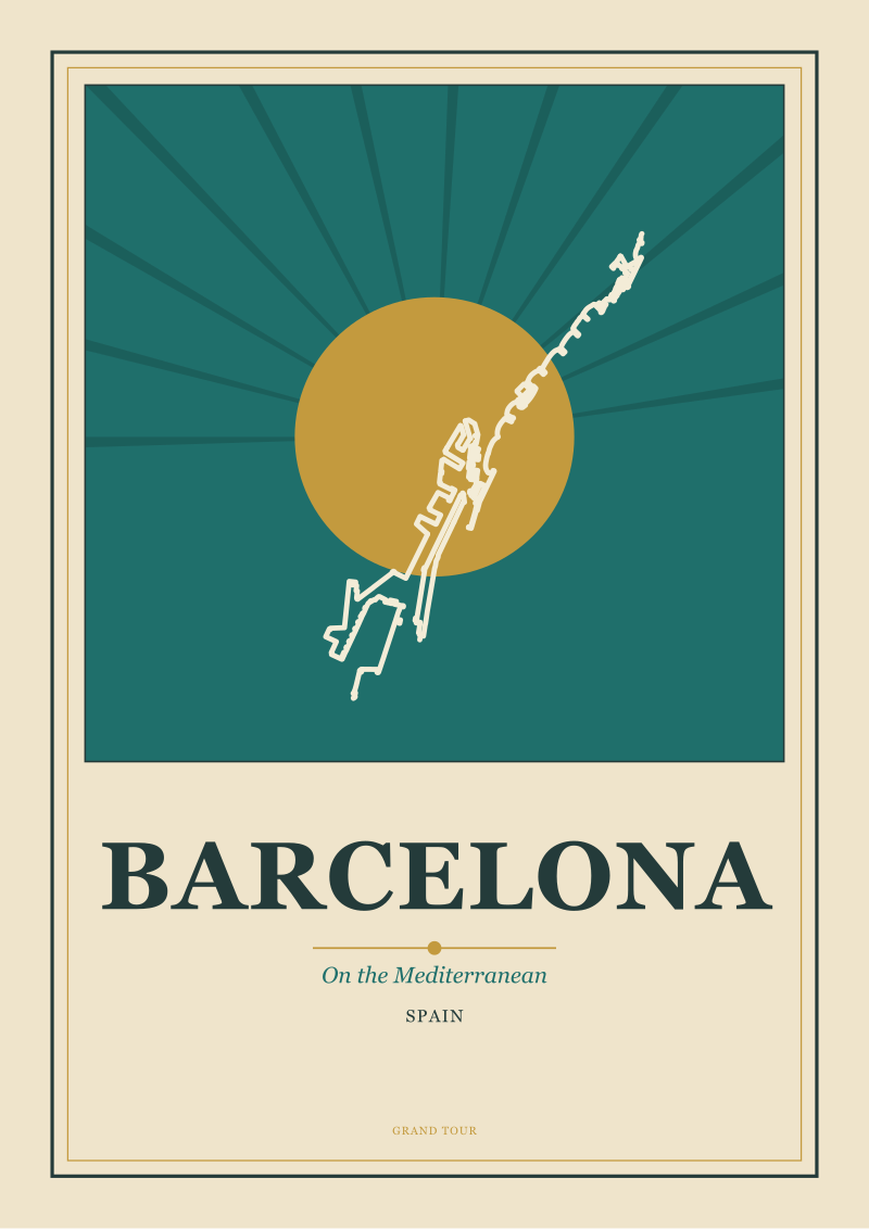 Barcelona
The print from this article · from €29.95
View the print →
Barcelona
The print from this article · from €29.95
View the print →
The Coastline Does the Work: Why Deco Reads Amalfi and Barcelona Correctly
Take two of the destinations a working poster studio comes back to constantly: the Amalfi Coast and Barcelona. Both are coastlines. Neither reads correctly in a photograph. A photograph of Amalfi tends to focus on one town — the pastel stack of houses at Positano, the arch of the cathedral at Amalfi itself — and lose the fact that what people mean by the Costiera is the sequence: the road bending along the cliff, the villages placed as accents along it, the sea below as a continuous plane. What made the coast famous is not any single town. It is the section. Deco understood how to draw sections.
| Dimension | What a photograph captures | What a Deco poster compresses |
|---|---|---|
| Amalfi Coast subject | A single town or terrace | The cliff-line as a rhythm of curves and towns |
| Barcelona subject | Sagrada Família or a rambla scene | The city meeting the Mediterranean as a horizontal edge |
| Depth cues | Atmospheric haze, lens perspective | Overlapping planes of flat colour |
| Reading time to identify place | Two to three seconds | Under one second |
| Detail level | High and often redundant | Low and load-bearing |
Barcelona is the same argument turned ninety degrees. The photographs of Barcelona that circulate are almost never of the thing that actually defines the city, which is the meeting between the grid and the sea. A traveller who has walked from the Eixample down to the water knows this — the city hands you over to the Mediterranean at a specific edge, and that edge is what Barcelona means as a destination. Deco could draw that edge. It had the vocabulary for hard horizontals meeting hard verticals, for the water as one plane and the city as another, for the way a coastline becomes an argument between two colours.
This is not aesthetic preference. It is accuracy. When a poster of Barcelona reduces the city to the meeting of grid and sea, or a poster of Amalfi reduces the coast to a curve of villages threaded along a cliff, the poster is being more faithful to what the place actually is than a wide-angle photograph of the same subject. The Deco method survived because the destinations it was built to compress are still shaped the way they were shaped in 1930.
A City Drawn in Planes: Amsterdam, Chamonix, and the Deco Instinct for Structure
Amsterdam and Chamonix look, at first, like opposite problems. One is horizontal and wet; the other is vertical and dry. In fact they are the same problem, and Deco solved both of them the same way.
Amsterdam is a river city built on a system of canals. Its identity as a destination — the reason it is called the City of Canals in the first place — lives in a specific geometric fact: the water and the buildings occupy the same visual plane, at roughly the same scale, with the gables reading as a serrated top edge above a flat bottom edge of canal. A photograph of Amsterdam tends to pull toward one bridge or one façade, and the moment it does, it loses the pattern. Deco does not lose the pattern. The Deco instinct is to treat the gables as a repeated motif, the water as a mirror plane, and the whole city as a horizontal composition read from across a canal — which is, in practice, how anyone actually looks at Amsterdam when they are in it.
Chamonix is the vertical case. It sits beneath Mont Blanc, and its identity is the confrontation between a settled valley and a massif that rises out of it. What Chamonix means as a place is not the town and not the mountain; it is the ratio between them. Photographs of the valley chronically fail here because a lens either takes the mountain and loses the town, or takes the town and shrinks the mountain into a background. A drawn poster in the Deco tradition can hold both at their true proportion by flattening everything else — the middle distance, the tree line, the atmospheric depth — so that only the two load-bearing shapes remain. This is not simplification. It is the drawing telling the truth about which two objects the place is made of.
The through-line from Amsterdam to Chamonix is that Deco was, at bottom, structural drawing. It was drawing that asked what a place is built out of before deciding what to render. That is not a period habit. That is a working method, and working methods travel across styles.
 Amsterdam
The print from this article · from €29.95
View the print →
Amsterdam
The print from this article · from €29.95
View the print →
What You Should Actually Do When You Look at One
If you are the reader we opened with — someone who wants to like Art Deco travel posters but suspects the affection is nostalgia in disguise — do this the next time you stand in front of one. Ignore the palette. Ignore the typeface. Ignore the border and the stylised sunburst if there is one. Look at the two or three shapes doing the geometric work. Ask what those shapes are: a coast, a range, a river bend, a grid, a gable line. Then ask whether those shapes are still the shapes of the place. If they are — and for most of the great Deco destinations, they still are — you are not looking at nostalgia. You are looking at a drawing that got the geometry right and has been quietly waiting for the world to notice again.
Then, if you find yourself wanting one on a wall, choose the poster by the place rather than by the aesthetic. Pick the coast you have walked, or the valley you want to walk, or the city whose structure you understood as soon as you saw it. The Deco method rewards specific attachment better than it rewards general taste. We keep drawing these destinations because they are the places whose geometry has survived — the Amalfi Coast as a cliff-line, Barcelona as a hard edge against the Mediterranean, Amsterdam as a repeated gable above still water, Chamonix as a ratio. The style is old. The geography is older. That is the whole defence.
Where this leaves the argument is not, we think, at a conclusion. It is at the next question, which is the one every poster on every wall eventually raises: what are the destinations being drawn today that will still be drawable in ninety years, and what will have changed underneath them by then? That is the harder essay, and it is not this one.



New city prints and 10% off your first order.
One email now with your code. No noise after.