The Orient Express began running from Paris toward Constantinople in 1883. The posters commissioned to sell it did not, for the most part, show the train. They showed the destination — a minaret against a flat sky, a coastline reduced to two colours, a bridge held by three shapes — treated as an image the passenger had already earned by buying the ticket. This is an editorial choice, not an aesthetic drift, and it separates the poster art of the Compagnie Internationale des Wagons-Lits era from the tourism advertising that followed it. The pros are legible in every surviving lithograph. The cons are legible in what the posters left out.
What the Numbers Actually Say
Count what is on the paper. In the surviving Wagons-Lits poster corpus that circulated between the first Paris–Constantinople service in 1883 and the last pre-war Simplon-Orient timetables, the ratio of destination-only images to train-forward images is heavily skewed toward destination. Coastlines, domes, bridges, mountains — these carry the composition. The locomotive, when it appears at all, is usually a horizontal band at the bottom of the frame or a plume of steam angled to lead the eye up toward the city. The city is the subject. The train is punctuation.
The palette count is equally revealing. Most posters in the era were printed as lithographs with a working range of four to seven flat colours. A poster of Constantinople in this period is often two colours of sky, one of water, one of stone, and a single accent for the minarets. The technical constraint of the flat-colour lithograph forced editorial simplification, and the artists commissioned by Wagons-Lits treated that constraint as a compositional gift. A coastline like the Amalfi Coast, drawn in this vocabulary, becomes a single sweeping line separating the sea from the cliff, with the towns reduced to blocks of ochre pinned at intervals along it. Nothing is rendered. Everything is placed.
The typography obeys the same discipline. City names are set in a display face and locked to a corner of the frame, usually the lower third. The railway's name — Compagnie Internationale des Wagons-Lits et des Grands Express Européens, a mouthful even in French — is either compressed into a monogram or relegated to a strip along the bottom. The reader's eye is told, in the hierarchy of the type, that the destination is the product and the train is the delivery mechanism. That hierarchy is the first thing modern travel advertising abandoned when it started leading with airline liveries and hotel logos.
The routes drawn on the map inserts, when maps appear at all, are similarly editorial. A line drawn from Paris eastward toward Vienna and beyond does not indicate every stop. It indicates the arc — Paris, an alpine crossing near Chamonix or the Simplon, an Italian junction, the Adriatic, the Bosphorus. The map is a promise about geography, not a schedule.
What Nobody Mentions
The corpus omits three things systematically, and modern reproductions rarely draw attention to what was cropped.
The first omission is the interior of the train itself. Wagons-Lits carriages were, by any honest description, the most luxurious rolling stock ever built for public revenue service, and the company's own promotional booklets did document the marquetry, the pressed leather, the dining-car china. But the posters — the pieces that hung in station concourses and travel-agent windows — almost never showed the sleeping compartment or the dining car. A single interior view survives in the popular imagination for every twenty destination portraits. The reason is commercial, not aesthetic: an interior sells one thing, the journey; a coastline sells the entire idea of leaving.
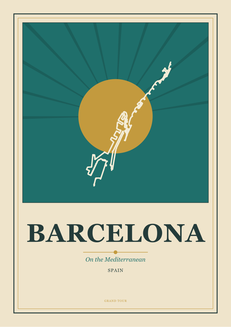
The second omission is weather and season, treated as fixed. The posters of the Adriatic and the Mediterranean, and of stops that fed the Wagons-Lits network from the coast, show a permanent summer. Amalfi is always noon. Barcelona is always the light-flooded Mediterranean afternoon, its coastline reduced to a sequence of horizontals with a single accent of red tile roof. Amsterdam is always the pale blue northern day that flatters the canals into ribbons — a City of Canals rendered as if the water were the actual medium of the poster, with everything else drawn on top of it. Winter, fog, rain, the drizzle a passenger would have actually met in November on the Paris–Vienna leg — none of it exists in the poster record. The passenger is being sold the idea of a place at its most drawable.
The third omission is the passenger. Human figures, when they appear, are silhouettes: a woman with a parasol on a promenade, a coachman on a bridge, a boatman on the canal. They are scale references. They are never portraits. The passenger buying the ticket is not shown enjoying the ticket, because the poster is not selling identification with a person — it is selling identification with a place. This is a subtle distinction, and it is the exact opposite of the strategy adopted by post-war airline advertising, which began by showing the stewardess, then the businessman, then the family, then the couple, and eventually reduced the destination to a background element behind a lifestyle scene. The Wagons-Lits poster reverses that hierarchy every time.
The final unmentioned discipline is what happens at the edges. Look at any Chamonix poster of the era. Mont Blanc is not centred. It is offset, cropped by the frame, its full mass implied rather than shown. The alpine posters in the Wagons-Lits family understood something that later mountain photography forgot: a mountain drawn to fit the frame reads smaller than a mountain that the frame cannot contain. Chamonix beneath Mont Blanc is a place where the mountain is bigger than any single view of it, and the posters honoured that by refusing to show all of it at once.
 Chamonix
The print from this article · from €29.95
View the print →
Chamonix
The print from this article · from €29.95
View the print →
The Real Cost
Work through what those editorial choices cost the passenger, and the accounting turns out to be honest in one direction and quietly dishonest in the other.
The honest cost was legibility. A poster reduced to four colours and one strong compositional idea travelled well. It could be read from across a concourse. It reproduced without loss in a travel-agent's window. It survived being folded into a brochure. The Wagons-Lits image system was designed for a distribution problem, and the geometric flattening of a coastline or a skyline was the price of that distribution. Compared to a photograph, the poster gave up detail and gained recognition. A passenger who had never seen the Amalfi coast could hold the poster's version of it in memory and match it, roughly, to what actually appeared out the window a week later. The poster taught the eye what to look for.
The quiet cost was the flattening of difficulty. A poster of Chamonix that shows Mont Blanc as a clean triangular presence above a valley of pine implies that arrival is the whole of the alpine experience. It does not show the weather that closes the pass. It does not show the two-day carriage transfer from the nearest Wagons-Lits stop to the actual base of the mountain, which was a real feature of pre-cable-car alpine travel. It does not show what happens when the train is late. The poster's job was to compress the friction of the journey into a single frictionless image, and the friction had to go somewhere. It went into the passenger's actual experience, which was, on any honest reading of period travel diaries, both more work and more reward than the poster admitted.
The same accounting applies to the coastal posters. Barcelona, drawn as a Mediterranean horizontal, does not show the harbour traffic that a passenger disembarking from a connecting steamer would have navigated. Amsterdam, drawn as a City of Canals, does not show the industrial ring that the train actually passed through on its approach. The posters chose the image the city wanted to be, not the image the city was. This is a defensible editorial position — every city has an image of itself, and honouring that image is part of what makes travel meaningful — but it is an editorial position, and it should be named as one.
The composite bill, then, has two lines. On one side, a visual vocabulary that made destinations legible and portable, that taught the eye to see cities as compositions, and that produced a body of work still copied, badly, in nearly every travel graphic made since. On the other side, a systematic omission of weather, effort, and arrival friction, which set a template that the entire tourism industry has been trying and failing to live up to for a century. The passenger got a picture worth keeping. The picture was, in the specific ways detailed above, incomplete.
If You Only Remember One Thing
The Wagons-Lits poster of the Orient Express era is not a picture of a train. It is a picture of a place, chosen and simplified to be legible from across a room. The train is the reason the picture exists and the reason it is worth owning, but the train is not the subject.
That inversion — destination as subject, transport as premise — is the single editorial choice that separates the poster art of this era from everything that came after it. Everything else in the Wagons-Lits image system, from the palette count to the treatment of the human figure to the cropped mountain at the edge of the Chamonix frame, follows from that one decision.
None of this settles the harder question of why certain places became drawable in the first place, and why some destinations resisted the poster treatment while others surrendered to it whole. That question — which cities are inherently image, and which are only ever description — is where the real work starts, and it is not where this piece ends.
 Paris
The print from this article · from €29.95
View the print →
Paris
The print from this article · from €29.95
View the print →
FAQ
Why did Wagons-Lits posters show destinations instead of the train itself?
The company treated the train as a premise the buyer had already accepted by walking into the ticket office. The poster's job was to make the destination legible from across a concourse, not to advertise rolling stock. Locomotives, when included, sit as horizontal punctuation at the base of the frame. The subject was always the place — a coastline, a dome, a bridge — reduced to the fewest shapes a lithograph could carry without losing recognition.
What was the typical colour count of an Orient Express-era travel poster?
Most surviving lithographs in the Wagons-Lits corpus worked in a range of four to seven flat colours. The constraint was technical — flat-colour lithography did not reward gradients — but the artists used it as editorial discipline. A poster of Amsterdam might resolve to a pale water-blue, a stone grey, one warm accent for brick, and black for the type. Simplification was not a compromise. It was the compositional language of the medium.
Did the posters ever depict winter, rain, or bad weather along the route?
Almost never. The Wagons-Lits corpus shows a permanent, flattering season — Amalfi at midday, Barcelona in Mediterranean afternoon light, Amsterdam under a pale northern blue. Weather that a passenger would actually have met in November on the Paris–Vienna leg is systematically absent. The omission is deliberate: the poster sold the idea of a place at its most drawable, and drawable weather is calm, clear, and lit from one direction.
Were human figures common in the posters?
Rarely, and never as portraits. When a figure appears — a woman on a promenade, a boatman on a canal, a coachman on a bridge — it functions as a scale reference for the architecture or coastline behind it. The Wagons-Lits system deliberately avoided placing the passenger inside the scene, because the strategy was to sell identification with the destination itself, not with a lifestyle to be enacted there.
How did the posters treat major geographic anchors like mountains or coastlines?
By cropping them. A Chamonix poster does not fit Mont Blanc inside the frame — the mountain is offset, its mass implied by what continues past the edge. An Amalfi coast is a single sweeping line separating cliff from sea, with towns reduced to ochre blocks pinned along it. The rule was consistent: a landform drawn to fit the frame reads smaller than a landform the frame cannot contain.
How is this poster tradition different from later airline or tourism advertising?
The hierarchy inverts. Post-war airline advertising leads with the carrier's livery, then the crew, then a lifestyle scene, with the destination reduced to a backdrop. Wagons-Lits posters do the opposite: destination as subject, transport as small type at the base of the frame. The shift traces the century's change in what travel was understood to be selling — first a place, later a version of the buyer's own life staged in that place.
Are original Wagons-Lits posters still in circulation today?
Original lithographs from the 1883–1939 window do surface at auction and in specialist print rooms, though condition varies widely and attribution to specific artists is often uncertain outside the best-documented commissions. What is more widely available, and more widely reproduced, is the visual vocabulary itself — the flat colour, the cropped landform, the destination-as-subject discipline — which continues to inform how the studio at Grand Tour Prints draws European cities for the shop.
From the collection


New city prints and 10% off your first order.
One email now with your code. No noise after.