How did the two-poster wall over a sofa become the most quietly argued-over surface in a living room? We draw cities for a living, and roughly a third of the questions that arrive at the studio are not about a single poster at all — they are about two of them, side by side, above a sofa that is already there. The Amalfi Coast next to Chamonix. Amsterdam next to Barcelona. A coastline against a river, a river against a mountain. What follows is a working history of that wall, told through the moments when the pairing changed.
1962: The Two-Poster Wall Enters the Living Room
The first thing to say is that the pairing is younger than the poster. For roughly the first sixty years of the modern travel poster — the era of railway commissions, ocean-liner campaigns, and the great Alpine and Riviera printings — the poster lived in stations, in ticket offices, on hoardings. It was public. It was singular. It shouted a single destination at a passing crowd.
The wall above a sofa, by contrast, is a domestic surface. It waited for a specific configuration of the room to make sense. That configuration arrived in the early 1960s, when the deep, low-slung sofa became the anchor of the living room in Western Europe and North America and left, above it, a wide horizontal band of empty wall. That band is what the two-poster pairing was invented to answer.
Two posters, framed and hung side by side, filled that band with something the single large canvas could not: a conversation. One image was a proposition; two images were a comparison. A coast against an inland city. A summer place against a winter one. A place the household had been against a place it had not.
We think of this decade as the moment the travel poster left the station and moved indoors, and the moment the pairing — not the single image — became the domestic form.
1974: The Sofa Becomes a Horizon Line
By the mid-1970s the sofa had grown lower and longer, and the wall above it had grown correspondingly wider. That geometry changed how the two posters spoke to each other. The top edge of a sofa is a very insistent horizontal line. Anything hung above it is, whether the household means it or not, floated on a horizon.
This is when we begin to see, in the pairings that survive from the period, a compositional habit that has not really left since: matching or answering the horizon inside each poster to the horizon of the sofa. An Amalfi Coast poster, drawn with the Costiera falling in terraces from the mountain ridge to the water, has a strong internal horizon roughly a third of the way down. A Chamonix poster drawn beneath Mont Blanc — with the valley floor of the Arve as its base and the summit as its ceiling — has an internal horizon much lower.
The 1970s pairing began to notice this. When both posters used a roughly matching horizon line, the pair read as a single continuous landscape stretched across the sofa. When the horizons deliberately disagreed — a low valley on the left, a high coastal ridge on the right — the pair read as a discussion, not a panorama. Neither is wrong. But the sofa is the base line that decides which effect the room will get.
The lesson, from this decade onward, is that a two-poster pairing is not really hung above a sofa. It is hung against the top edge of the sofa, and the sofa participates.
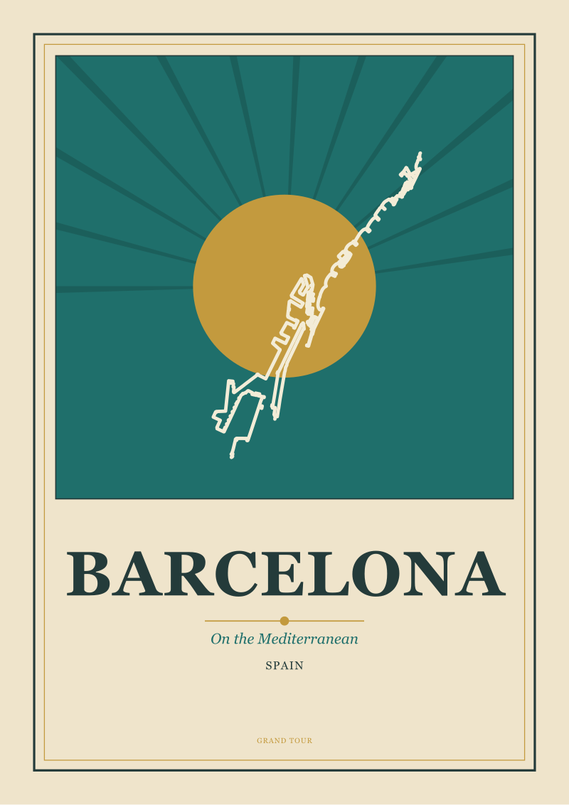 Barcelona
The print from this article · from €29.95
View the print →
Barcelona
The print from this article · from €29.95
View the print →
1989: The Coast-and-Mountain Pairing Refuses to Die
By the late 1980s a specific pairing had established itself as the dominant one, and it has never really been dislodged. It is coast on one side and mountain on the other.
There is a reason for this. The old travel poster tradition, running back through the interwar railway and steamship printings, had already trained the eye to see Europe as a set of paired seasons: the summer coast and the winter Alp. Riviera posters and Alpine posters were often produced by the same railway companies and often hung in the same waiting rooms. The pairing was not decorative — it was the calendar of the year the railway sold.
The Amalfi Coast and Chamonix are the surviving version of that calendar. The Costiera as the drawn coast, its promontories advancing into the Tyrrhenian in a rhythm the eye reads as descent. Chamonix as the drawn valley, the Arve threading its base while Mont Blanc anchors the top of the frame. One image falls toward water; the other rises toward snow. Placed side by side, they inherit a whole century of poster grammar without the household needing to know it.
We have watched this pairing outlive several waves of decorating fashion. Households that own no other framed art will often have exactly these two. The reason, we think, is that the pairing is not about either place. It is about the year having two ends.
2004: The Canal Poster Learns to Sit Next to a Coast
The pairing that came next was harder, and the studio watched it settle into place around the mid-2000s. It is the river or canal city next to the coast.
The classic example is Amsterdam and Barcelona, and it is instructive because the two cities do not, on paper, belong together. Amsterdam is drawn from its ring of canals — a pattern of arcs whose defining line is water inside the city. Barcelona is drawn from its Mediterranean edge and its grid — a pattern whose defining line is water outside the city, and whose interior is the disciplined geometry of the Eixample. One is a wet interior; the other is a dry interior with a wet edge.
For a long time these two subjects were considered structurally incompatible on a wall. The Amsterdam poster reads as a plan — you look down onto the canals — and the Barcelona poster tends to read as a section, either from the sea or from above the ridge. The eye did not know how to accept one as the neighbour of the other.
What resolved it, in our experience, was the arrival of the balanced palette. When both posters were drawn in the same restrained colour range — the same paper white, the same range of blues and terracottas — the compositional difference stopped being a fight and became a productive contrast. Plan on the left, section on the right; canal water inside, sea water outside; and the same hand drawing both. Palette became the diplomat.
 Amalfi Coast
The print from this article · from €29.95
View the print →
Amalfi Coast
The print from this article · from €29.95
View the print →
2019: Pairing as Composition, Not Decoration
The most recent shift is the one we still work inside. By the end of the 2010s, our correspondence with households had changed. The question had stopped being which two posters and had become how these two should be composed against each other.
Households now ask whether the two posters should face the same way or face each other; whether the dominant diagonals should agree or oppose; whether the horizon lines should align or deliberately shear. These are compositional questions, not decorative ones. They are the questions a poster artist asks before committing a plate.
We have a small set of working answers. Face the posters toward each other rather than both toward one end of the sofa — the pair becomes a single object rather than a queue. Give the pair a shared sky, either literal or implied by matching paper tone, so that the wall between the two frames is read as continuous. Let one poster carry the vertical energy and the other the horizontal: Chamonix will always want to be the vertical one, the Amalfi Coast will always want to be the horizontal one, and Barcelona and Amsterdam can play either role depending on which crop of the city is chosen.
This is also the decade when the studio began treating the two-poster pairing as a single commission rather than two — a shift you can see in our own /shop/ pairings, which are drawn to be neighbours rather than merely offered as options next to each other.
What It All Means
The living-room wall above a sofa is not a neutral surface, and the two posters hung on it are not two decisions made twice. They are one decision made once, with the sofa participating as a third element. The horizon line of the furniture, the internal horizons of each drawing, the palette agreement or disagreement between the two frames, and the compositional stance the pair takes toward each other — these are the four variables. Every question that reaches the studio about pairing turns out, on inspection, to be a question about one of them.
The reason the coast-and-mountain pairing has outlived every fashion is that it answers all four variables in a stable way. The reason the canal-and-coast pairing was hard for so long, and is easy now, is that palette discipline eventually resolved a compositional argument that geometry alone could not. And the reason the current decade's pairings feel more considered than the 1970s ones is that households have stopped asking us for two nice posters and started asking for a composition.
This piece does not cover a few things we care about and have views on. It does not address frame choice, matting width, or the specific hanging heights that make a pair sit correctly above different sofa depths — those are worth their own field notes and would double the length here. It does not address three-poster arrangements, which behave under different rules and are not simply "two plus one". And it does not address the question of pairing a city you have lived in with one you have only visited, which is an emotional composition rather than a formal one, and deserves an essay rather than a section.
FAQ
Should the two posters be of places we have both visited?
There is no rule that says so, and in practice the strongest pairings we have drawn are often one place a household knows well and one it does not. The pairing then does a specific piece of work: it puts the familiar place in conversation with an aspirational one, and each poster changes how the other is read. If both places are equally familiar, the wall becomes a memory shelf. If both are equally unknown, it becomes a mood board. A mixed pairing tends to sit longest in a room.
Do the two posters need to be the same size?
They should be the same outer frame size when hung directly above a sofa, because the sofa's top edge is such a strong horizontal that any asymmetry in the frames above it reads as an error rather than an intention. Inside the frames, the compositions can differ — a vertical cityscape can sit beside a horizontal coastline — as long as the framing itself is matched. Different sizes belong on gallery walls, not above sofas.
Coast and mountain, or two coasts?
Both work, but they do different jobs. Coast and mountain — the Amalfi Coast next to Chamonix is the archetype — gives the wall the old railway-poster calendar of summer and winter, and reads as a year on a wall. Two coasts, for example the Amalfi Coast next to Barcelona, reads as a single Mediterranean argument told in two accents. The first pairing widens the room's imaginative reach; the second deepens it. Neither is more sophisticated than the other.
Can a canal city and a coastal city sit together?
Yes, and this pairing has become one of the studio's most requested. Amsterdam next to Barcelona is the working example: one drawn from its ring of canals, the other from its Mediterranean edge and grid. The pairing was harder before restrained, matched palettes became standard, because plan-view and edge-view drawings fight when their colour temperatures disagree. Drawn in a shared palette, the contrast between interior water and exterior water becomes the point of the wall rather than a problem on it.
How does the sofa itself influence the pairing?
More than most households expect. The top edge of the sofa acts as a horizon line for anything hung above it, so the two posters are read against that line whether the artist intended it or not. Low, long sofas favour pairs with matching internal horizons, because the wall reads as a continuous landscape. Higher-backed or more architectural sofas absorb pairs with deliberately different horizons, because the furniture is already asserting its own geometry and the posters can afford to disagree.
Should the posters face each other or face the same direction?
Facing each other, in almost every case. When both posters point their dominant diagonals toward the centre of the pair, the two frames read as a single composed object above the sofa. When both point the same way, the pair reads as a queue moving off one end of the wall, which unsettles the room's balance. The one exception is a deliberately narrative pairing, where the household wants the eye to move from left to right — for instance from an inland valley toward a coast — as a small journey.
Is there a pairing the studio would gently steer away from?
Two versions of the same subject. Two coasts drawn in the same register, two canal cities drawn in the same register, two Alpine valleys — these pairings collapse into a single image read twice, and the wall loses the conversation that made the two-poster form worth adopting in the first place. The pairing wants difference held inside agreement: the same hand, the same palette, the same paper, but two distinct geographies. Sameness of geography is the one axis on which a pair almost always fails.



New city prints and 10% off your first order.
One email now with your code. No noise after.