Most gift guides for travel poster enthusiasts are ranked lists of ten prints with a star rating next to each. We think that is precisely the wrong shape for this gift, and for this reader. Hear us out. A travel poster is a portrait of a place — Paris along the Seine, for instance, is drawn from the river's actual geometry, not from a mood board — and the right print for someone depends less on what is popular this year than on three quiet questions about who they are as a looker. So this guide is a flowchart in prose. We will ask you three things, and route from there.
Question 1: Does the Recipient Know the City, or Only the Idea of the City?
This is the fork that decides more than people expect, and it is the one gift guides never ask.
There is a real difference between the friend who has walked from Île de la Cité down to Pont de Sully on a wet October evening and the friend who has never been to Paris but has held the idea of it — the boulevards, the zinc rooftops, the river — as a private landscape for years. Both are legitimate recipients of a Paris print. But the print that will land for each of them is not the same print.
If Yes: they know the city
Give them a portrait that rewards recognition. This is the version that treats the Seine as a specific line rather than a decorative squiggle — a drawing in which the river's actual bends are the composition, where the two islands sit exactly where the recipient remembers them from a bridge they crossed at some particular hour. The pleasure of this kind of print, for a person who knows the place, is the pleasure of a well-drawn map that also happens to be beautiful. It confirms rather than instructs. They will stand in front of it and locate their old apartment, the bookshop, the crossing they used most. That is the gift.
If No: they know the idea
Give them the icon version. Not literally the Tour Eiffel by itself — that reduces the city to a souvenir — but a portrait that leans into the drawn, poster-like tradition: the graphic river, the confident silhouette, the sense of a place seen through the golden age of travel print rather than through a phone camera. This person is not going to compare the print to a memory of a specific afternoon. They are going to fall into it as a mood. The right print for them borrows the visual grammar of the railway posters that first taught people, a hundred years ago, what it felt like to want to go somewhere.
Question 2: Are They Furnishing a Single Wall, or Building a Series?
The second fork is about scale of ambition. A print bought for a single wall is a full stop; a print bought as the first of a series is an opening sentence. These are entirely different gifts, and they behave differently in a room over time.
We ask this because most people cannot answer it about themselves. You often can, from the outside. If the friend has a home whose walls are already composed — a photograph here, a framed something there, a considered emptiness — a single sovereign print is likely what will land. If instead their walls read like a work in progress, the gift that opens best is the one they can extend.
If Yes: a single, sovereign print
Choose the print that can hold a wall alone. This tends to mean a portrait that has enough internal composition — river, skyline, weight of type — to carry the room by itself. Paris along the Seine works exactly here: the river gives the whole image a spine, so the print does not need a partner to feel finished. Frame it larger than instinct suggests. A sovereign print at a modest size reads as an accessory; the same print sized up reads as the room's argument.
If No: the first of a series
Choose the print that is unmistakably part of a family. Same studio, same drawing hand, same treatment of geography — the river-line logic in Paris, the coast-line logic somewhere else, the section-through-a-hill logic somewhere else again. The gift here is not just the Paris print. The gift is the promise, legible to the recipient the moment they open it, that this is a series you can walk into. In a year they will own three of these. In three years, seven. The room becomes a small private map of Europe. That is a completely different kind of pleasure from the single-print wall, and it is a specific kind of person who wants it.
 Paris
The print from this article · from €29.95
View the print →
Paris
The print from this article · from €29.95
View the print →
Question 3: Do They Love the Golden Age, or the Line Being Drawn Today?
The third fork is the taste question — and the one where studios like ours are, honestly, most opinionated. The golden age of the travel poster, roughly the interwar decades, produced work that still owns the visual language of going somewhere. Art Deco, in particular, invented the confident diagonal, the flat sky, the sans-serif that means "railway timetable." A person who loves this era loves that vocabulary. But there is also a contemporary line — work being made now, using geographic data and clean typography and the studio-drawn aesthetic — that is not merely a pastiche of the 1930s.
If Yes: give them the historical register
Reach for prints that speak in the deco vocabulary — reduced palette, geometric confidence, the sense that the image was cut rather than sketched. The recipient of this kind of gift is often someone who reads about the Grand Tour, who knows why a certain kind of railway poster looked the way it did, who understands that Chamonix as a destination was in part invented by an image. Do not condescend to them with a reproduction. Give them a contemporary print that has genuinely absorbed the tradition rather than sampled it.
If No: give them the line being drawn now
Reach for the studio-drawn print that treats geography as its source material. This is where a Paris drawn from the real river geometry — via the openly licensed map data of OpenStreetMap, in our case — earns its keep. The recipient here loves the fact that the print is not a mood board but a portrait made from something. They want to know the drawing began with the Seine's actual line. They want the print to be of the twenty-first century in its methods, even if it is unhurried in its manner. Tell them that when you give it. It is part of the gift.
If You Answered Everything: The Recommendation Table
Eight possible combinations. Below is the map from your three answers to a concrete recommendation. Each cell is one sentence, and each sentence is meant to be usable as a decision, not as a hint.
| Q1: Knows the city? | Q2: Building a series? | Q3: Loves the golden age? | Recommendation |
|---|---|---|---|
| Yes | No | Yes | A large, sovereign Paris print in the deco register — the river as spine, framed to carry a full wall alone. |
| Yes | No | No | A single Paris print drawn from real Seine geometry — contemporary line, sized up, given as the room's argument. |
| Yes | Yes | Yes | The Paris print in the deco register as the opening move; commit privately to a golden-age European set over the next year. |
| Yes | Yes | No | The geographically-drawn Paris print as chapter one of a slowly-collected contemporary European series. |
| No | No | Yes | A poster-tradition Paris — flat sky, confident type, icon rather than map — framed generously as a single wall statement. |
| No | No | No | A studio-drawn Paris print, contemporary line, presented with a note about how the drawing began with the river's actual geometry. |
| No | Yes | Yes | The Paris deco print as the first of a mood-led European series they can extend by feel rather than by checklist. |
| No | Yes | No | The contemporary Paris print as the opening entry in a series where each city is drawn from its defining geographic element. |
One paragraph of context, because a table alone is austere. The rows are not ranked; there is no best row. What the table encodes is that a gift is a match, not a winner. The eight recommendations differ in register (deco versus contemporary), in ambition (single print versus series), and in reading (map versus icon) — and every one of them starts with Paris. That is not an accident. That is the next question.
 Chamonix
The print from this article · from €29.95
View the print →
Chamonix
The print from this article · from €29.95
View the print →
Why Paris Is the Right First Print, Almost Regardless of the Answers
We are a studio that draws European cities from real geography, and we have watched hundreds of first prints leave the shop. Paris is disproportionately often the first one — and after a while we stopped explaining that away as sentimentality. Paris is, structurally, an unusually good starting print.
Three reasons, briefly. First: the city has a defining geographic element that everyone recognises, and it is a river. Rivers are extraordinarily kind to portrait-drawing, because they give the image a natural line to compose around. The Seine's bends through the centre of Paris are legible even in a small print, and they are what a viewer's eye rests on before it names anything else. Second: Paris is one of the very few cities whose idea and whose actual geography agree with each other. Many cities read one way in the imagination and quite another on the map; Paris does not have that gap. The river the recipient half-remembers is the river that is actually there. Third: Paris does not close off a series. It opens one. A wall that begins with Paris can go almost anywhere in Europe next without the earlier print looking overruled.
None of this is an argument for putting Paris on every wall in every home. It is an argument that if you have to choose a first print for a recipient whose taste you can only half-read, Paris is the answer that survives the widest range of the three questions above.
Framing, Sizing, and What the Print Actually Does in the Room
A word about the physical object, because a print is not a JPEG and a gift is not a link. Framing decisions decide more than people expect, and gift guides tend to skip them entirely.
Size up. The single most common mistake with a travel poster gift is to buy it small — twelve by sixteen inches, say — and then watch it disappear on the wall of a real room. A travel poster wants presence. If the recipient's ceiling and wall will allow it, twenty-four by thirty-six inches is the size at which a poster begins to do what posters historically did, which is stop you in your tracks from across a room. For a hallway, go larger still.
Frame quietly. A thin black frame, a slim natural oak, or an unfussed white edge — any of these lets the drawing speak. Ornate framing fights the graphic clarity that makes the poster tradition work in the first place. A mat border of an inch and a half around the image gives the print air; less than that reads cramped, more than that reads uncertain. If the print is going into a room with a lot of visual noise already — books, art, texture — the mat becomes more important, not less.
Hang once. The print should live at eye level for a standing viewer, which in practice means the centre of the image roughly fifty-seven inches from the floor. This is museum-standard for a reason: it puts the image where the eye naturally seeks it. Above a sofa, drop it slightly so the bottom of the frame sits six to eight inches above the back cushion. These are small measurements. They decide whether the gift reads as considered or as improvised.
Where the Series Goes After Paris
If the recipient's third answer was yes — they are building a series — the interesting work begins after the first print. The question then is not which cities are most famous, but which cities extend the drawing logic the series has begun.
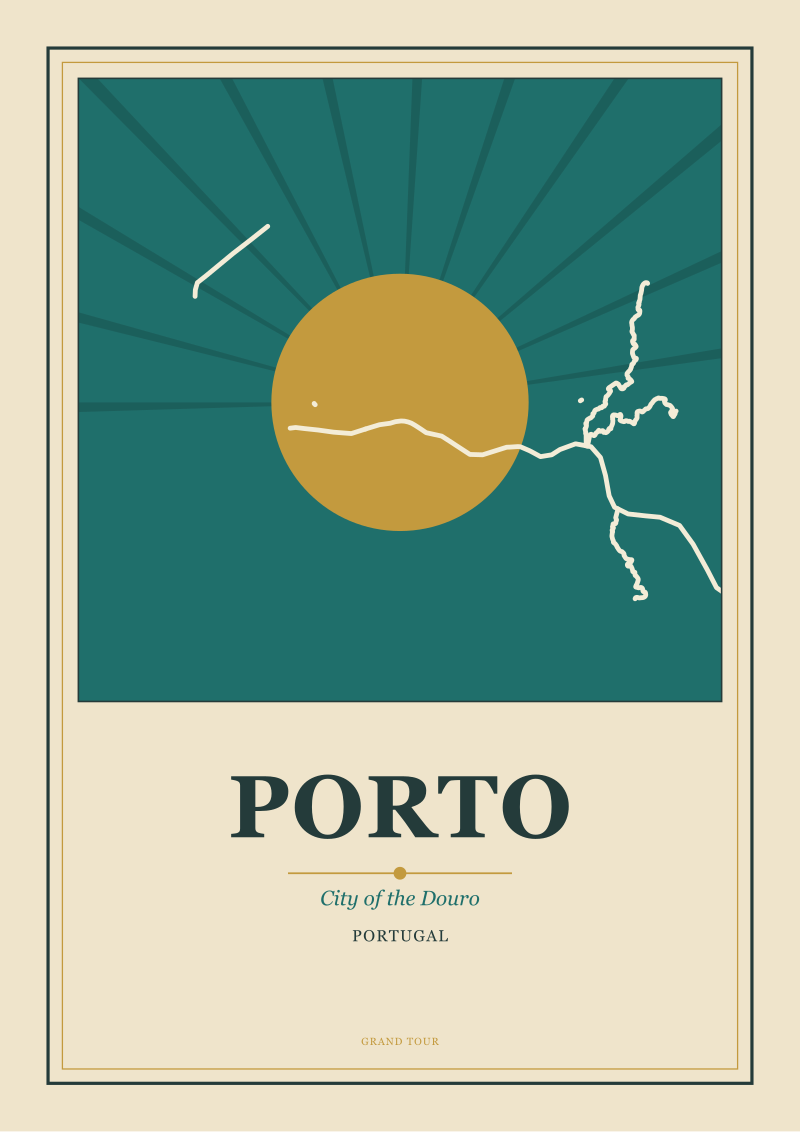
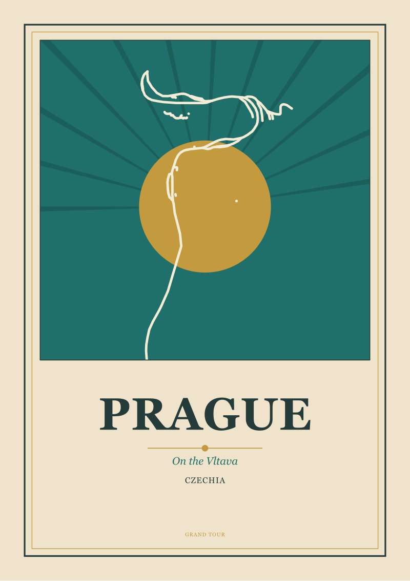
We think of it as a geography-first walk rather than a top-ten. If the Paris print is a river-portrait, the natural second is another river-city — a Porto, a Prague, a Budapest — where the defining line of the drawing is again the water, but the water does something entirely different (a section-drawn river valley, a bend rather than a spine, a divided city). If the Paris print is being read primarily as an icon of the Grand Tour tradition, the natural second is a city that pulls the series south and toward the coast, or east into the deco imagination of central Europe. What you are avoiding is a series in which every print is the same drawing of a different place. What you are building is a series in which each print is the portrait its city actually asks for.
The recipient will not need this explained to them by year two. By then the wall will have taught them what it wants next, and their taste — sharpened by living with the first prints for a while — will make the call. The gift you are really giving, in that scenario, is a beginning that has enough integrity to survive being extended. Paris does. That is why, of all the possible first prints in Europe, this is the one we keep coming back to when someone asks what to buy first.
You can see the Paris print, and the rest of the series as it grows, at our shop.
FAQ
How do I choose a travel poster for someone whose taste in art I don't fully know?
Use the three-question route rather than the top-ten route. Ask whether they know the city or the idea of it, whether they are furnishing one wall or building a series, and whether they lean toward the golden age of poster art or a contemporary drawn line. Those three answers narrow the field faster than any ranked list, and they force the gift to be about the recipient rather than about what is popular in 2026. When in doubt on all three, default to Paris — it survives the widest range of readers.
Why is Paris the recommended first print in almost every combination?
Three structural reasons. The Seine gives the image a natural compositional spine, so the print reads as a portrait rather than a decorative panel. The city's imagined geography and its real geography agree with each other, which is unusual and makes the print land for people who know it and people who only know the idea. And Paris opens a European series without closing off any direction it might go in later. It is a beginning with room to become a wall.
What size should I buy for a gift?
Larger than instinct suggests. Twelve by sixteen inches tends to disappear into a real room. Twenty-four by thirty-six inches is roughly the size at which a travel poster starts doing what the tradition intended — stopping a viewer from across the room. For a hallway or a tall wall, size up again. If you must choose blind, err on the generous side; a slightly-too-large print reads as considered, a slightly-too-small one reads as an accessory.
Should the print be framed before I give it, or should I let the recipient decide?
If you know the room it will live in, framing it is part of the gift and worth doing. Choose a slim, quiet frame — thin black, slim natural oak, or an unfussed white — with a mat border of roughly an inch and a half. If you do not know the room, leave it unframed and include a short note recommending the size of frame and mat, so the recipient can commit to it locally. Do not choose ornate framing; it fights the graphic clarity of the poster tradition.
Is a series of prints a better gift than a single one?
Not better — different. A single sovereign print, sized generously, is a complete gesture and can carry a wall by itself. A series is a longer promise: it says the recipient is going to spend the next few years slowly building a private map of Europe on their walls. Match the gift to the person. Composed rooms with existing art usually want a single print; work-in-progress walls usually want the first of a series.
What makes a "geographically drawn" poster different from a decorative one?
The drawing begins with the actual line of the place — the Seine's true bends through Paris, in our case, sourced from OpenStreetMap under an open licence — rather than with a stylised mood-board version of a river. This matters because a viewer who knows the city can locate real things in the image, and a viewer who does not know the city is still looking at a portrait of somewhere specific rather than at an idea of a European city in general. It is the difference between a map that happens to be beautiful and a decoration that happens to name a city.
How do I extend the series after Paris without it becoming repetitive?
Let each next city be drawn around the geographic element that actually defines it, rather than repeating the river-portrait logic everywhere. A coastal city wants its coastline; a hill-town wants its section; a city divided by a river wants that division as the composition. The point is that every print in the series is the portrait its own city asked for. A wall of eight near-identical river-drawings becomes wallpaper; a wall of eight distinct geographic portraits becomes a small studio museum.
Where can I actually see and buy the Paris print discussed here?
The Paris-along-the-Seine print, and the growing series of European city portraits drawn from real geography, are at our own shop at /shop/. We do not sell through third-party marketplaces, and we do not recommend other studios' prints in this guide — this piece is the studio's own gift-routing framework, and the shop link is the one commercial destination we point to.

New city prints and 10% off your first order.
One email now with your code. No noise after.