At 11:14 on a November morning in Vienna, the light on the Danube runs the color of pewter, and the Ringstrasse traffic moves in the unhurried way of a city that has never had to hurry. This is the specific scene an interwar railway poster tried to fix in four ink plates. Nearly a century later, a person on your list wants that image, printed, on a wall. The guide below is a flowchart in prose. We will ask three questions. Your answers route to one recommendation, not seven, and the recommendation is a print — not a list of them.
Question 1: Is the Recipient Anchored to One City, or Do They Collect by Theme?
The first fork decides everything downstream. A person who has spent three summers in one city and can name the tram line to the outer districts is buying a portrait. A person who owns a print of Chamonix, a print of a lake steamer, and a print of a night train is buying a category. The two collectors do not want the same object, and the frequent mistake — the reason so many travel prints end up leaning against a bookshelf instead of hung — is buying a portrait for a category collector or a category piece for someone who was actually asking for their city.
The diagnostic is a single question, asked casually: which trip did they take twice. If they answer with a place, they are anchored. If they answer with a mode of travel, or a season, or a color of light, they collect by theme.
If Yes — They Are Anchored to One City
Buy the city, and buy the version of the city that shows its defining geography. For Vienna, that geography is the Danube. It is not the Stephansdom silhouette, which is a souvenir; it is not the Sacher-Torte reference, which is a joke. It is the river, running east through the Second District, holding the shape of the whole city against it. A poster that acknowledges the Danube reads as a real place. A poster that skips the river to fit a tighter frame reads as a stock image with a city name on it.
Ask, if you can, whether the recipient prefers the city in one specific season. Anchored collectors almost always do. The same Vienna in November light — pewter Danube, low sun on limestone — is a different poster than the same Vienna in June, and the anchored recipient will notice the discrepancy inside two seconds.
If No — They Collect by Theme
Route the gift toward the theme rather than the geography. The three themes that reliably recur in serious travel-poster collections are: the golden age of rail (roughly 1920s to late 1930s), alpine and lake travel (a subset of the above but with distinct visual grammar), and the Grand Tour cities as a set (Rome, Florence, Venice, Vienna, Paris, treated as a curriculum rather than as individual destinations). A themed collector will accept a city they have never visited if the piece fits the collection. They will reject a beloved city if the piece breaks the visual grammar of what they already own.
The safest gift for a themed collector is a piece from the theme they are most under-represented in. If they own five alpine prints and one riverine city, buy the river.
Question 2: Do They Read Posters as Art History, or Hang Them as Décor?
This is the harder question because most recipients will claim both. Very few actually operate as both. The distinction shows up in how they talk about a poster they own: an art-history reader will place it in a movement, name the era, and probably know whether the original was lithograph or later offset. A décor reader will describe the palette and where it hangs in the apartment. Neither is wrong. They want different objects, and the mismatch is the second-most common reason a travel-poster gift underperforms.
The tell, if you cannot ask directly, is whether they have hung anything with visible half-tone dots, printer's registration marks, or the small imperfections of period lithography. If yes, they are reading. If everything on their walls is clean flat color, they are decorating.
If Yes — They Read Posters as Art History
Buy a piece that visibly belongs to a period. Art Deco travel posters (broadly the late 1920s through the 1930s) have a specific vocabulary: flattened perspective, strong geometric composition, limited palette per plate, and a subject rendered as design rather than as description. The Vienna of that period was drawn by artists working across the empire's successor states and rendered in a graphic language that was continental, not local. A piece that honors this vocabulary reads as art history the moment it comes out of the tube.
Include, if the printmaker offers it, a small note on the piece's grounding — which movement it references, what its geometry is doing. Art-history readers keep this note. It becomes part of the object.
If No — They Hang Posters as Décor
Route toward palette and format. Décor readers make decisions the way an interior designer makes them: does the color of the water in this Vienna print work with the room; is the horizontal format the right proportion for the wall above the sofa; does the framing style resolve. They are not wrong to think this way — a poster that fights the room is a poster that comes down inside a year. Ask what color the wall is. Ask whether they hang landscape or portrait. Ask what else is nearby. If they say "warm neutrals and a lot of wood," a limestone-and-pewter Vienna at dusk is closer than a bright summer Danube.
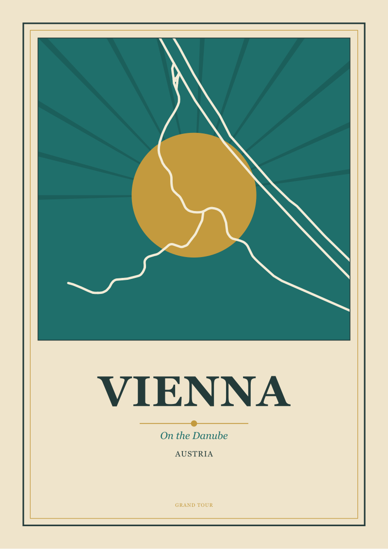 Vienna
The print from this article · from €29.95
View the print →
Vienna
The print from this article · from €29.95
View the print →
Question 3: Is This for a Wall They Own, or a Wall They Rent?
Format follows tenure. This is the least romantic question and the most decisive. A wall someone owns can carry a large framed piece, hung with proper anchors, that will stay in place for a decade. A wall someone rents cannot. The physical constraint dictates size, framing choice, and — quietly — how much you should spend on the piece itself, because the frame is often two-thirds of the total.
The two branches want different objects at different price ceilings. Confusing them produces the guest-room fate: a beautiful large print, delivered in a tube, that lives on a shelf because the recipient never solved the framing.
If Yes — They Own the Wall
Go large and go framed. A 50 × 70 cm poster (roughly 20 × 28 inches) is the historical format of the golden-age railway poster and the size at which a city portrait resolves — the Danube reads as a river, not as a blue stripe. Framed, that piece will occupy a wall as an object rather than as decoration. If the recipient has a defined space (over a mantel, in a stairwell, above a dining table), measure the wall before ordering. The rule of thumb: the framed piece should occupy roughly two-thirds of the wall's horizontal or vertical span, not more, not less.
Frame in a material that matches the room's existing wood tones, or in a matte black if the room is modern. Avoid gold frames on Art Deco pieces unless the room is genuinely period; the combination is more theatrical than most rooms can carry.
If No — They Rent the Wall
Go smaller and go unframed, or go framed in a lightweight format that can be moved. A 30 × 40 cm print is the format that survives a rental. It leans on a shelf, hangs from a single nail, and travels in a portfolio to the next apartment without ceremony. The recipient is likelier to actually hang it, and to keep it visible across two or three moves, than they are to solve a large-format framing problem inside their lease.
For a renter, prefer a print that is finished — trimmed, on archival paper, ready to go — over a piece that requires additional investment in framing. The gift is complete when it arrives. That matters more here than it does for an owned wall.
If You Answered Everything: The Recommendation Map
The three questions produce eight combinations. The map below routes each combination to one specific recommendation. Read the row that matches your three answers.
| Q1 (Anchored / Themed) | Q2 (Art History / Décor) | Q3 (Own / Rent) | Recommendation |
|---|---|---|---|
| Anchored | Art History | Own | Large-format Vienna-on-the-Danube in a period-consistent Art Deco composition, framed to match the room. |
| Anchored | Art History | Rent | Small-format Vienna print with visible period vocabulary, unframed, in a portfolio sleeve. |
| Anchored | Décor | Own | Large-format Vienna Danube at the season the recipient prefers, framed in a palette-matched wood. |
| Anchored | Décor | Rent | Small-format Vienna river scene chosen for palette fit, ready to hang without additional framing. |
| Themed | Art History | Own | Large-format piece from the theme they are most under-represented in, framed to sit in the collection. |
| Themed | Art History | Rent | Small-format print that closes a gap in the collection's period vocabulary, unframed. |
| Themed | Décor | Own | Large-format piece chosen for palette and format fit rather than city, framed to the room. |
| Themed | Décor | Rent | Small-format print in the collection's dominant palette, finished and ready to hang. |
The map is deliberately narrow. Each row produces one object, not three to choose from. The point of a decision tree is that the choosing has already happened. If a row does not sit right after you read it, the answer is almost always that one of the three earlier questions was answered generously — most people are less "both" and more "one" than they claim.
For Vienna specifically, the anchoring recommendations lead back to the river because the river is the city's defining geography in the grounding the studio draws from. A gift that honors that geography is a gift that will still make sense on the wall in 2036. That is the horizon that separates a print from a poster.
 Chamonix
The print from this article · from €29.95
View the print →
Chamonix
The print from this article · from €29.95
View the print →
FAQ
How do I know if the recipient is really anchored to one city, or just fond of it?
Fondness produces phrases like "I love Vienna." Anchoring produces phrases like "I always stay in the Seventh District" or "the Naschmarkt on a Saturday." Ask a follow-up about a specific street, a tram line, or a season, and listen for a specific answer rather than a general one. Anchored recipients answer with details; fond recipients answer with adjectives. The distinction matters because the anchored recipient wants the actual city and will notice a generalized rendering.
Is a travel poster still a meaningful gift in 2026, or does it feel dated?
The format is older than any of us and the demand for it has not softened. What has changed is the alternative supply — algorithmic wall art, dropshipped generic prints — which makes an intentional, grounded travel poster read as more considered rather than less. A print rooted in a real geography, made in the visual vocabulary of the golden age, is not a nostalgic gesture in 2026; it is the opposite of the algorithmic default, which is the point.
Does the frame really matter more than the print itself?
For an owned wall, the frame will cost between one and two times the price of the print, and it decides whether the piece reads as an object or as a decoration. A well-chosen frame extends a good print. A poorly chosen frame — the wrong tone, the wrong weight, or a mat that fights the composition — will neutralize even a strong piece. For a rental, the calculus reverses: unframed or lightly framed is the honest choice.
What size actually works in a normal apartment?
Two sizes cover almost every case. A 50 × 70 cm piece is the golden-age railway-poster format and the right size for a defined space on an owned wall — over a mantel, above a table, in a stairwell. A 30 × 40 cm piece is the right size for a rental, a shelf lean, or a bedroom wall where a larger piece would dominate. Sizes between these two tend to look indecisive on the wall.
Can a travel poster work for someone who has never been to the city?
Yes, but only under two conditions. Either the piece belongs to a theme the recipient is already collecting — golden-age rail, alpine travel, the Grand Tour cities as a set — or the city has a visual identity strong enough to function as an image regardless of visitation. Vienna reads as itself even to a viewer who has never crossed the Danube, because the geography and the period vocabulary do the work. A less iconic city is a riskier gift for a non-visitor.
How do I avoid buying something that looks like generic wall art?
Look for three markers: a defining geographic feature (a river, a coast, a range) rendered honestly rather than cropped away; a period-consistent visual vocabulary (limited palette, flattened perspective, deliberate composition); and a printmaker who can name the source of the geometry. Generic wall art skips all three. It crops the geography, mixes visual vocabularies, and cannot tell you where the shape of the city came from. Those omissions are the tell.
Should I let the recipient choose, or is the surprise part of the gift?
The decision-tree above is designed to let you choose confidently without asking the recipient directly. If you can answer the three questions with reasonable certainty, surprise them. If you cannot answer even one of the three, ask a single indirect question rather than presenting a menu — a menu turns a gift into a task. The best travel-poster gifts arrive already decided.
Where should I actually buy the print?
For grounded city portraits drawn from real geography in the tradition of the golden-age travel poster, the studio's own shop is the natural place — the Vienna-on-the-Danube pieces referenced throughout this guide are drawn from OpenStreetMap geometry rather than composited from stock imagery, which is the difference between a portrait and a generic. Any printmaker who can tell you where the shape of the city came from is doing the same work.

New city prints and 10% off your first order.
One email now with your code. No noise after.