For the reader choosing one large piece for a wall they will live with for years — not a gallery grid, not a hallway rotation, one anchor image in a room where people eat, read and talk — the drawn travel poster is the better default, and we will defend that here. The likely objection is the obvious one: a good photograph is truer to the place, and truth is what a souvenir is for. We think that argument mistakes what a wall image is asked to do. A poster of the Amalfi coastline, of Amsterdam's canal ring, of Barcelona's meeting with the Mediterranean, or of Chamonix under Mont Blanc is not a smaller version of being there. It is a considered drawing of what makes the place itself, and that is a different, more durable job.
The Steel-Man for Photography, Stated Fairly
We should begin by giving the other side its best argument, because a defence that skips the steel-man is not a defence at all. The photograph, at its best, does something a drawing cannot: it testifies. A well-made photograph of the Amalfi coastline at a specific hour, with a specific weather, is a piece of evidence that the world once arranged itself in exactly that way. The light on the water was that colour. The cloud sat on that ridge. Someone was there and pressed a shutter, and the wall image is, in a small but real sense, a document.
For a certain kind of viewer this is the whole point. A photograph taken by the person who lives in the house, or by someone they love, carries information that no third-party image can. It is not only a picture of Amsterdam; it is a picture of the morning they were in Amsterdam, and the wall image inherits that private meaning. We are not arguing against this. We think photographs of one's own life belong on walls, and often should be printed larger and framed more seriously than they usually are.
The steel-man goes further. A great landscape photographer — the tradition is real and does not need naming here — will out-see most illustrators. The photograph can register weather, atmosphere, and the accidents of a specific moment in a way that the drawn poster, which by construction generalises, cannot. If what you want on the wall is a specific afternoon in Chamonix, the photograph is the honest tool.
Our claim is narrower than "posters beat photographs". It is that for the anchor image in a lived-in room, the drawn poster is the better default, and that the reasons are structural rather than a matter of taste.
A Poster Is a Decision; a Photograph Is a Record
The difference we care about is not medium but authorship. A photograph, however skilled, begins as a record of what was in front of the lens. Its editorial work — the crop, the exposure, the choice of moment — is done against the raw material of the world. A poster begins the other way around. Someone decided which coastline to draw, from which angle, at which level of abstraction, and everything the viewer sees is the residue of those decisions. Nothing arrived by accident.
This matters on a wall you live with because accidents are what tire. A photograph of Barcelona from a specific rooftop contains, alongside the Mediterranean and the grid, a hundred small facts the photographer did not choose: a crane in the middle distance, a particular car on a particular street, a sky that happened to be that shade. On the first viewing these read as texture and truth. By the fiftieth viewing, they read as clutter, because the eye has learned them and there is nothing more to find. A drawing of the same view has, by design, only what the artist decided was load-bearing. The eye can keep returning without exhausting the image, because the image was built to be returnable.
The travel poster tradition understood this early. The great railway and shipping posters of the late nineteenth and early twentieth centuries were made for stations and ticket halls — places people passed through repeatedly. They had to work at a glance, from across a room, and again on the tenth walk past. The form selected for durability. Photography, invented for a different job, selected for the moment. Both traditions are honourable. Only one was designed for the wall.
There is a second layer to this. A drawing declares that it is an interpretation. It never pretends to be the place. This honesty is restful. A photograph, by contrast, is always faintly asking to be checked against the real thing: is that really what Chamonix looks like now, has the light changed, would we still recognise the ridge? A poster asks nothing of the sort. It offers a considered version of the place and lets the viewer live with it.
 Chamonix
The print from this article · from €29.95
View the print →
Chamonix
The print from this article · from €29.95
View the print →
The Wall Is a Room, Not a Feed: How the Two Behave at Three Metres
The other structural argument is about distance. Most images the modern eye encounters — on phones, on laptops, on social feeds — are consumed at reading distance. Photographs are optimised, whether the photographer knows it or not, for that intimate scale. Detail rewards leaning in. Colour is calibrated for a small bright rectangle held close to the face.
The anchor image on a wall lives in a different physics. It is seen, most of the day, from three metres away, in mixed and changing light, by people who are doing something else — talking, cooking, reading, walking through. It has to do its work without being examined. This is where the two forms diverge most sharply.
A drawn poster is built for three-metre reading. Its shapes are large. Its palette is restricted, often to a handful of flat colours chosen to hold against wall paint and evening lamplight. Its composition can be understood before the eye focuses. This is not a limitation of illustration; it is what illustration for public spaces was invented to do. Poster designers in the golden age worked with the constraints of printing presses that could not deliver photographic subtlety, and turned the constraint into a discipline. The result is images that, a century later, still read cleanly from across a hotel lobby.
A photograph enlarged to poster size behaves differently. The subtleties that made it a fine photograph — the gradient of a sky, the micro-texture of stone, the play of near-focus and soft background — either flatten under gallery lighting or begin to demand the viewer's proximity. The image works when someone crosses the room to look at it, and rests uneasily the rest of the time. This is not a failure of the photograph. It is a mismatch between what the medium optimises for and what a wall asks of an image.
| Dimension | Drawn travel poster | Enlarged photograph |
|---|---|---|
| Read distance the form was built for | Across the room | Reading distance |
| Number of visual decisions in the frame | Every element chosen | Chosen frame, unchosen contents |
| Behaviour on the fiftieth viewing | Returns to composition | Returns to noticed detail, then quiets |
| Relationship to time | Ages as design | Ages as document (weather, era, moment) |
| Honesty about interpretation | Declared | Implicit |
The table is not a scorecard. Each row is a real difference, and each difference can cut either way depending on what the wall is being asked to do. Our claim remains narrow: for the room you live in, the top row is the one that decides it.
What the Amalfi Coast, Amsterdam, Barcelona and Chamonix Teach About Drawability
The last defence is empirical rather than theoretical. Some places are simply more drawable than others, and the four destinations named at the top of this piece are among the most drawable in Europe. This is not a coincidence of taste. It is geography.
The Amalfi Coast is a coastline, and a coastline is the clearest possible instruction to an illustrator: a single decisive line where land meets water, punctuated by settlements that read as compact shapes against the mass of the cliffs. A photograph of the Costiera has to contend with haze, with the exact hour of the light, with whichever cruise ship happened to be in frame. A drawing keeps the line and the settlements and lets the rest go. What remains is what makes the place the place.
Amsterdam is a city organised around a river and a canal system, which is to say around geometry. The canal ring is one of the most legible urban plans in Europe, and legibility is the raw material of poster design. Drawn, Amsterdam becomes what it structurally is: concentric arcs, bridges, the rhythm of gabled façades along water. Photographed, it becomes whichever corner the photographer happened to be standing on. Both are true; only one is portable to a wall in another country.
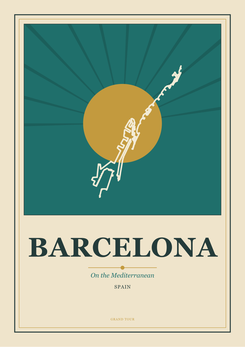
Barcelona is a city defined by its meeting with the Mediterranean. That relationship — the grid running down to the sea — is the drawable idea. The specific streets and buildings are the photographable ones. A poster of Barcelona that takes the coastline and the grid as its subject is holding onto the part of Barcelona that will still be recognisable when the specific streetscape has changed, as cities always do.
Chamonix is a river valley beneath Mont Blanc, and mountains are the oldest subject of the drawn travel image. The poster tradition around the Alps, running from the early railway years through the art deco period and beyond, learned that the mountain is not a photograph problem. It is a silhouette problem. The exact snowfield changes with the season and the century; the shape of the massif does not. A drawing goes for the shape. That is why the Chamonix room, decades from now, will still feel like Chamonix on the wall.
None of this is an argument against ever hanging a photograph. It is an argument that when the place itself is the subject — when the wall image is meant to hold a room by evoking a coast, a canal city, a Mediterranean grid, or a valley under a great mountain — the drawn poster is doing the job the form was invented for. The photograph is doing another job, honourably, elsewhere.
 Amsterdam
The print from this article · from €29.95
View the print →
Amsterdam
The print from this article · from €29.95
View the print →
What You Should Actually Do
If you are the reader we opened with — one anchor image, a room you spend real hours in, a place that matters to you — start with the geography. Ask what the place actually is at its most reduced: a coastline, a river, a grid meeting a sea, a valley under a mountain. If the answer is a shape rather than a moment, the drawn poster is almost certainly the right form. Choose the destination first, the composition second, and the frame last. Hang it at eye level for a standing adult, on the wall that gets the least direct sun, and give it enough clear wall around it to be the anchor rather than one item among many.
If your instinct is still toward a photograph, honour that instinct honestly. Print a photograph you or someone you love actually made, not a stock landscape by a stranger. Print it large, frame it seriously, and accept that it will do a different, more private job than the poster would have done. For the studio's own drawings of the places named above — Amalfi, Amsterdam, Barcelona, Chamonix — the shop is where they live. Everything else this piece has argued about drawability, distance, and durability is already built into them.
This piece did not cover framing choices in any real depth: mount, glazing, and moulding decide as much about how a wall image ages as the image itself, and each deserves its own argument. It did not cover the case of the gallery wall, where the rules change because no single image is being asked to hold the room. And it did not cover children's rooms, where the calculus about durability, changeability, and cost tilts the other way. Each of those is a separate conversation, and we would rather write them properly than tuck them in here.
FAQ
Is a drawn travel poster really more durable to live with than a large photograph?
Durable in the sense we mean — not physically, but visually, over years of daily viewing — yes, usually. A poster is built out of chosen elements, so the eye keeps returning to composition rather than exhausting incidental detail. A photograph carries unchosen contents in every frame, which read as texture at first and as clutter later. Both forms can be beautifully printed and framed; the difference is what they ask of the wall over time.
Does this argument apply to any destination, or specifically to places like Amalfi, Amsterdam, Barcelona and Chamonix?
It applies most cleanly to places whose defining feature is geographic and shape-driven: coastlines, river cities, mountain valleys, grid cities meeting a sea. Amalfi, Amsterdam, Barcelona and Chamonix all sit squarely in that category, which is why we use them. Places whose character is atmospheric or textural rather than structural can lean the other way, and a photograph of them may hold a wall as well as a poster would.
What about a photograph I took myself on a trip that mattered to me?
Print it, frame it seriously, and hang it somewhere you will actually see it. Personal photographs carry meaning that no third-party image can, and that private weight changes the calculation. Our argument is specifically about the anchor image in a lived-in room when the reader is choosing between a drawn poster and a stock or gallery photograph of the same destination. A photograph of your own life is not the same category and deserves its own wall.
Why do old railway and shipping posters still look modern on contemporary walls?
Because they were designed for the same physics contemporary walls impose: read from across a room, seen in mixed light, glimpsed rather than examined. The form was disciplined by the printing presses of its era into flat colour, strong silhouette, and legible composition, and those constraints turned out to be timeless properties of images that live on walls. A drawing made today in that tradition inherits the same discipline and behaves the same way.
Does size matter more than medium for wall impact?
Size matters, but medium decides how well an image survives being large. Enlarging a photograph beyond its native resolving intent tends to flatten it or reward only close inspection. A drawn poster is composed with scale in mind from the first sketch, so enlargement clarifies rather than dilutes the image. For an anchor piece, choose the form first, then choose the largest size the wall can carry without crowding.
Where should the one anchor image go in a room?
On the wall that gets the least direct sunlight, at the eye level of a standing adult, with enough clear wall around it that it reads as the anchor rather than one item among several. Avoid hanging it above a piece of furniture that competes visually. If the room has a natural focal wall — the one people see first when they enter — that is usually where the anchor belongs, whether or not it is above a sofa or fireplace.
Can a poster and photographs coexist in the same home?
Easily, and they should. The argument here is about the single anchor image in the main lived-in room, not about excluding photographs from the house. Photographs tend to do their best work in more intimate spaces — a hallway of family images, a bedroom wall of specific memories, a study grid — while a drawn poster earns the room where the household actually gathers. The two forms complement each other when each is used for the job it was built for.


New city prints and 10% off your first order.
One email now with your code. No noise after.