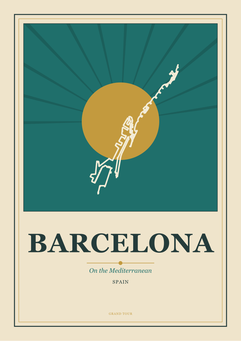
Between the late 1940s and the mid-1960s, two design languages ran on parallel tracks and were almost never discussed in the same room. One was the golden-age travel poster — flat color, held horizon, confident line — inherited from the railway commissions of the interwar years and the discipline of Art Deco. The other was the mid-century interior — teak, tension, the wall treated as composition rather than surface. They shared a grammar. When a room from that period holds a poster of the Amalfi Coast, of Amsterdam's canal geometry, of Barcelona's Mediterranean edge, or of Chamonix beneath Mont Blanc, it does not read as decoration. It reads as one design vocabulary recognizing itself in another. This piece is about why, and about how a studio matches a specific poster to a specific room without letting the result collapse into pastiche.
Methodology
We spent several months in the studio testing the same four destination portraits against a range of mid-century room references — actual rooms photographed for period design magazines, and a set of contemporary interiors built in that vocabulary. The four posters were fixed: the Amalfi Coast as a coastline drawing, Amsterdam read through its canal geometry, Barcelona held against the Mediterranean, and Chamonix beneath Mont Blanc. Each room was assessed on three variables we could isolate cleanly: horizon behavior (where the eye rests, and at what height), palette temperature (warm-dominant, cool-dominant, or split), and wall scale (the ratio of art to surrounding surface). We noted which pairings held and which read as costume. We did not test frame finishes, glass reflectivity, or lighting temperature — those are downstream decisions and would have muddied the signal. What follows is the pattern that emerged from that work: four findings, each grounded in what we saw when we lined the posters up against the walls and stepped back.
Finding #1: The Horizon Line Is the Grammar Both Forms Share
The reason a golden-age travel poster sits inside a mid-century room without argument is that both were built around a held horizon. Look at a coastline drawing of the Amalfi Coast: the sea meets the cliff on a line the artist has decided will not move, and every element in the composition — the switchback of the road, the shoulder of the town, the tilt of a boat — is placed relative to that line. Then look at the wall of a mid-century room from the same decades: a low-slung credenza, the top edge of a teak sideboard, the horizontal band of a Bertoia console, the shelf that runs the full width beneath a window. The room itself has a horizon, and that horizon is usually set at roughly the height of a seated adult's eye. When the poster's horizon line falls within a few inches of the room's horizon line, the composition closes. The eye reads them as one drawing.
This is not a coincidence of taste. Both traditions inherited the same discipline: the poster from railway commissions that had to be legible from a moving platform, the interior from a Scandinavian and Californian modernism that treated furniture as a horizontal instrument for organizing a room. The horizon was where legibility lived in both cases. A Chamonix poster with Mont Blanc's summit line held high behaves differently than an Amsterdam canal view where the water's edge sits low; the first belongs above a low console, the second above a taller cabinet. We match the drawing's horizon to the room's, not the drawing's subject to the room's mood.
 Chamonix
The print from this article · from €29.95
View the print →
Chamonix
The print from this article · from €29.95
View the print →
Finding #2: Palette Temperature Decides the Match Before Subject Does
The second variable we watched, and the one that most consistently decided whether a pairing worked, was palette temperature. Golden-age travel posters lived in a narrower temperature range than people remember. The Riviera posters — Amalfi Coast, Barcelona's Mediterranean edge — sit warm: an ochre-into-terracotta base, a sea rendered as cobalt or teal to sharpen the contrast, and skies that were often left as a warm cream rather than a cold blue. Northern subjects — Amsterdam's canal geometry, Chamonix under a winter sky — sit cool: slate, muted brick, a grey-blue that reads almost as silver against snow or against a north-lit facade. When we put a warm Mediterranean poster into a cool-dominant mid-century room — a room built on walnut, greys, and a single blue accent — the poster fought the room. When we put the same poster into a warm-dominant room — teak, oiled walnut, a cream wall, a mustard textile — it disappeared into place.
The rule that emerged: match temperature before you match subject. A canal city can absolutely live in a warm room, but only if the poster's rendering pulls the water warm rather than cool. A Chamonix drawing can live in a warm room if the artist has rendered the rock face brown-warm rather than blue-shadow. Subject is a story; temperature is the physics of whether the eye accepts the pairing at all. Get temperature wrong and no framing choice will rescue the room.
Finding #3: Scale Follows the Wall, Not the Frame
Scale is where most poster placements go wrong, and where the mid-century vocabulary is most instructive. The instinct is to scale the poster to the frame — a large frame for a large wall, a small frame for a small wall. The mid-century instinct is different. The wall is treated as a composition with a wall-length event on it: a credenza, a shelf, a bench. The art is scaled to sit inside that event's proportion, not to fill the wall on its own.
In practice this means the poster's width should read as roughly two-thirds to three-quarters of the wall-length object beneath it. An Amsterdam canal drawing over a six-foot walnut credenza wants to be about four feet wide — not five, not three. A vertical Chamonix portrait beside a lounge chair wants to align its lower edge with the top of the chair's back, not float above it. When we test this the wrong way — a large poster over a small console, or a small poster on a wide empty wall — the room reads as a gallery rather than a room. The golden-age poster was designed for railway stations and travel offices, spaces where it competed with signage and crowds; it wants a wall event to anchor to. Give it one and the pairing settles. Ask it to hold a bare wall alone and it goes back to being a poster.
 Amsterdam
The print from this article · from €29.95
View the print →
Amsterdam
The print from this article · from €29.95
View the print →
Finding #4: The Subject Should Answer What the Room Is Missing
The last variable is the subject itself, and here the studio's rule is counterintuitive: the poster should answer what the room is missing, not double what the room already has. A room built around wood, warmth, and enclosed volume — the classic mid-century living room — is missing distance and water. An Amalfi Coast coastline drawing gives it distance and water in one move; the eye travels from the interior warmth to the drawn horizon and back, and the room feels twice its size. A Barcelona Mediterranean view does similar work. Put the same warm coastal poster in a room that is already open, light, and coastal in feel, and you have redundancy — the poster stops being a window and becomes wallpaper.
The Amsterdam and Chamonix portraits do different work. Amsterdam's canal geometry brings structure — repeated verticals, the discipline of a grid — into a room that may be too soft, too curved, too domestic. Chamonix brings verticality and altitude into a room that is otherwise horizontal, and this is why a Chamonix portrait so often anchors a stairwell or a room with a low ceiling: it pushes the eye up. Match the poster's subject to what the room lacks. If a room lacks nothing — if it is already a fully resolved composition — the poster becomes redundant and reads as decoration rather than architecture. The wall is telling you what it needs; the studio's job is to listen before choosing.
| Poster subject | Palette temperature | Horizon behavior | Best wall event | What it gives the room |
|---|---|---|---|---|
| Amalfi Coast | Warm (ochre, terracotta, teal sea) | Mid-height, held | Low credenza, long console | Distance, water, warmth continued |
| Amsterdam canals | Cool (slate, brick, silver-blue) | Low, water-level | Bench, low bookshelf | Grid, repeated verticals, structure |
| Barcelona coast | Warm (cream sky, cobalt sea) | Mid-height | Dining sideboard, cabinet | Mediterranean light, calm expanse |
| Chamonix / Mont Blanc | Cool (slate, snow, warm rock) | High summit line | Tall cabinet, stairwell, lounge chair | Altitude, vertical push, cold air |
What This Does NOT Prove
None of this proves that a golden-age travel poster only belongs in a mid-century room. Posters from that tradition have held perfectly well in Georgian entrances, in contemporary lofts, in painted rooms with no wood at all. The four variables we watched — horizon, temperature, scale, subject — apply across those settings too; they simply resolve differently in each. Nor does this piece prove a mid-century room needs a travel poster at all. Many of the best rooms from the period held abstract painting, textile art, or nothing at all above the credenza, and the horizon was carried entirely by the furniture.
What we can say is narrower: when the pairing works, it works because both objects were built on the same underlying discipline of held lines and considered color, and when it fails, it fails because one of those variables was overridden by taste. This piece is a set of observations from the studio floor, not a taxonomy. A room is not a diagram.
The Takeaway
Match the horizon, match the temperature, scale the poster to the wall's event, and let the subject answer what the room lacks — do these four and the pairing will feel inevitable rather than styled.
FAQ
Do golden-age travel posters only work in mid-century rooms?
No. The reason they sit so well in mid-century interiors is that both design languages inherited the same interwar discipline of held horizons, flat color, and considered scale. But the same posters hold in Georgian rooms, in white-walled contemporary apartments, and in painted historic interiors — the four variables we described (horizon, temperature, scale, subject) simply resolve differently in each context. What mid-century interiors do better than most is make the underlying grammar visible, which is why the pairing reads as a match rather than as a decorative choice.
How do I match a poster's palette temperature to a room?
Start by identifying whether your room is warm-dominant (teak, walnut, oiled woods, cream walls, mustard or terracotta textiles) or cool-dominant (grey-washed woods, white walls, blue or slate accents, cooler stone). Then look at what colour the poster's largest area actually is — not what the subject "should" feel like. A Riviera poster can render cool if the sea dominates; a Northern poster can render warm if the buildings dominate. Match the poster's dominant temperature to the room's, and you rarely need to negotiate the subject.
What size should the poster be relative to the wall?
Scale to the wall-length object beneath the poster, not to the wall itself. If the poster hangs above a credenza, sideboard, bench, or shelf, its width should read as roughly two-thirds to three-quarters of that object's width. Above a six-foot console, a poster around four feet wide sits correctly. On a bare wall with no furniture beneath it, mid-century logic breaks down and the poster starts to behave like gallery art — which is a different problem, and usually not the effect the room wants.
Which of the four destinations works best over a dining sideboard?
Barcelona and the Amalfi Coast tend to hold the strongest against a dining sideboard because both carry warm Mediterranean light and a held mid-height horizon that aligns naturally with a seated eye across a dining table. Amsterdam works if the sideboard is walnut or dark and the room needs structural rhythm rather than warmth. Chamonix is usually the wrong choice for a dining setting — its vertical push and cool palette want a lounge chair, a stairwell, or a room that is otherwise horizontal and needs altitude introduced.
How do I avoid the pairing looking like themed pastiche?
Pastiche happens when every element in the room is doing the same job — the poster says "Riviera", the textile says "Riviera", the ceramic says "Riviera" — and the room becomes a costume rather than a composition. The studio's rule is that the poster should answer what the room is missing, not repeat what it already has. If the room is already warm, coastal, and open, a warm coastal poster is redundant. Introduce contrast at the level of subject while holding the match at the level of horizon and temperature, and the pairing reads as intention rather than theme.
Does the frame finish matter as much as the poster itself?
It matters, but less than the four variables above. Once horizon, temperature, scale, and subject are correct, most frame choices in the mid-century vocabulary — natural oak, walnut, blackened wood, thin polished brass — will hold. Frames go wrong when they fight the room's woods (a cool ash frame in a warm walnut room reads as an intrusion) or when they exaggerate the poster's period rather than let it sit quietly. If in doubt, the frame should match the room's dominant wood rather than the poster's subject.


New city prints and 10% off your first order.
One email now with your code. No noise after.