Set an interwar railway poster of the Amalfi Coast next to a phone photograph of the same coastline and one of them is doing more work. The poster has fewer elements — a diagonal, a horizon, a wedge of blue, a name in a confident sans — and it has taken a position on what the place is for. The photograph is a record. The poster is an argument. That distinction is the whole of the art deco travel poster, and it is why, nearly a century after the format's commercial peak, studios still draw Chamonix as a triangle beneath Mont Blanc and Amsterdam as a ribbon of canal.
What the Poster Actually Was (Not a Painting, Not a Photograph)
The interwar travel poster is routinely filed under "graphic design" or "commercial art" as if those labels settled anything. They do not. What the poster actually was is a persuasion device produced under two specific constraints that shaped every visual decision inside it: it had to be legible at the speed a pedestrian walked past a station wall, and it had to survive being printed by lithograph in a limited palette on paper that was not particularly good.
Those two constraints did most of the design work. Legibility at walking speed forces reduction — a coastline becomes a single sinuous line, a mountain becomes a wedge, a city becomes the one silhouette that carries it. Limited-palette lithography forces flat colour fields rather than tonal gradation, which is why Amalfi in a poster is not the coast's actual dozen greens and blues but two blues and a terracotta, chosen for the way they sit against each other without muddying at the register. The photograph never had to submit to either constraint, and it shows: photographs of the Costiera tend to be pretty, and posters of it tend to be about something.
Compositionally the format converged on a small vocabulary. The diagonal — of a rail line, a road, a coast, a ski slope — carried the eye across the picture plane at speed, which was the point: the poster was selling motion. The high horizon compressed the sky and gave the destination the majority of the surface, because the destination was the product. Typography was set into the composition, not laid over it, which is why the name of the place feels like part of the geography rather than a caption bolted on afterwards. None of this was decoration. It was argument, in visual grammar.
What the Art-History Shelves Consistently Underplay
The standard telling puts the poster into a lineage — turn-of-the-century advertising, then the Beggarstaffs, then Cassandre, then the golden age — and treats it as a stylistic movement that eventually gave way to photography. That version is not wrong so much as it misses what the format was inside its own economy. The poster was not primarily an art object. It was a piece of infrastructure produced by railways, shipping lines, and tourist boards to make new places legible to a public that had never seen them and, in most cases, was never going to.
That last part is what the shelves consistently underplay. The overwhelming majority of people who saw a poster of the Amalfi Coast in the interwar decades never went to the Amalfi Coast. The poster was not a memento of a trip. It was, for most of its viewers, the trip — a compressed, idealised, arguable image of a place they would only ever know through the image itself. That is a strange and interesting thing for a piece of commercial art to be, and it explains why the format aged into something more than an advertisement. It became the popular image of these places. When a contemporary traveller arrives in Chamonix and the mountain lines up the way they expected it to, some of that expectation was set by a poster their grandparents may have walked past on a station platform in 1932.
The other thing the shelves tend to soften is that the format was not a single style. "Art deco travel poster" is a useful shorthand for a family of related approaches, but the family included Cassandre's high-modernist geometries, the softer romantic naturalism used by many British railway commissions, Swiss and Austrian alpine tourism boards leaning into a colder abstraction, and Italian state-sponsored work that ran between confident graphic reduction and something closer to painterly persuasion. Naming any of it "art deco" is honest only in the broad sense — the shared vocabulary of streamlined form, flat colour, diagonal composition and confident lettering that dominated European commercial art between roughly the mid-1920s and the late 1930s.
 Chamonix
The print from this article · from €29.95
View the print →
Chamonix
The print from this article · from €29.95
View the print →
What the Revival Is Really Buying — and What It Isn't
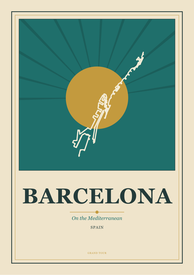
Something happens on a wall when you hang a poster of Barcelona drawn in this vocabulary next to a framed phone photograph of the same view. The photograph shrinks. It becomes a piece of personal evidence. The poster, meanwhile, does not shrink, because it was never trying to prove anything. It was making a claim about what the place is for the eye. That asymmetry is what the current revival is quietly buying, and it is worth being precise about it, because "nostalgia" is the lazy explanation and it is not what is happening.
Nostalgia sells reproduction. If the revival were nostalgic in the strict sense, the market would be dominated by direct facsimile prints of interwar originals, and the second-hand poster market would be softening rather than strengthening. Neither is true. What sells now is new work made in the format's grammar — Amsterdam rendered as a ribbon of canal held between two typographic blocks, the Amalfi Coast reduced to that same diagonal and terracotta, Chamonix reduced to the triangle beneath Mont Blanc that the geography actually gives you if you look. New drawings of real places, made with the discipline the old posters had, sold to people who have often already been to the place and want an image of it that argues rather than records.
That last motive is the interesting one. The phone in every pocket has effectively broken photography as a way of remembering somewhere you went. A person returning from the Costiera has, without effort, several hundred pictures of it that they will never look at again. What the poster offers is the opposite scarcity: one image, chosen, that says here is what this place is when you take the accidents away. The revival is not buying the past. It is buying a functioning visual language that photography, precisely because it will record anything you point it at, cannot supply. The old posters happen to have invented this language. The new work is using it, honestly, on places the old work also drew — because the geography is still there. The Amsterdam canals still ring the old city. Barcelona still meets the Mediterranean at the same angle. Chamonix still sits at the foot of the same mountain. The argument survives because the subject survives.
There is a commercial honesty in this that is worth naming. A studio drawing these places today — ours included, at see the Chamonix print — is not restoring anything. It is continuing a working format on the same subject matter it was invented for, in the same reductive discipline, for a use that has, if anything, grown: the need for one image on a wall that stands in for a place, in a house where every other image of that place is a scroll.
If You Only Remember One Thing
The art deco travel poster is not a style you either like or don't. It is a solved problem in visual persuasion — how to make a place legible, memorable, and argued for in one image — and the solution has not been improved on in the century since.
The revival is not a costume. It is what happens when a working format outlives the era that produced it and turns out to still be right about the thing it was right about the first time. If you take one idea away, take this: the poster of the coast is doing something the photograph of the coast structurally cannot. Hang both, and watch which one your eye returns to.
 Amalfi Coast
The print from this article · from €29.95
View the print →
Amalfi Coast
The print from this article · from €29.95
View the print →
FAQ
What actually defines an art deco travel poster, versus other interwar advertising art?
The defining traits are compositional, not decorative: a strong diagonal carrying the eye, a high horizon that gives the destination most of the surface, a limited palette of flat colour fields dictated by lithographic printing, and typography set into the composition rather than laid over it. The "art deco" label is a broad umbrella covering roughly the mid-1920s to late 1930s in European commercial art. Individual national schools — French, British, Swiss, Italian — varied noticeably in how far they pushed geometric reduction versus painterly warmth.
Who commissioned the golden-age posters, and why did that matter?
Railways, shipping lines and state or regional tourist boards were the primary commissioning bodies. That matters because it made the poster a piece of infrastructure rather than a fine-art object: its job was to make an unfamiliar destination legible to a mass public on a station wall or a shipping-office window. The commercial brief — sell motion, sell a place — is what forced the visual reduction. When people call the format "designed", the design pressure came directly from that commissioning context, not from an art-school aesthetic decision.
Why did the format decline, and when?
Colour photography and cheaper offset printing progressively displaced hand-drawn commercial lithography from the late 1930s onward, with the Second World War effectively ending the golden age's commercial economy. Postwar tourism advertising increasingly used photographs, which were faster to produce and read as more "real" to a public newly saturated in photographic magazines. The format did not disappear so much as lose its commercial infrastructure. What survived did so because the underlying visual solution kept working even after the industry that paid for it moved on.
Is the current revival nostalgia, or something else?
It is not primarily nostalgia. Nostalgia would drive a market in direct reproductions of interwar originals, and while that market exists, the growth is in newly drawn work made in the format's grammar. What buyers are actually acquiring is a working visual language — reduction, argument, one image of a place — that photography structurally cannot supply in a phone-camera age where every destination is over-documented. The revival is buying function, not memory.
Are contemporary art deco style posters historically accurate?
"Accurate" is the wrong word for a format whose entire premise is compressed argument rather than record. What a responsible contemporary poster should be is geographically honest — Chamonix genuinely does sit beneath Mont Blanc as a triangle, Amsterdam's ring of canals really is the defining shape of the old city, the Amalfi coastline really does run as one long diagonal. The idealisation is in the reduction, not in the underlying geography. Studios that invent geography rather than reduce it are doing something else.
Do original interwar posters still exist, and how does the current market treat them?
Yes, a meaningful body of original lithographs survives, primarily in specialist auction houses, museum collections and private hands. The second-hand market for genuine period pieces has been strong for decades and remains so, with condition, printer, and destination significantly affecting value. The revival in newly drawn work has not softened the original market; if anything, it has broadened the audience aware of the format, which tends to support rather than undercut interest in the historical originals.
Why do certain destinations dominate the format — the Riviera, the Alps, canal cities?
Because the format rewards places whose defining geography can be reduced to a single graphic idea. A coastline gives you a diagonal. A mountain gives you a wedge or triangle. A canal city gives you a ribbon of water threaded through a silhouette. Destinations that resist reduction — sprawling inland cities without one defining geographic element — appear far less often in the historical corpus for exactly this reason. The revival inherits the same bias, not by preference but by structural fit: the format works where the geography is drawable.


New city prints and 10% off your first order.
One email now with your code. No noise after.