Every Prague poster we draw begins with three forks in the road, and the wrong answer at any one of them produces a picture that could be any Central European capital with a castle on a hill. The city is not generic, but the shorthand for it is, and the shorthand is what most posters settle for. What follows is the flowchart we actually use at the desk before a pencil touches paper: three questions, asked in order, each with a yes and a no branch, each branch producing a materially different Prague. Read it as a workbook. The final section collapses the branches into a table.
Question 1: Is the Vltava the Spine of Your Composition?
The Vltava is the reason Prague is drawable at all. It is what makes the city legible from any elevation and any distance: a curved axis that separates Old Town from Malá Strana, that carries the eye from the southern bend up under Charles Bridge and past the castle bluff. Every other element in the poster is either on the river, above the river, or reading across it. If you do not decide, before drawing anything, whether the river is your spine or merely your foreground, the composition will drift toward the castle by default, and the castle alone is not enough to distinguish Prague from Bratislava, Ljubljana, or half a dozen other capitals with a fortified rise above a medieval quarter.
We ask this question first because it dictates the aspect ratio and the horizon line. A river-as-spine poster wants portrait orientation and a horizon set roughly two-fifths from the top, so the water has room to curve. A river-as-foreground poster wants landscape orientation and a lower horizon, so the castle silhouette gets sky above it. These are not preferences; they are constraints. Choose wrong and every subsequent decision inherits the error.
If Yes
The river runs the height of the poster, entering from the lower right and exiting upper left, or the mirror of that. Charles Bridge crosses it roughly at the golden section. The castle is not the subject — it is what the river passes beneath. Old Town roofs mass on the right bank as a lower, warmer weight to counterbalance the castle's cooler stone. This is the composition that reads as Prague from across a room, because the S-curve of the Vltava is a shape no other European capital owns in quite the same proportion. We give the water its own tonal band: not blue, usually a muted teal or a soft slate, so it registers as a distinct element rather than a hole in the picture.
If No
The river becomes a horizontal ribbon at the bottom quarter of the poster, and the castle bluff dominates. This is the older, more traditional shape — closer to the nineteenth-century vedute that pre-date the travel poster proper. It works, but only if you give the castle enough architectural specificity to survive being the main event: the long spine of the palace, the vertical of St. Vitus, the way the whole complex sits on the ridge rather than crowning a single peak. If you draw the castle as a generic silhouette in this composition, you have made a poster of a fortress on a hill, which is not Prague. The river-as-foreground version demands more detail from the buildings, not less, because the water is no longer doing compositional work.
Question 2: Are You Counting the Spires, or Drawing the Silhouette?
Prague's nickname is a hundred spires, and the number is not literal. Older counts put the figure closer to a hundred; modern surveys, depending on what qualifies as a spire, land anywhere from several hundred to over a thousand. The point is that the skyline is dense with verticals, and the poster has to decide whether to honor that density or edit it into something a viewer can read at a glance. This is not a question of accuracy versus poetry. It is a question of what kind of picture you are making.
The distinction matters because the two approaches produce different objects. A counted-spire poster is a document; a silhouette poster is an image. Both are legitimate, and the golden age of travel posters produced examples of each, but they cannot be blended without turning muddy. The desk's rule is: pick a lane before you rough in the skyline, because the pencil work that establishes one approach cannot be recovered into the other later.
If Yes
You draw the spires you can name, in the positions they actually occupy along the river's east bank, and you accept that the poster will be busier than the standard travel-poster grammar prefers. The Old Town Hall tower, the two dark points of Týn, the greened dome of St. Nicholas in Malá Strana, and the twin western spires of St. Vitus rising above the castle wall — these are the anchor verticals. Between them, you draw enough of the smaller spires that the density registers, but you resist the temptation to include every one. Roughly twelve to fifteen named or namable verticals is the ceiling; past that, the poster starts reading as a technical drawing rather than an image, and the eye has nowhere to rest. Color stays restrained in this version, because the linework is doing the heavy lifting.
If No
You reduce the skyline to five or six silhouettes and let the rest of the city read as a warm roofline mass. This is closer to the deco-era travel poster's economy: strong shapes, empty air between them, the viewer's eye completing what the poster only implies. St. Vitus becomes the single western vertical; Týn's two dark points read as a paired accent on the right bank; the castle spine runs as a long horizontal beneath. Everything else is roof-tone. This version travels better as an image — it prints down to postcard scale and still reads — but it forfeits the specific pleasure of being able to identify the buildings. It is a portrait of Prague's shape, not its inventory.
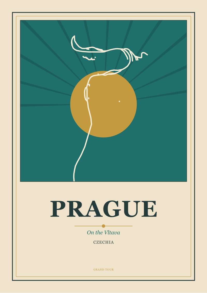 Prague
The print from this article · from €29.95
View the print →
Prague
The print from this article · from €29.95
View the print →
Question 3: Is the Palette Doing Geography or Doing Mood?
Prague has two distinct climate registers that a poster can lean into: the pale, clear, golden-hour light that the city gets in dry autumn afternoons, and the low, silvery, close-weather light that dominates much of the rest of the year. The first is what postcards and tourist photography have made canonical. The second is what the city actually looks like on most days. Neither is more truthful than the other — they are different truths — but the palette has to commit, because a poster that hedges between warm and cool ends up reading as neither.
We ask this question third rather than first because it depends on the two earlier answers. A river-as-spine composition with a silhouette skyline can carry the silvery register beautifully; a river-as-foreground composition with a counted-spire skyline usually wants the warmer palette to keep the density from feeling oppressive. The palette question is where the poster's mood is set, and mood is what determines whether a print earns wall space or gets rotated out after a season.
If Yes
Geography-first palette means you draw the light as it actually falls. Sandstone yellows in the castle wall, terracotta and ochre in the Old Town roofs, the muted teal of the Vltava's actual color under most conditions, greens for the copper domes that have oxidized, and a sky that is honestly overcast more often than blue. This is the palette we default to for our Prague work. It sits closer to the northern European poster tradition than to the Mediterranean, and it produces a print that reads as specifically this city rather than as a warm generic dream of it. The trade-off is that it will not photograph as well on a phone in a shop, which is a real commercial cost.
If No
Mood-first palette means you push the warmth. Sunset ambers behind the castle, deeper terracottas across the roofs, a river that reads gold rather than teal. This is the palette that travel posters have historically used to sell places, and it is not dishonest — Prague does look like this some evenings — but it is a partial truth performing as the whole one. The mood palette is what a lot of Prague posters settle for, which is why so many of them are hard to tell apart from each other, and from posters of Budapest, and from posters of Vienna at the same hour. If you go this route, the composition and the spire treatment have to work harder to keep the city specific, because the palette is no longer doing that job.
If You Answered Everything: The Decision Table
Eight combinations of the three answers produce eight materially different Prague posters. The table below is the map we work from — one row per combination, one recommendation per row, kept to the shortest form that still identifies what the poster is.
| Q1: River as spine? | Q2: Count the spires? | Q3: Geography palette? | Recommendation |
|---|---|---|---|
| Yes | Yes | Yes | The definitive editorial Prague: river-led, dense skyline, honest light. Portrait format. |
| Yes | Yes | No | Handsome but crowded; the warm palette fights the linework. Use only for autumn print runs. |
| Yes | No | Yes | Our house default: S-curve river, edited silhouette, silver-gold light. Portrait, restrained. |
| Yes | No | No | The most sellable single print: river spine, clean silhouette, mood warmth. Postcard-friendly. |
| No | Yes | Yes | A vedute revival: castle-led, spire inventory, honest palette. Landscape, historically minded. |
| No | Yes | No | Risk of Central-European-capital generic; add a river-color accent to anchor to Prague. |
| No | No | Yes | Castle-dominant landscape in silvery light; quiet, atmospheric, harder to sell in daylight shops. |
| No | No | No | The tourist-shop default. Works commercially, but forfeits the case for being specifically Prague. |
The pattern the table makes clear: the yes-yes-yes and the yes-no-yes rows are the two shapes we return to most, and the no-no-no row is the one we decline. The commercial pressure to draw the no-no-no version is real — it is the poster that sells fastest in an airport gift shop — but it is also the one that erases the city into a mood, and the whole reason we draw Prague from its geometry is to refuse that erasure. The other six rows are legitimate posters, each with a use case, and part of the desk's work is deciding which of them a given commission calls for before the drawing starts.
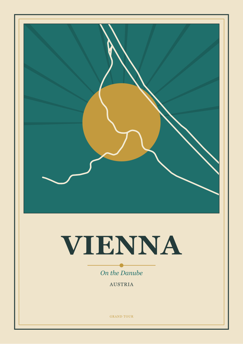 Vienna
The print from this article · from €29.95
View the print →
Vienna
The print from this article · from €29.95
View the print →
What This Walkthrough Does Not Cover
Three things this piece has deliberately left out, in order of what we would tackle first if we were expanding it into a longer craft essay.
The typography question. Every travel poster is also a lettering decision, and Prague's poster tradition — from the interwar Czech modernists through the socialist-era tourist boards — has an unusually rich vocabulary of typefaces to draw from or resist. We have not addressed which lettering registers pair with which of the eight compositions above, because that is a full separate argument that deserves its own walkthrough rather than a paragraph of hedged advice.
The seasonal question. Prague's snow-covered version is a different poster from its summer version, and the winter city is where a great deal of the twentieth-century poster tradition actually lives. We have written this piece for the year-round poster because that is the commission we get most often, but the winter Prague — with its lower contrast, its reduced palette, and its shortened light — is a distinct craft problem that this flowchart only partially covers.
The night poster. Prague at night is drawn far less often than Prague by day, and the reasons why are worth an essay. Night forces every one of the three questions above into a different answer: the river reads darker than the buildings rather than lighter, the spires become negative silhouettes against illuminated sky, and the palette collapses into a much narrower range. We have not tried to fold that into the day-poster flowchart because the geometry genuinely changes at night, and pretending otherwise would produce advice that fails on contact with the drawing board.
FAQ
Why does the river matter more than the castle in a Prague composition?
Because the river is the shape that distinguishes Prague from every other Central European capital with a hilltop fortress. Vienna, Bratislava, Ljubljana, and Budapest all offer a castle-on-a-rise silhouette; only Prague places its castle above a specific S-curve of water crossed by a specific bridge at roughly the golden section. The Vltava is the geometry that makes the city legible at poster distance. The castle is the accent the geometry frames.
Is the "hundred spires" figure accurate, and does it matter for the drawing?
The figure is traditional rather than literal, and modern counts vary widely depending on what qualifies as a spire. For a poster, the exact number is beside the point — what matters is that the skyline is verticality-dense enough that the drawing has to choose between honoring the density (a counted skyline of twelve to fifteen named verticals) or editing it into a legible silhouette (five or six shapes). Both are valid; the two approaches cannot be blended.
Why do you push back on the warm sunset palette?
Because it is the palette that sells fastest and specifies least. A warm sunset Prague can be mistaken for a warm sunset Budapest, Vienna, or Kraków. The silvery register that dominates most of the city's actual year is harder to sell in a daylight shop, but it produces a print that reads as specifically this city rather than as a generic warm evening in Central Europe. The trade-off is real; we accept it in most of our editions.
How does aspect ratio follow from these three questions?
The first question decides it. If the river is the spine of the composition, the poster is portrait, because the S-curve needs vertical room to breathe. If the river is a foreground ribbon and the castle is the subject, the poster is landscape, because the castle spine wants horizontal room and the sky above it wants to feel open. Trying to force a river-spine composition into landscape flattens the curve; trying to force a castle-subject composition into portrait crowds it.
Which of the eight table combinations do you actually draw most often?
The yes-no-yes row — river as spine, edited silhouette, honest geography palette. It is our house shape because it does the most work to keep the poster identifiably Prague rather than a generic Central European capital in warm light. The yes-yes-yes row runs a close second when the commission calls for the counted-spire density; the no-no-no row we decline, even when a client asks for it.
Do you draw Prague at night or in winter?
Rarely, and never using this flowchart. The night poster and the winter poster are distinct craft problems: night inverts the river-to-building tonal relationship and pushes the spires into negative shapes; winter compresses the palette and shortens the useful light. Both deserve their own walkthroughs. The three-question flowchart in this piece is for the standard year-round day poster, which is the format most commissions ask for.
Does the flowchart apply to other Central European cities?
The three-question structure — is the defining geography your spine, do you count or silhouette, is the palette doing geography or mood — is transferable. The specific answers are not. Budapest's spine is the Danube and its geometry is different; Kraków's defining element is a square rather than a river; Ljubljana's scale collapses the questions into a smaller decision space. The method is portable across our desk's work, but each city's flowchart has to be built from its own geometry.


New city prints and 10% off your first order.
One email now with your code. No noise after.