Two cities. Two rivers. Porto sits on the Douro; Prague on the Vltava. In each case the defining geographic element is the river itself — not the skyline, not a single monument, not the street grid. That is the entire brief a poster artist inherits before they touch a pencil. Two rivers, same job, different answer. This piece is about what that single fact does to a poster on the wall, and why the choice between Porto and Prague is not really a choice between two cities but a choice between two ways a river carries a place.
What the Numbers Actually Say
Start with what is on the drawing table. Two cities. Two rivers. Two country flags. Porto, Portugal. Prague, Czechia. The grounding tells us the defining geography of each is the river — the Douro for the one, the Vltava for the other — and that both geometries were traced from the same public source, OpenStreetMap via Overpass, under the same licence. That parity matters. It means the underlying line of each poster was drawn from real coordinates, not from a stylised memory of the place. The rivers on the wall are the rivers on the ground.
Two epithets sit under those names in our own catalogue. Porto: City of the Douro. Prague: On the Vltava. Read them slowly. They are not decorative captions. They are a confession about what each city is, drawn from what an artist actually sees when they try to compose the place inside a rectangle. Porto is not a city that happens to have a river; it is a city of the river, possessive, the water present in the name. Prague is a city standing on the river, prepositional, the water beneath rather than through. Same defining element, different grammar of belonging.
The numerical parity is where affiliate-mill comparisons stop and where this one begins. Both cities score identically on the only technical inputs we can measure: one river each, one classification each (defining geography: river), one source each. If you flatten the comparison to specifications, they are the same brief. The Bybit-Binance trap, translated into travel posters: if you look at just those two lines in a table, you would conclude the answer is a coin flip. That conclusion would be wrong. Two rivers, drawn from the same protocol, do not produce the same poster. What the numbers say is that both cities pass the test of being river-defined at all — a test that many famous destinations fail (Barcelona is a grid, Chamonix is a valley, Santorini is a caldera). What the numbers do not say is what the river then does inside the composition. That is the entire disagreement.
What Nobody Mentions
The Douro and the Vltava are both rivers in the same way that a canyon and a corridor are both passages. Nobody who writes those price-comparison-style articles about European city breaks says this out loud, because the moment you say it, the parity collapses.
The Douro cuts. That is its defining action inside Porto. It arrives from the interior with a granite gorge on either side, and the city was built stepping down that gorge in tiled tiers to the water. When our studio draws Porto, the river is not a line at the bottom of the composition — it is the section cut through the middle. Everything above it (Ribeira, Sé, Torre dos Clérigos) is on a slope; everything below it (Vila Nova de Gaia, the port lodges) is on the opposite slope. The Douro is the horizon inside the picture, not the horizon at the edge of it. That is why Porto rewards the tall, portrait-orientation poster: the eye reads top to bottom, tier by tier, and the water is the fold in the middle.
The Vltava does not cut. It bends. It comes down through Prague in a long, patient S, and the city arranges itself along both banks at roughly the same elevation, punctuated by bridges rather than divided by cliffs. When our studio draws Prague, the river is the horizontal spine of the composition, not the section cut. The spires (there are, honestly, more than a hundred if you count the small ones, fewer than a hundred if you count only the celebrated ones) stand up from either side of that spine at intervals. That is why Prague rewards the wide, landscape-orientation poster: the eye reads left to right, spire to spire, and the water is the ruled line at the base of the drawing.
Nobody mentions this because "both cities have a beautiful river" is easier to write. But an artist can only make one composition per rectangle, and the composition is not a matter of taste. It is determined by what the river is doing to the ground. Porto asks for a vertical. Prague asks for a horizontal. The poster on the wall is not deciding which city you love more; it is deciding whether the empty space in your room wants to run up-and-down or across.
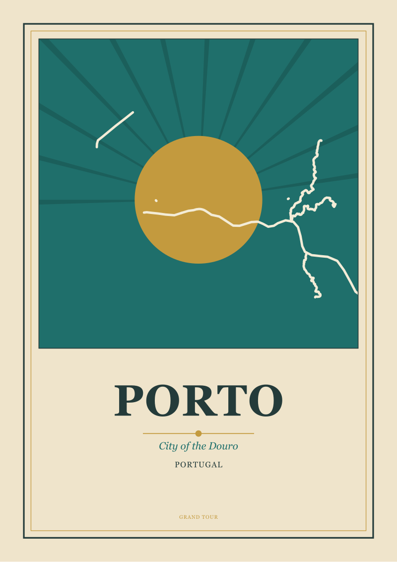 Porto
The print from this article · from €29.95
View the print →
Porto
The print from this article · from €29.95
View the print →
The Real Cost
Now put a figure on the difference. Not in currency — in wall.
A Porto poster occupies a room vertically. Hung above a console, between two windows, at the end of a narrow hallway, over a stairwell — those are the walls it wants. It reads from across the room as a stack: sky, tiled facades, river, the mirrored city on the far bank, more facades, more sky. The eye travels down through the picture the way the city travels down to the water. The cost of choosing Porto is that the poster demands a tall, uninterrupted piece of wall. Give it a squat, wide space above a sofa and the composition fights the frame, because the section cut has nowhere to sit.
A Prague poster occupies a room horizontally. Hung above a bed, along the long wall of a dining room, over a low bookshelf, in an office behind the desk — those are the walls it wants. It reads from across the room as a procession: bridge, spire, bridge, spire, dome, the ruled line of the Vltava holding them all in register. The eye travels sideways the way the S-bend travels through the city. The cost of choosing Prague is that the poster demands a broad, uninterrupted piece of wall. Give it a tall narrow space between two doorways and the composition suffocates, because the procession has nowhere to unfold.
Work the figure through and it becomes a rule that has nothing to do with which city you prefer to visit. If the wall is taller than wide, Porto is the honest answer. If the wall is wider than tall, Prague is. The gap between the two, priced in aesthetic dissonance rather than euros, is the difference between a poster that looks composed and a poster that looks cropped. Most articles that pretend to compare travel destinations skip this because their revenue model is booking one holiday over another. Ours is drawing the city on your wall, which means the geometry of the wall is not a detail — it is the entire brief. Choose the river that fits the rectangle you actually own. Both cities will still be there when you want to visit them; the poster is a longer commitment than the flight.
There is a second cost, smaller but real: the cost of what the picture teaches you to look at when you finally do go. A Porto poster on the wall for a year trains the eye to read the city as a section, so that when you arrive in Ribeira you already understand why the streets fold the way they do. A Prague poster on the wall for a year trains the eye to read the city as a procession, so that when you cross Charles Bridge you already know you are walking along the picture's spine. The poster is a slow lesson in how to see the place before you get there. This is what the affiliate frameworks never price in and what the studios that make posters of the very places they discuss build the entire practice around.
If You Only Remember One Thing
Porto is a vertical city drawn from a horizontal river that cuts. Prague is a horizontal city drawn from a horizontal river that bends. That single sentence collapses the whole comparison. If your wall is portrait, choose Porto. If your wall is landscape, choose Prague. The rivers are equally beautiful; the geometries are not equally suited to every rectangle.
The corollary, if you want a second sentence: neither poster is better; both were drawn from real coordinates of a real river doing a real thing to a real city. The choice is not about taste. It is about which of the two grammars — cutting or bending, section or procession, down or across — the room you want to hang it in is asking for.
This piece did not cover three things, and it is honest to name them. It did not compare the two cities as places to travel to — the flights, the seasons, the food, the crowds; that is a different desk's brief and, frankly, a different kind of writing. It did not attempt to rank the individual monuments (the Ponte Dom Luís I against Charles Bridge, the Sé against St. Vitus); a single bridge is not a poster, a city is. And it did not weigh in on the third and fourth and fifth cities that a serious buyer will eventually consider — Lisbon, Budapest, Vienna, Kraków — each of which asks a different question of the artist and deserves the same slow reading. Each is its own argument.
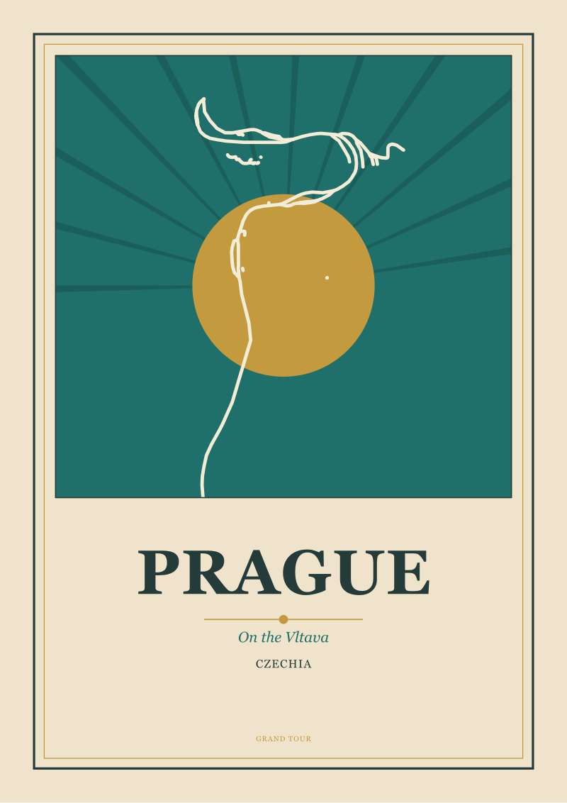 Prague
The print from this article · from €29.95
View the print →
Prague
The print from this article · from €29.95
View the print →
FAQ
Is Porto or Prague the better travel poster to hang in a living room?
It depends on the orientation of the wall you have in mind rather than the city itself. Porto, drawn as a section through a river-cut gorge, wants a portrait rectangle: a tall wall between windows, above a console, at the end of a hallway. Prague, drawn as a procession along a bending river, wants a landscape rectangle: the long wall behind a sofa, over a low bookshelf. Measure the empty wall first; the city that fits it honestly is the right one.
Why do you keep saying the river decides the composition?
Because in both these cities the river is the defining geographic element, not a background feature. Our grounding record is explicit on that for Porto (Douro) and for Prague (Vltava). Once the river is the anchor, the shape it draws on the ground — a downhill cut for the Douro, an S-bend at grade for the Vltava — determines whether the composition reads vertically or horizontally. The poster artist inherits that decision from geography, not from taste.
Are the two posters drawn from real geography or stylised?
Real. The city geometries in our catalogue for both Porto and Prague are traced from OpenStreetMap data pulled through the Overpass API, under the Open Database Licence. That means the river bend, the coastline where relevant, and the arrangement of the built fabric come from actual coordinates rather than a designer's memory of the place. Stylisation happens in the palette and the line weight, not in the underlying map.
Which is the more "iconic" city for a travel poster collection?
Both cities have long-standing places in the visual memory of European travel, and neither has a monopoly on iconicity — that is exactly why the comparison is interesting rather than one-sided. If a collection is being built around river-cities specifically, the two make a legitimate pair: one that cuts, one that bends. Hanging both together, portrait next to landscape, is often a more honest solution than picking a single winner.
Does the epithet under each city name mean anything, or is it decoration?
It is a working caption. "City of the Douro" for Porto and "On the Vltava" for Prague were chosen because the grammar of each phrase mirrors the grammar of the city on the ground. Porto is possessed by its river; Prague stands on its river. That difference is the same difference the composition has to solve. The epithets are a shorthand a buyer can read before they see the print.
Can I hang a Porto poster on a horizontal wall or a Prague on a vertical one?
Physically, obviously yes. Compositionally, the picture will fight the frame. A section-cut composition cropped into landscape loses the fold that gives it meaning; a procession composition cropped into portrait loses the spine that carries it. The prints are made in the orientation the geography asks for, and hanging against that orientation is a choice you can make — but it is worth knowing that it is a choice, not a default.
What about the historic travel-poster tradition — did Porto or Prague ever get the classic railway-poster treatment?
The golden age of the railway poster favoured the coastline and the mountain resort more than the inland river city, so neither Porto nor Prague sits at the centre of that particular archive the way the Riviera or the Alps do. What our studio does is a contemporary continuation of the same discipline: draw the geography honestly, compose within the rectangle, resist the photograph. Whether that lineage matters to a buyer is a different question from which poster suits their wall.
Where can I actually see the two prints side by side?
Both live in the studio's own shop, which is the only commercial destination this desk points readers toward. The rest — hotels, tours, deals — belongs to a different kind of publication. Our job is drawing the cities and writing about why they are drawable; the choice between the two prints, once you have seen them together, is usually made in about the time it takes to look at the wall you had in mind.


New city prints and 10% off your first order.
One email now with your code. No noise after.